Showing posts with label Death Korps. Show all posts

Wednesday, 3 August 2016

Stiff backs and shiny sabres

Greetings shipmates, back again with another quick visit to my "out" tray. This time a rather lovely Death Korps/Cadian kitbash that just oozes "officer":


The donor model was the sadly long-OOP Cadian officer with the monocle and the sneer. Wonderful figure, but the client already had one and he's waaaay too distinctive to have twins of. So with a shiny-hatted Death Korps head in hand I went about decapitating the original and replacing it with the new resin head. Razor saws are the absolute win for that job. I've managed to save the head entirely so that's going back to the client for future projects.

dayum that one in the right caught the light!

As for painting? Well, I've painted so many of these brown DKK over the years that there really isn't much to natter about. Except that the brass was a bit of an experiment. I painted it as I normally do, brassy brass, highlighted with silver. For some reason the tone was just all wrong. Just way too brown this time. No idea why. I knew I needed to get that warm brass tone back so broke out the Casadora Yellow. One clean pass of the wash - acting more as a glaze as all GW washes do - was enough to warm that up nicely and give the shiny brass hat I was after. Very nice.

That's all for today folks, more shinies inbound soon

TTFN

Friday, 22 July 2016

Grubby, grubby mechanics

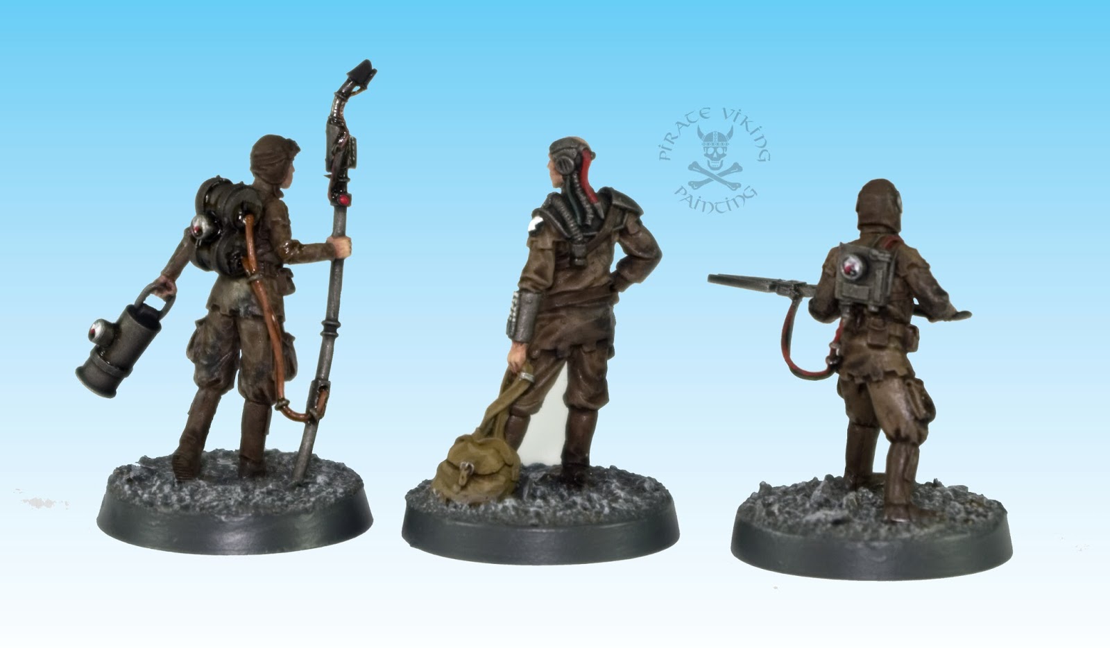
Greetings and salutations folks, quick one for you today. A trio of grubby mechanic types from Blight Wheel Miniatures:


You may remember "Tank Spanner Girl", well, these three are companion pieces to her. Marginally less grubby, but well used all the same. I quite liked the sculpts, proportions are a bit off here and there but the design accents are really nice. I especially like the crenellated edges on the garments. Gave them a real "medieval sci-fi" look and fit in nicely with the mechanicus cog wheel imagery.


Painting wise they're not much to talk about. As part of the Khaki crowd they're just, well, shades of brown. I did my usual trick of adding a little German Camo Black-Brown to the metalwork basecoat when I want metal to look well used and rugged. The grime is just black soot weathering powder worked in to enamel Engine Oil weathering paint. The whole effect is then softened by "stumping" with odourless turps to make the stains "sink in" to the fabric rather than visually sitting on the top. Like I say, not much to say on the painting front. But fun!

More shinies soon

TTFN

Thursday, 21 April 2016

Krieg Kit-bash Konversions

Hi folks, fairly quick one today as we have but two candidates on the workbench:


These two gents fall in to a nebulous "Krieg but not Krieg" category. On our left is a kasrkin whose head has been rather violently removed with various saws and replaced with a Krieg one. The right is more of a kitbash, Elysian legs and arms with Krieg grenadier torso. Both look rather lovely I think. The aesthetics blend nicely. Well, except that the old metal kasrkin is massive compared to the forgeworld models. Seriously, look at the base sizes in the picture, I had to tweak the scale to make the picture look anything like sane. But anyway, enough with the scale grumbles, lets talk about painting man mountain fink:


 It's hard to see but the kasrkin is the same paint job as these chaps, I think he's supposed to be an officer or something leading them. As a result most of my colour choices were already made. In the end almost none of the Flecktarn camo can be seen but from the back he is very stealthy.


This chap I needed to do more thinking for. He's to join a group that has black; green and yellow as a colour palette but he needs to still be a soldier. So while I knew I needed some nice saturated green in to the model... I figured I still needed some more soldierly green to form the main body of the fatigues. The armour is much brighter in person than it seems in the photos by the way. The yellow was always going to be more tricky to pull off. Too much would give it a cartoon vibe but there needed to be some in order to bind him to the group theme. Inspiration struck by realising I could just put some quick arm-of-service-esque stripes on the gun and helmet. It's small, but it's enough.

There we go, like I say, a quickee today. More shinies soon!

TTFN

Wednesday, 13 April 2016

Death Korps, now with mustard

Ahoy shipmates, guess what? There's some more Death Korps leaving their assembly areas on my workbench and boarding the cardboard transport to the front lines.


I believe these are some kind of specialist unit on secondment to the rest of the DKK already with the client. Brief was for grey with mustard details.


The yellow is based on the Averlander yellow I use, i.e. Val Tan Yellow with glazes. In this case two coats of Seraphim Sepia to create a more ochre-ey (totally a word) followed by matt varnish to kill the shiny wash effect.


It's tough to see on the images but the greys are different between the armour; coat; and canvas mask/puttees. If you were painting for a studio and online photos you'd want more contrast. Realistic doesn't always look good on "film".


Final pics for the day are two random Inq28 goons. Well, one goon and a monk. The monk is based on a real order which are beige with brown flecks. Meant breaking out the pointillism to make the little flecks. The goon needed to look "classy-threatening" so pin stripe suit and a nice black leather trench-coat was the order of the day to go with a shotgun straight out of the ministry of emphasis.

That's all for today folks, not much to natter about so just enjoy the pretty pictures :)

If pretty pics are your thing by the way, head over to the Beard Bunker, I just finished my series of shots of our trip to the new warhammer world (from quite a while ago), there's some good stuff there.

Warhammer World - Part One; Part Two; Part Three.

TTFN

Thursday, 31 March 2016

And I Beheld A Pale Horse...

...And his name that sat on him was... Roderick... and the Death Korps followed after.


Yup, it's yet more Death Korps o'clock! This time it is the blue, sorta WWI Belgian variants and include one of my very favourite DKK models. The Death Riders always looked good on the website but getting one in my hands? Let me tell you all, Forgeworld knocked it out of the park on this one. Fantastic. Let's jump straight in:


I dithered a lot over the colour of the horse. I figured I had a couple of options, either a strong contrast or a colour that would compliment the regimental scheme. In the end the decision was made on two counts: One, the overall scheme would suffer by too much of a totally different colour being added (and I was worried a dark horse would diminish the impact of the creepy tack) and two, I had called to mind that "I beheld a pale horse" Revealations quote and figured that was perfect for the Death Korps. I didn't trust my ability to get a nice "champagne" colour - really tough with painted horses as much of the tone is the skin showing through the fur - so a pale grey was the best option. Plus it felt like the sort of colour that might be bred en masse for a consistent regimental appearance.


The horse of course (of course, of course) was not the only animal on the base. The officers little dog was a plastic part from another kit added on to give even more character to the piece. I joked with the client that the lack of gas mask meant it must be an Eastern Krieg Gashound bred for hardy doggy lungs. It's shape though was much more spaniel in form so spaniel it got!


The rest of the painting (including his two buddies) was the familiar Fenris Grey with assorted mid greys, rubber mask and brass fittings. Not terribly tricky and discussed in prior DKK posts so I won't bore you with it. Suffice to say, a fun project and was I to be doing a DKK army any time soon? It would have a shedload of the riders in it as they. are. awesome.

TTFN

Thursday, 17 March 2016

Krieg Troops and Catalogue Models

Hiya folks, more shinies this week for ya!


Long time readers will definately recognise the colour scheme at work here. I dread to think how many of these brown Krieg I've done over the years but these are amongst the last. However, it's rather clear that three of these things are not like the others... let's check them out.


These three lovely ladies are more of the "Toughest Girls of the Galaxy" range, yep same as the Vostroya Today cover model. While these are still posed in rather a "catalogue model" attitude I quite like them. The middle one has a too large head but the sculpting is actually really nice and they were a ton of fun to paint. Not least because the client wanted darker skin than the usual Caucasian. Picking which exact shade you can paint a model generally depends on the sculpt. These girls are very European in sculpt, but that means you can choose anything from the far North of Norway down all the way to bits of Turkey. Lots of choice. This skin tone started with Val Beige Brown, shaded with a mix of Reikland Fleshtone and Agrax Earthshade, highlighted by adding increasing amounts of Kislev Flesh to the Beige Brown and then glazed with Seraphim Sepia. I think it came out quite nicely and is definitely being added to my repertoire of skin tones I'm happy with.


The rest of the paint scheme was rather informed by their attachment to the brown Krieg forces. Camo greens, khaki and a saturated dark green was the order of the day and led to quite a quick, enjoyable session bashing them out. Fun models. No idea what I'd ever do with them myself, but fun nonetheless. One of those times where its nice to be a commission painter as you do things that you wouldn't have chosen to try yourself.


Heading back to the gasmask lads, well, there isn't a lot to say that I haven't said dozens of times before. So we'll just check out the pretty pictures and not worry about my blathering so much.


Really like this tank commander. Such contempt for the kind of weapons normally flicked at an armoured vehicle that not only is he out of his turret, but in a pose of absolute, casual calm.

And that's all for today. Hope you've liked them and more next week!

TTFN

Sunday, 10 May 2015

Imperial Guard! Flags! People Holding Them!

Yes, I'm running short of titles for DKK posts.


Today we've got some shiny, shiny banners and some very normal DKK dudes holding them. These are all part of the mopping up project finishing off the client's DKK collection. The dudes are pretty much normal as per previous posts:

Perfectly normal dudes for reference
I've done some minor modifications as per client instructions, mostly small posing changes, goggles on helmet etc.


The banners are mishmashes of Imperial Guard flags, Empire finials and "dangley bits", one of them is a straight up Empire banner. The one above is just the army colours and my faux NMM gold.Getting happier with it as I go. Still not a fan of NMM in general but on cloth, it works really well.


The next two have more work involved in them. The flag on the left had a Cadian Gate on it. Client asked for it to be removed and replaced with an Armageddon style fist. Twenty minutes with a Dremel and a couple of hours with ProCreate and a new flag is born. The one on the right is totally freehand. The horses tail is less stubby than it looks in the picture. The black shows through the yellow with the lighting.

So, all done! There'll be more DKK before we're done (again) but for now

TTFN

Sunday, 19 April 2015

Men in Blue (part 3)

Hi folks, got some more DKK for you, the blue flavour, and with flags this time!


As I've chatted about the painting side of these before so I won't go into to too much detail, more of a picdump.


I am really liking the way the blue works with the various greys. The camera doesn't pick it up too well but the lining, helmets/armour, trousers and gas mask are all slightly different greys. I added a splash of khaki this time with the bedrolls on the backpacks but the overall look is very "professional soldier" which I always like on guardsmen.


The banners are a mix of plastic cadian banners and Forgeworld's rather nice krieg ones. The piles of skulls are so very Death Korps.

So there you go, not much to chat about but pretty pics nonetheless. These got finished over the last week or so but it seemed insane to do multiple posts all featuring the same colours and models so I waited till I had a group shot going.

TTFN

Wednesday, 1 April 2015

Tank (Spanner) Girl

Hi folks, today we have some of the wo(men) behind the armoured might of the Imperial Guard. A mechanic to keep them running and a commander to aim the gunning (I'll stop that now). First off, the mechanic, or Tank Spanner Girl as I'd named her:


I wound up painting this model twice. The first time I was just not happy with the result, so I thought "what the heck, I'll have another crack at her". Stripped, repainted. Still not happy. I figured I couldn't possibly have cocked up such a simple figure twice in a row. The commission brief was simple enough (to fit the brown Krieg I've painted before) and the colour scheme was sound. So what was wrong? Then it hit me. She didn't look like a mechanic. She looked like a pin up from a car mag "'Ere luv, 'old that big spanner and we'll take some shots...". Clearly she needed more mechanic cred. Nothing I could do about the sculpt (she must have been warm in the workshop or something) so I gave it more thought. Grime! Was the result of that thought. Proper mechanics are dirty. Initially I tried just using the Ammo Oil Stains paint. This was way too shiny (model is much, much more matt than the photo indicates) and too brown. It's designed to indicate spilled fresh oil. So I mixed some black dry pigments (forgeworld ones) into the oil stains and tried again. This time it was entirely made of win. The right consistency, the right colour everything. I softened each stippled layer with odourless turps and overall applied 3-4 layers. I now realise that the reflectiveness in the pictures is the microscopically thin layer of the turps that still hadn't cooked off reflecting light. Doh!

Anyway, this fixed her. Win! On to a friend, a dismounted tank commander (possibly destined for the leviathan, possibly just a disembarked chap for when tanks become sad and explode mid game:


The model is a cut and shunt conversion of a tank commander body and a cadian set of legs. The sword he came with had such a bad miscast (hollow) that it just disintegrated on assembly. Fortunately I had a perfect alternative in the form of a cutlass from the Free Company box. I figured that like sailors, tank crewmen would appreciate the easy-to-draw-in-confined-spaces curved blade over the normal straight guard sword. Maybe he's friends with a navy armsmen. Who knows. Painting wise he's nothing special. Dark grey and gloss black to fit with the previous tank crew I painted for the Krieg. The pink flashes on the cuffs and epaulettes are to finish the WW2 German tank crew vibe (yep, pink, it actually works quite well).

And that is all! Short one but at least there were shinies!

TTFN

Thursday, 19 February 2015

More men in blue and a Tank Commissar

Hi folks, last time we were showing off a couple of Death Korps in their WW1 French/Belgian-inspired scheme (blue grey). Today we have better photos and another pair have joined them!


Eagle-eyed readers will have noted the deliberate mistake from last time. The green sash that has been a unifying spot colour across a lot of the guard I've painted for this client were absent. Oops. Meant to do that obviously. Fixed now. The remaining two DKK are minor conversions of the command packs from Forgeworld and more evidence for me that DKK really are the way to go for Imperial Guard if the wallet will bear it. The faceless thing means that twinned bodies impact far less than in other armies. Just swap out the arms and you have a new feel of model.


Truth be told, there isn't a lot to say about these that wasn't covered in the previous post. One thing I forgot to say last time though was about the choice of the grey areas. I could have used two separate greys - German Grey would have been a great choice for the darker areas - but by using the same grey and just darkening and lightening it for the two areas you get two apparent colours without having two different hues. This doesn't matter much but it helps if you are going to introduce a strong fourth spot colour like the green. Technically the eye sees the four different colours and should be starting to twitch (three is pretty much the limit before you have to be careful about clashes and garish-ness, totally a word). Instead, the eye sees two shades of the same hue and two other colours. Much happier. This is a finicky thing but an example of the kind of oft unconscious thought processes that go into making colour choices when you have a decent grasp of colour theory.


In a similar vein, this tank commissar was driving me nuts. The gas masked face was simply not working in the same rubberised fabric as the others. It just disappeared into the other black tones (note the Val German Grey uniform and German Camo Black-Brown leather trenchcoat). Frustrated, I ignored it while I worked through the other areas of the model. Finally it was finished and I had to face facts that the face wasn't working. The whole thing was just a null area. Then I remembered seeing a photo of WW1 German storm-troopers who had painted stylised skulls on to their respirators. The mask was kinda skull shaped anyway so I went with it. Really helped. Finally he had a crude face and a point of interest in the model. Plus, y'know, an actual death's head will help his terror-cred no end, right?

That's all for today folks

TTFN

Saturday, 14 February 2015

More Death Korps, and this time, they're blue

Hi folks, another quick update today (the commission I'm working through is several small groups of Imperial Guard officers). This time it is once again Death Korps of Krieg (becoming something of a specialist, them and Legio Astorum titans) only this time, rather than their normal drab khaki, they're a rather fetching blue:


I've said it before and I'll say it again, I love the Death Korps models, they're an example of Grimdark done right. They're whole vibe is so hopeless and faceless and yet simultaneously the models are characterful and most importantly the overall impression is of a professional, regular army. So many IG regiments looked like irregulars or ridiculous peacocks. These and the steel legion that undoubtedly inspired them are soldiers. Not ultra-gothic walking cathedrals, not wild; fanatical desperadoes. No. Just an army. Heck, they've even got backpacks. Love 'em. Were I ever to do another guard army it would be DKK. Although probably a mechanised one as doing a whole infantry horde at those prices? Shudder. Anyway, enough of that, painting:


First up is the lovely radio operator. Colours were taken from a photo of the client's existing army (always tricky to match exactly, so they're kinda "Jeff-matched" colours). The main coat colour is The Fang (blue-grey, #stupidpaintnames), shaded with Drakenhof Nightshade to give it a more blue tone and then rehighlighted first with The Fang then with a couple of mixes of The Fang and Russ Grey. The lining and the trousers both start with Mechanicus Standard Grey. The trousers get a bit of black mixed in to darken it. The coat lining gets highlighted with Dawnstone and the trousers just come back to Mechanicus Standard Grey. The armour is the same as the trousers. All that's left really is the rubber mask (Ammo Rubber and Tires) and the leather (Val Leather Brown shaded with Agrax Earthshade and rehighlighted) and he is done. On to the officer.


This pose is absolutely awesome. The flying - gorgeously sculpted coat - the purposeful stride, the drawing sword, the totally absent face... wait what? Yeeeeah, I don't know if this is a) a miscast, b) difficult to sculpt/cast face in the tiny area available, c) uh, dunno, but there really is not any features under that cap brim. I tried faking it but in the end just minimised it with dark skin and a suggestion of eyes. Ignore the face, ignore it. Another time I might have tried sculpting in the top half of the gas mask to obliterate it. I'd recommend you all do so. But anyway, otherwise lovely model, same paint treatment as the rest of it with the pseudo NMM braid and done.

Hope you enjoyed this whistle stop tour of DKK, more coming soon.

TTFN

Tuesday, 27 January 2015

Men In Beige

Hi folks, got a quick one for you today, I'm definitely back to work 'cos I've had DKK on my painting table ;)


These fine looking Men In Beige are part of the ever growing horde of Death Korps of Krieg featured in previous posts. This time they came fixed to nifty Scibor resin bases for added oomph. The DKK from Forgeworld really are a consistently good model range, I've painted a bunch of them and they're now my favourite guard models. Easy to paint with their total lack of skin, atmospheric gas masks and trench-coats and best of all - on the ordinary infantry - weapons that feel a little more in scale than the norm. Great range and always a pleasure to paint.


This fine fellow for example shows just how nicely resin can give us slight undercuts and thin casts on the cloth that is really tough in metal (undercuts chew moulds and thin metal bends and tears) and damn near impossible in plastic without the most careful planning and cutting before moulding (the steel moulds that plastic is made from cannot release undercuts). That coat, in particular is a lovely piece of work. Plus the stance just oozes character despite not being able to see the face.


I've talked quite a bit about painting these guys in this scheme over the years but in the intervening time since I painted the first lot and now the paint range changed... Mercifully the replacements for the colours I was using are close enough that you really can't see too much of a difference, the brown is a little more saturated than the old Khemri Brown and the green a little paler perhaps. But not enough to make a difference, besides compared to space marines where the colour is really in your face and thus makes tiny changes in hue really noticeable, guard uniforms can vary a little without trouble.

So there you go, not a lot of content this time but some pretty pictures. Happy painting folks and

TTFN

Wednesday, 31 July 2013

Death Korps armour crew

Hi folks! We've mostly got half measures today:


Yup, "top half only" to misquote Brassed Off. The models above are for the turrets of tanks sticking out of the cupola so there's no need for legs. This half of the commission was for tanks with a "Third Reich"-esque camo scheme so the client wanted a Panzer-feel tank uniform. Instead of pure black I went with grey with gloss black armour plates. Pure black is very much the colour of commissars in the Imperial Guard. The pinkish red piping on the cuffs and epaulettes is actually authentic colour for german tank crews back in the '40's. Pink being a girls colour is a fairly recent development - heck napoleonic Russia had whole regiments with pink and green banners - we'd initially dismissed the pink as it might have seemed silly. But during painting the crews needed a little something else and so the pink was lurking in the back of my mind. Tried it, and who knew? It works.


Then as an example of how much a different paint job changes a model we have the DKK infantry scheme on the same figures. These guys are destined for chimeras. I used the grenadier scheme to add the green ballistic plates to the steel helmets. Figured if your job includes sticking your head out of armoured vehicles you'd want the extra protection.

Just add a girder and a New York skyline right?
Finally today we have the centaur crews. These chaps are actually destined for Salamander troop compartments. As a result the "driver" models needed some converting:


I had a spare DKK lasgun and grenade launcher and was able to get reasonably convincing "at ease" poses with their weapons across their laps. But what to do with the third. I tried having him sitting there just weaponless but the fist in the air just looked weird. I sat there looking at it and trying to figure out what to do with him. Then the idea struck me. A brew. A section of plastic tube closed off at one end and smoothed off with a thin strip of plasticard for a handle and the classic squaddy enamel mug is formed. Add some chips and dings and he's all there. There is one important question about the model though and I wonder if anyone will ask it in the comments? ;) That's all for models today but I thought I would finish with a wargamer fitness report:


Nope, hadn't forgotten about this! Weight loss progress has slowed a little, but I've still lost another 6 pounds or so putting me down to 19st 7lb. More importantly, my fitness is increasing exponentially. I've been doing the NHS's couch to 5k program of running podcasts. They're designed to take you from sedentary to running 5k without rest. Over the past two months or so I've gone from being barely capable of jogging for a minute at a time to running 8 minutes - over a kilometer - at a time. (The program is interval training so the current run is two eight minute runs seperated by a recovery walk). I honestly feel better than I have in years and haven't been this weight since university 13 years ago. I'll keep you posted on progress and there'll be a before and after pic in the fullness of time (probably at the end of the year).

TTFN

Thursday, 25 July 2013

Death Korps again and nifty banners!

Greetings shipmates! I have more shinys for you, this time Death Korps flavour:


Long time readers will know this as an expansion of the previous Death Korps army I painted for the same client. This time around it is a mish mash of tank commanders, orphaned sergeants and other random "fill in" bits. Including the rather nifty command squad pictured above. One feature does rather leap out though right?


The client wanted the Empire army standard part used as it was so perfect for this rather grim army. I thought we could go a bit further though and made some modifications. The sigmar symbol on the shield was ground and sanded off, the hammer head removed and replaced with a Zombie scythe. I then removed the back of the scythe head, cut an aquilla in half, glued the halves together and attached them to theme the scythe. A flagellent's chain and a tank skull-quilla finished the effect. These small changes made the icon much, much more Imperial in tone rather than Empire. The "Death is Our Gift" legend is totally a Buffy the Vampire Slayer paraphrased quote btw.


The host of add-ons finish off this post, I've discussed the painting before on this blog but it is worth noting something about this batch. Despite the best efforts of the camera - khaki shades are evil to photograph - this batch is much more vibrant than the last. This is due to the change in paint shades. Citadel have done me a favour here. The militaristic colours from the Foundation range that I loved are still here, but a bit more saturated. Creates a much nicer effect. The models are much nicer in the "flesh" too, stupid camera ;)

TTFN

Tuesday, 18 June 2013

Limited Edition Death Korps Quartermaster

Avast shipmates! Remember these? They were part of my last Death Korps commission, two years ago. How time flies. Today, I've added to it:


Yup, this fine fellow is the fantastic Forgeworld event only Quartermaster. He, along with about thirty miscellaneous buddies are being added to the client's original commission. Take a moment and see how far I've come with both painting and photography in those two years by checking out the older post. One of the problems though is that none of the colours I used to paint the previous incarnation exist anymore! Fortunately, by judicious use of online comparison tables I got everything close. A few things just got swopped straight out. I used to mix a particular shade of canvas green (the mask and the puttees around his legs) which turned out to be Val Grey Green. Who knew?


It's actually made me more confident that I could match older paint schemes if I had to with the new paints. Still haven't achieved the same tone for my Blood Angels as I used to but they were a hench army to begin with. Don't think I really need to add much more in the way of infantry to that...

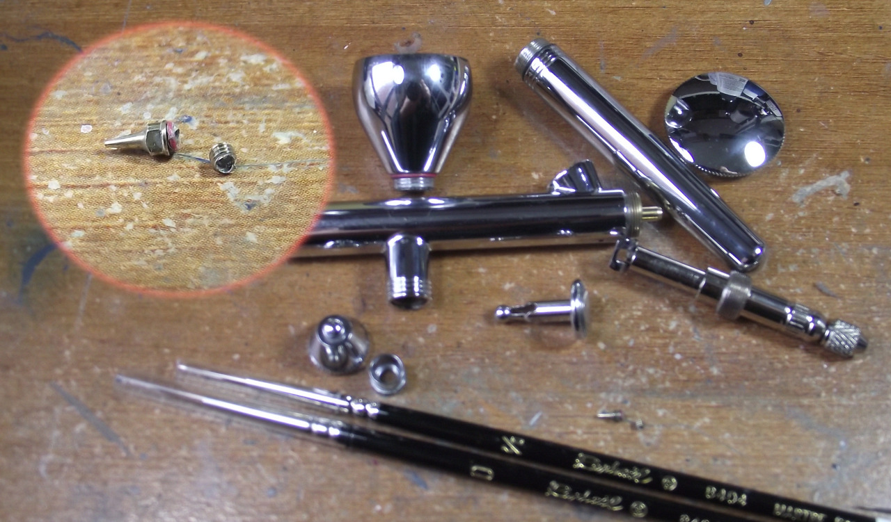
So with this fellow finished some of you who read "Today I have mostly been" either through the Tumblr or the Facebook/Twitter feeds will realise that I solved my brush quandry. I feel I ought to give a qualified shout out to Lawrence Arts who were the only people online in Britain who seemed to have a stock of the Raphael 8404 brushes that I prefer. Seriously, they're brushes. They take up no space whatsoever. How can people run out of them and not be able to restock for a fortnight in the 21st century? Sheesh. Anyway, Lawrence Arts are more expensive than my usual supplier and had a high P&P but by the gods they deliver fast. 17 hours from order to door. Not too shabby. Sadly, I now have to switch from the "Just In Time" supply chain for this sort of thing and move to having a backup of all my brushes so that when they wear out I'm not crippled by supply issues. This might seem a "duh" option but frankly, when brushes last 8 months to a year and take up no space at all you kinda expect them to be available to buy! Paint, yes, I have backups of that, spray too, but brushes. Grr. Never mind, expense over with... or so I thought.


Proving that these things come in threes (my 0 and 00 brushes simultaneously dying and the stockists being rubbish being the first two) take a look at the picture above. The sequin sized componant just above the brushes and magnified in the inset is the beautifully machined, precision nozzle for my airbrush. Without it it will not work. This morning while I was checking for any dirt/paint ahead of continuing work on the Titan it sheared clean off it's screw thread. I managed to extract the screw thread from the brush thank the gods but this now needs replacing too. A quick order on The Airbrush Company's web page found the part (0.35mm nozzle with O-ring if anyone cares) which comes to... Fifteen pounds. FIFTEEN QUID? It's the size of a grain of rice! (thinking about it that's probably why it's expensive Jeff, chill out).

Anyway, I've had quite a day so it was very nice to be able to have those brushes turn up right as I was in mid fury at having all productivity stopped by circumstance. A run around the block and a few cups of tea later I was calm enough to paint again and the DKK Quartermaster was a fun and rewarding model to spend the afternoon on. Aaaaand relax. So, looks like mostly DKK for the rest of the week until the new nozzle arrives. Ce la vie right?

TTFN.


Thursday, 9 June 2011

DKK Bodyguards, and what bodies...

Although not part of the DKK army I found these two among the resins and decided to paint them as bodyguards for the regiment commander.


I am not sure who the manufacturer is, but I am pretty sure they are part of a Weird War II range. They have the feel of Nazi S&M pinups. [Edit: They are West Wind Secrets of the Third Reich]


First, the slightly more sensibly clothed one! The MP40's she has in each hand had very shallow detail and thus didn't respond well to drybrushing or washing. As such I lined in the edges with mithril to give them some definition. I contemplated painting the gas mask in the same canvas colour as the rest of the army but it was clearly sculpted to indicate rubber. My usual method of charadon granite with a badab black wash and some grey highlights served me well and gave her quite a sinister look.


Both models have nicely modelled bases that benefitted from careful painting and weathering to add interest but avoid detracting attention from the miniatures.


Now for the slightly less subtle figure! The stockings and shirt were the cause of a fair amount of experimentation. I wanted the shirt to look like thin cotton and thus appear slightly shear at areas where it was pulled tight over skin (shoulders, back, bosom, upper surfaces of arms). This effect is annoyingly difficult to photograph as it is more subtle than the translucent effects you often see on fantasy miniatures (have to paint one like that one day). It is a simple matter of adding the top highlight of your skin tone to the colour used for the fabric, you have to be careful to make the effect blend very gently as otherwise you make the fabric transparent.


The stockings caused a bit of head scratching, I didn't want to paint them in the same way as the shirt as I thought the effect may be too obvious. Instead I decided to take the slow path and build up the colour in very thin layers. A 50:50 mix of Vallejo Smoke and Black inks was thinned by at least a 5:1 ratio. Very, very thin in other words. This was then gradually layered on until I achieved the desired denier.

These were fun figures and a bit of a break from the norm for me, also gave me the chance to try some new techniques. Having cleared all my current commissions (now is the time if you want something done fast!) I've got a personal day tomorrow. Hmmm, Blood Angels, Dark Elves, Warmachine or cowboys tomorrow...

TTFN