Showing posts with label Painting. Show all posts

Wednesday, 10 December 2014

Useful References

Hi folks, I often talk about how useful/important research is to getting the result you want. Well, I've been doing a lot of musing lately about skin painting, I've got Caucasian pretty much down and using Dwartist's excellent mix has led to nice Afro-Caribbean tones (currently secret Inq28 project but I'll share after I inflict them on my players), but there are dozens more and it's often tricky to get a starting point for the midtone. Well, a photographic artist has provided us wargamers with a really interesting resource:


"Humanæ" by Angélica Dass is a work in progress artwork with the midtone colour of each participant (ratio of pink people is a little high at the moment but work in progress) defined by its Pantone colour. Much easier to compare a paint to a swatch than the ever changing shades of skin so I'm hoping it'll be a useful starting point. Thus I figured share it here! [it has a naff interface at the moment, use the tiny red "fore and back" at the bottom to scroll the pages]

Ideally, I'd like to see more companies making - and sculpting - a better range of skin paints and face shapes but until they do, we'll have to keep on finding useful shades in the existing ranges and sharing them. I think I know some of the reasons for the reluctance to move beyond the Caucasian norm in wargaming, race is one of those very, very touchy subjects. Almost better to be thought of as white-centric than to offend by mislabelling people or worse, missing an ethnic group out while featuring others. I'd say, time to grow up wargaming industry, accept the fact that some people will throw toys out of the pram and handle it when they do. Another reason is expense, flesh tones are tricksy, adding dozens more is expensive. But as we're seeing in Humanæ there are probably existing tones in your ranges. Would it be so hard to label them as Burnt Umber / Afro Carribean Skintone? Of heck, just call them the skintones and let us figure out that they can be also used for other things.

Anyway, that's it. Thought I'd share a resource and some thoughts. If you've got a nice solid skin recipe for the hundreds of non-Caucasian skin tones out there then feel free to share it in the comments! If I get enough I'll make a sort of library of them. There's dozens of reference sites for animals (Equusite for horses is one I use a lot), nice to see one for humans.

TTFN

Sunday, 18 May 2014

Quick painting Averland Empire (and Nuln!)

Greetings folks, today, we get a little sneak preview of my next Warhammer project. Something I've been waiting to get started for a while but have been constantly distracted away from, the army of Averland in The Empire.


This venerable metal drummer is my chosen test model for determining the optimum batch painting method before the conveyor belt starts and hundreds of state troops begin marching across my workbench. Partly to document this process and partly to share my findings I thought I'd share the process with you all! After the step by step below (which if you ignore the yellow works for nuln too) I'll share a few thoughts on the choices I made:


Step 1: Over a black undercoat, sequentially drybrush the steel areas. I used three quick layers, AP Gun Metal, Plate Mail Metal and Shining Silver. Basecoat the fabric in Val German Grey.
Step 2: When the first layers have dried, wash the entire figure in a 1:1:1 mix of Black Ink, Lahmian Medium and Water. Creates a decent but not perfect replacement for Badab Black.
[note, if you want to paint Nuln rather than Averland skip forward now to Step 6]
Step 3: Basecoat all the yellow areas with Val Tan Yellow.
Step 4: Two wash steps now, first a Seraphim Sepia shading wash and then a glaze of Casadora Yellow to deepen the yellow tone a little.


Step 5: Edge highlight all the yellow areas with Val Tan Yellow
Step 6: Basecoat all the areas requiring a brown wash, Val Beige Brown with streaks of Val Deck Tan for woodwork, Val Deck Tan for strings and ropes. Rhinox Hide highlighted with Mournfang Brown for the leather. On this one there was also a Val Stone Grey drumskin.
Step 7: Wash all the areas painted in Step 6 with Agrax Earthshade.
Step 8: Skin (my usual Cadian Flesh, Reikland Fleshtone, then highlights of Cadian Flesh to Flayed One Flesh through Kislev Flesh) and details
Done!

One of the reasons that this project has been much delayed was discovering which yellow to use. I was desperate not to have a very bright, modern yellow dye colour. I wanted a natural yellow, something you could achieve with natural yellow dyestuffs like onion skins. I tried dozens of combinations with most being too bright or too earthy or just needing too many layers to achieve the effect. Remember, this isn't character method. This is churn out hundreds method. The Vallejo Tan Yellow was a lovely finish and needing just that colour and the two wash steps makes it properly economical as well. Very happy.

Hope this inspires a few of you, happy painting!

TTFN

Tuesday, 14 May 2013

Tutorial - Flecktarn Camouflage

Greetings shipmates, while painting the latest batch of the Flecktarn Guard I mused "wouldn't it be useful to just take a few photos as I went so that I can show people how to achieve this sort of thing rather than just telling them". Then I grabbed the camera and went for it! Hence, here I present Pirate Viking Painting's guide to painting Flecktarn style camouflage. Note that I said "Flecktarn-style", this is not intended to be some kind of historically accurate guide to recreating a pattern. Rather it is intended to show how to achieve a reminiscent pattern.

image from Trident Military

First things first, you need some reference material, this is an image grabbed from google. Between that and the small library of books I can usually find what I need for reference material! The next stage is to really examine how the pattern is put together. In this case it is a pale green/brown/grey with three different browns printed over it. So the easiest way to accomplish the effect is to try to replicate the printing with paint.


First, the model gets a nice solid basecoat of Val Grey-green (I), this is very pale but will be dulled and browned by later processes. Once dry - and it is worth noting that Vallejo paints dry much darker in tone than the wet tone - patches of Val Flat Earth are painted over the Grey-green (II). Try not to make the patches too smooth edged or it'll look like a fresian cow. Next, another layer of patches, this time in Val Chocolate Brown (III) making sure to overlap some of the Flat Earth. Very few camouflage patterns have hard edges and clear, high-contrast demarcations. Makes it a pain in the bum to photograph which is why you end up with the typical Cadian schemes. The last stage of the patches are painted in Val German Camo Black-Brown (IV). These need to be smaller patches and trying to leave some Val Grey-green showing. Don't worry too much about this though as the next stage will add a fair bit more Grey-Green into the scheme again.


The next steps in the scheme are to use the same colours as in steps I-IV again. But this time you just put small dots of the colour on the other patches. Each time apply a fewer dots so you end up with lots of grey-green dots (V) and not many Camo Black-brown dots (VIII). This is technically finished but there is no differentiation in shading across the cloth. Regular highlighting will cause insanity or blindness, trying to highlight each tiny dot or patch across folds in the cloth? Life is too short. Instead I opted to just use a glazed shading wash.


Before I apply the wash I paint all of the colours that would need a brown shading wash (IX). Gaiters, belts and pouches in Val US Field Drab, ropes in Val Deck Tan and so on. Then you give the whole thing a very generous wash of Agrax Earthshade (X) which corrects the tone of the Grey-green and also adds shading and contrast. Once all the other bits are finished the camouflage forms a nice textured backdrop to the other regions.

So there y'go! How I paint this scheme. Hope it proves useful inspiration for someone. Granted a ten stage cloth painting scheme is not for everyone but can provide a nice effect if you have the patience! Until next time folks.

TTFN

Friday, 8 March 2013

Turbo Lasers and Colour Theory in action

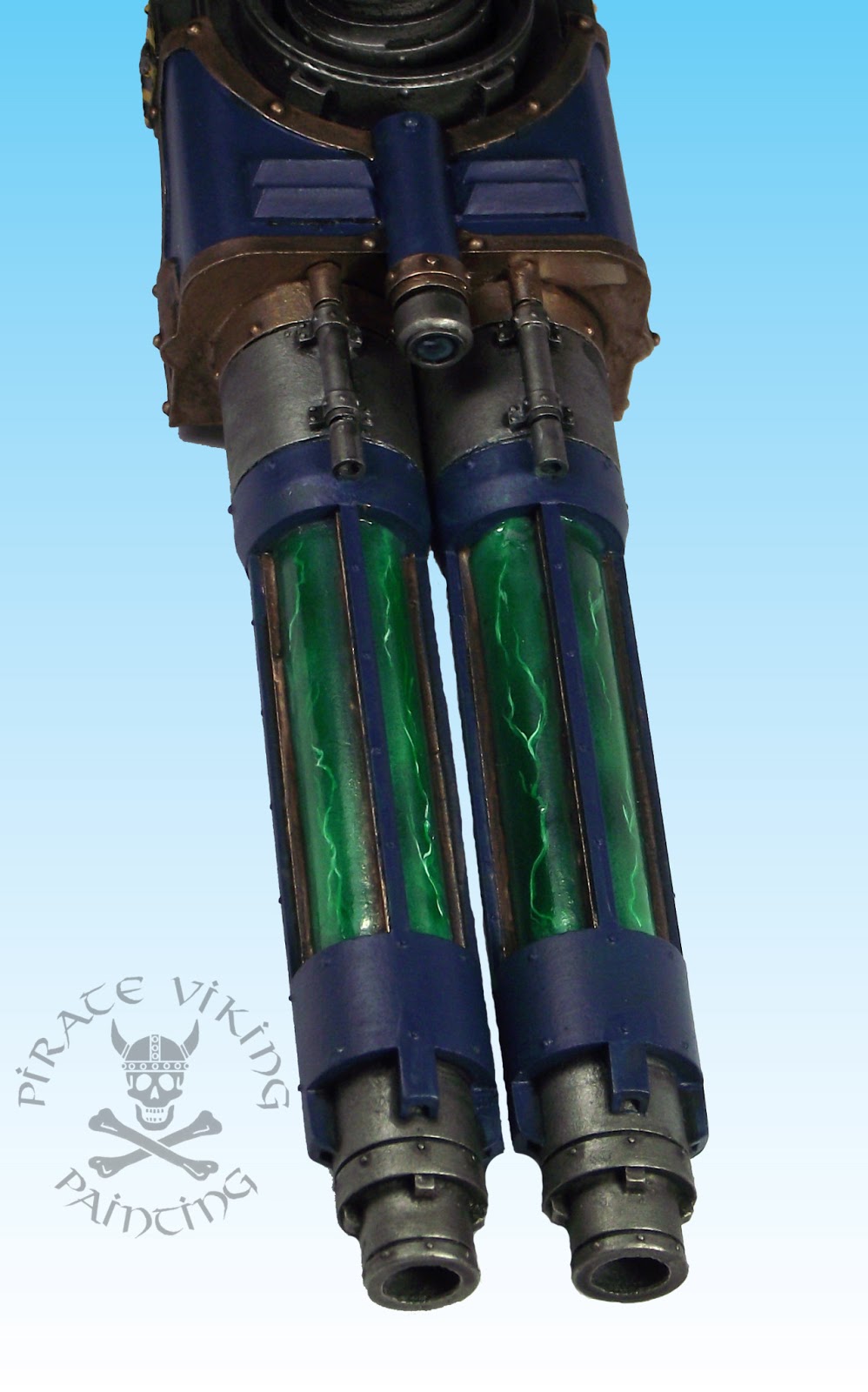
Hello to one and all. Just a quickee today showcasing the turbo-laser destructor of Pyladii Alpha and along the way, showing that colour theory is more important than you think!


That's a turbo laser! And what a stupid name that is by the way. Turbo-laser destructor. It almost beats bloodstrike missile. Almost. I mean what does it mean? That the laser is turbo charged? That the laser is faster... than the speed... of... light... no, that can't be it. So is it firing faster? Is that the turbo? But turbo is all about forcing gas into a smaller space to get more power. And what about the third element? Destructor? Sounds like it is destroying the turbo-laser. Enough. The name is stupid but it has hung around since Adeptus Titanicus so I think I can forgive it. Now, "why does this demonstrate colour theory Jeff?" I hear you ask, well, at the moment it doesn't. Consider, however the following picture.


Now compare the weapon on the left with the one on the right. On the left it looks like a toy, the colours look awkward somehow. Why? Because if I had left it there I had broken colour theory. Lets go to the wheel:


The picture on the left uses adjacent colours on the wheel. There is no contrast, and precious little complement. The addition of the brass/bronze gives the opposing colour creating a split complimentary scheme. More on this here. Essentially the message to take home is to think through the scheme before you start as you can run into problems later. In this case I had instinctually known that green would work in the scheme (I've been doing this a while) but by the time I got to the picture on the left I was starting to worry that I had made a mistake. It just didn't work. A quick glance up at the colour wheel on my wall keeping the overall plan in mind reassured me. Once the orange/brown metallic shade was in place the blue and green would be complimented. If I didn't have this knowledge and the tool of the colour wheel then I might have changed course mid way through wasting time and possibly having a worse finish at the end. Lesson learned.


While we are talking about this I should mention the green! While musing on the colour scheme for this weapon I had done my usual internet meanderings and had found this on Spikey Bits. I liked the idea of not having just plain steel tubes running through the middle but thought that the linked example was a little too cartoony for me and didn't serve to explain how the weapon worked. It was just lightning for lightning's sake. For Pyladii Alpha I figured that making the tubes look like they contained some sort of highly charged plasma cloud, I picture it flashing into light when the weapon fires. Yeah, I know the physics doesn't exactly stack up but there you go! To achieve this I first airbrushed a series of different diffuse clouds in white over the black undercoat to achieve a greyscale cloudy effect. Then I painted white lighting on it fading out at either end to indicate that it was simply passing out of sight rather than petering out. Then I airbrushed green ink over the result and left it to dry. Inks are perfectly translucent and thus simply tint the greyscale below and are therefore perfect for this role. I repainted the brightest areas of the lightning in white and resprayed with green ink. A thin coat of water effects finished the deal. More titan stuff after the weekend folks!

TTFN

Tuesday, 19 February 2013

Citadel Paints: A more measured review

Hello and huzzah shipmates. Well, it has almost been a year since the new line of Citadel paints came out. I did a first impressions review way back in August of last year, but having used them extensively now I think I have honed in on what works and what doesn't about the new range along with a few suggestions to fix what doesn't work. I usually think The Good, The Bad and The Ugly when I am doing reviews, in this case I am also adding The Indispensable as there are some of the new paints that I just wouldn't be without. So without further ado...


The Good: By and large almost all of the new paints fit into this catagory, if you don't see one mentioned then it probably belongs here. Weirdly, one of the things I grumbled about in the last review - the demise of desaturated foundation paints - has actually helped me become a better painter. It kicked away the drab crutches and forced me to use brighter, more vibrant schemes. This was a win. The browns certainly belong in here, there are now lots of nice, versatile brown shades to choose from and there isn't one that I haven't found a use for yet. Including two different vibrant turquoises and a solid pink is also a sterling effort as these colours are evil to mix (Pink? Really? Yep, just try mixing a "hot" pink). I'm also liking the two bone tones (heh heh) which make highlighting bone a fast task rather than another mixing stage. I'm also a fan of the new washes. Yes, I know Nuln Oil is not a pure black wash but it is rare that we really want one. I just use black ink if I need really black washes. So all in all, the vast majority of the range ends up here. Unfortunately...


The Bad: These aren't dreadful paints, there's just something a little wrong with them and that is why I have placed them in the Bad rather than the Ugly. One of my most immediate gripes is with some of the metallics. Three of them - Runelord Brass, Sycorax Bronze and Hashut Copper - are excellent and come with my recommendation. Unfortunately the same cannot be said for the steel and gold shades. Ah, it's not like we use them often though right? The problems with both are coverage. The gold needs all five stages to be painted in sequence in order to look right. FIVE stage gold on EVERYTHING? Every finger ring, every bracelet? Forget it. I needed a one coat gold that would just do the job. I found it in Vallejo Liquid Metal paints. Yes they are a bit of a pain to use and clean (you need Isopropyl Alcohol - useful stuff) but with one coat they create a solid, lustrous gold that can't be beaten. They take shading washes nicely too. The steel - I am reliably informed by Andy of Lair of the Brevicks - would be better served by Army Painter Plate Mail Metal and Gunmetal. I'll give it a go. Getting very fed up of having to do two basecoats for steel.

Another mild gripe is the greens, this may seem wierd but stick with me. The new range has some lovely blue greens and some pleasant yellow greens but no solid mid-tone green like the old Snot Green. I suspect this is because you are supposed to use Waywatcher Green glaze to rebalance a scheme but I prefer to start with the right colour. Not finangle it at the end. But then I used to live and die with just Knarloc and Snot Green so the extra variety isn't all bad.

Oddly a staple colour is in this list too: Abbaddon Black, I do not know what they have done to it but they have killed it's coverage. Citadel Black does not cover in one coat. I am bemused. I've switched over to Vallejo Black. The last entry for this part is the texture paints. These used to be in the Ugly but I have found a solid use for them. They really are excellent at texturing movement trays and similar. They still remain Bad as they are - in my opinion - useless for texturing bases, but I haven't found a faster way of getting texture onto trays.


The Ugly: Urg. These are paints - mercifully few - that I can find neither use nor unintended purpose for. Seriously, these are the ones I roll my eyes at. Lets start with a horrible metallic: Screaming Bell. What the hell is this for? It does not mix well with itself, refuses to smooth out into anything other than a curdled mess and even after minutes of shaking resolves itself only into a vague metallic red-orange. It's layer partner Brass Scorpion is not much better. I can think of no situation in which I would want to use this colour and I'm an imaginative guy.

Next, the Dry Pigments. Initially I quite liked the idea of these but in practice they are just annoying. Once you get past the top layer they are tough to actually get onto the brush in quantity and can only be used for drybrushing. This means that the lightest colours in the range cannot be used normally without carefully reconsituting them with water and thinner. I no longer see the point. You can drybrush with normal paints! All making them "Dry Pigments" does is restrict their usefullness. I got excited when the edge paint kit came out as this seemed to be the answer to this problem but they hadn't made all of them! Why? In god's name why? Please, if anyone from Citadel is reading this: Keep the Dry Pigments, I'm sure someone gives a damn about them, but release those colours as normal paints as well. Do it through the website, don't worry about space in shop racks. Just do it.

EDIT: OH MY GOD THEY DID IT! The edge pigments are available as individual pots. Screw it, I'm claiming credit ;)


The Indispensable: Luckily though there is another side to the Ugly coin, some paints that I would not be without these days. Let me introduce you to them:

The Flesh Tones: With the exception of Ratskin Flesh I have loved each and every one of these. The new flesh tones are godlike and create some lovely looking skin. Especial mention must go to Rakarth Flesh and it's attendent Pallid Wyche Flesh. Every pale flesh GW have ever brought out has been nasty, either pink or chalky. This stuff is the absolute Daddy. By changing which wash you use you can either make it vital but pale or dead and drawn. It is also a brilliant highlight for woodwork over Steel Legion Drab (the new more vibrant Khemri Brown which I also love) and an Agrax Earthshade wash.

Ceramite White: A one coat white. That is all. If you have ever tried to paint white you need no more explanation than that.

The Yellows: Again, superb, nice coverage at the darker end of the spectrum and with the yellow glaze and wash there is no risk of chalky highlights or insipid shadows. Love 'em.

Thunderhawk Blue: A lovely delicate colour that perfectly highlights black.

So there you have it. Hopefully you got from that the impression that the Citadel range is 80% good, with about 15% not very good. The remainder are either excellent or horrible. I suspect that the ratio would be similar across other paint ranges too. Increasingly these days I use whatever paint works to get my effect. We've never had it so good. The various ranges out there should cater for whatever paint colour or effect you need. It's just nice to know that the old reliable citadel paints that I started with are still mostly a solid range. Just for gods sake avoid the Bad and the Ugly.

TTFN.

Wednesday, 22 August 2012

Musings on the New Paints

Greetings all, I am back from my week of camping in the woods and once more connected to this interweb thing. It looks like Mulder pressed the buttons on time and posted last week's efforts in my absence so all is well!

I promised recently that I would share with you all my musings on the new paint range that Citadel have brought out. I now feel ready to do so, having spent a few weeks working with them. The easiest way is probably to split up the range into it's component parts and examine each in turn.


The base paint range is essentially what the old foundation paint range brought to the party. Solid coverage, clean base shades, does what it says on the tin. There is one important difference though, whereas the old foundation paints used to be entirely dull, desaturated colours; these new ones are bright and vibrant. Lots of colours now have a cool and a warm version of themselves in the base paints and the addition of Ceramite White is one of those innovations that should have choirs of angels singing the first time you pick up the pot! In short, I love the new base paints. The only foundation paint I haven't got a decent analogue for - and mourn its absense - is Charadon Granite.


Just like the base paints the shading washes are essentially an upgrade on the previous wash range. I know people have been grumbling about them but I really cannot see the problem. I think the new range has more intensely and finely ground pigments. The medium the pigments is suspended in dries smoother and leaves nice gradiated shading. The major difference between these and the previous shades is that the new ones provide a slight glaze and thus change the tone of the underlying paint. If you want the original wash effect just thin them a little. A major advantage is the lack of foul reeking stench to the new washes. The old ones used to kiff more than a little. Games Workshop seem keen to promote Base-Shade-Layer-Layer as the method du jour, I respectfully disagree, instead use Base-Layer-Shade-Layer-Layer. Gives a smooth transition.


The layer paints are effectively the old range of paints with one important difference, coverage. The new layer paints are a little more translucent than the old citadel colour range. This may seem like a problem but is actually an advantage, the translucence gives a nice boost to blending layers of colour. Just don't try to use a layer paint in place of a base, it simply will not cover well enough. Get into the habit of using a base paint, any base paint as a colour primer beneath the layers.


How to describe the Dry Compounds? They are kind of like blancmange in texture and are absolutely laden with intense pigment. You dip the brush in and wipe off the excess, the result is brilliant. Far less chalkiness than using layer paints and the different shades make it easy to choose the right one. It is a shame that the highest tones of the new paints are only available in dry compounds but I suspect - haven't tried it yet - that adding some thinner medium and water would create more normal paint.


To my mind one of the biggest shames of the new range is that there are only four glazes. They work wonderfully well to enrich the tones of the paint they are applied over. I just wish there was a flesh one, a brown one etc. For red, blue, yellow and green though these are hard to beat. Don't forget though that a watered down shading wash with some glaze medium added will perform a similar task.


I've played with these but I must confess, they are the worst element of the new range. I'd much rather have had six extra glazes or something similar. Truthfully I don't like using these much. The pigmented nature of them means that it is hard to avoid messing up the painted feet of the miniature you are basing. As a result the "simplicity" of the new textures is undone by the care needed to apply them. I won't be bothering with these much and sticking to sand and PVA. I might play with adding texture to scenery with these but I haven't done so yet.

In short, I really do think that the new paints are an improvement on the previous range. You do need to make some small adjustments to your painting technique to gain the best from them but they are worth it. The new shades and bases are the stand out successes for me and are well worth your time and cash! Are they perfect? No, of course there are some colours that you will probably never use, the textures are kinda pointless too. On the whole though? Very pleased. Hopefully you will be too.

TTFN

Wednesday, 1 August 2012

Workbench: Painting Non-metallic Gold Flags

Today I am presenting a step-by-step tutorial on a quick-and-dirty NMM gold technique for use on fabric. Thanks to a big commission I've been able to get my hands on the new paint range and these make this technique easy. No really, NMM isn't really hard anymore, just don't try and paint the sanguinor with this few stages. Now, in the interests of full disclosure, I really, really don't like the eruption of NMM as the "mark of a competition painter" and the promotion of the technique - mostly from Cool Mini or Not who have only a few styles they like. I do though like using it on fabric as using metallics on a banner makes it seem like you have put foil on the fabric.

Basecoat: XV-88
The flag I am painting belongs to the last of the Imperial Agents and was originally a Cadian HQ banner. I've been doing this as a "drying time" project while working on other things (more on those in future posts, watch this space). having blocked out the main colours (need neatening in places) I basecoated the gold with the XV-88 base colour.

Wash: Seraphim Sepia
Step two involves a very liberal wash of Seraphim Sepia shade. These new shades are bleedin' marvelous, they have much denser pigment than the old washes, dry with tidier gradiations of tone and best of all, do... not... stink. Good god some of the darker shades of the old washes reeked, I had to leave the room after washing a forty strong Night Goblin unit.

Wash: Agrax Earthshade
Once the Seraphim Sepia is dry I applied a second, slightly less liberal wash of Agrax Earthshade. This gives the deepest brown tone that you need. Now, let it really dry.

Leave to dry!
Once dry you can see the lovely gradiated shading achieved by the washes. By allowing them to pool in the centres of the smaller pieces (in the opposite of the usual technique!) you create the dark central shading you need.

Highlight: Balor Brown and White Scar
Now you need to start taking the highlights up. This needs to happen quite quickly and starkly to achieve the NMM look. I used Balor Brown and White Scar in a roughly 3:2 mix. Pay attention to where the highlights are going to make the reflective look happen. This isn't something I can teach you, look for examples in paintings - rennaisance painters are a good source.

Second Highlight: Balor Brown and White Scar
A second highlight is applied and some catchlights with a 2:3 mix of the Balor Brown and White Scar, I.E. just add some more White Scar!

Glaze: Casadora Yellow
Once I was sure that the highlights were dry I watered down some Casadora Yellow shade and glazed the entire area to knock back the whiteness of the highlights. I could have used the Lamenters Yellow glaze but this creates a very intense yellow and I wanted a bit browner. Leave this to dry as well.

Final Highlights: Balor Brown and White Scar
Finally I rehighlighted with the same mix from the second highlight stage. This sharpened the highlights and gave the reflective appearance. I can see a few areas where I have to clean the highlights - damn camera shows all - but all in all a nice look with minimal effort. Give it a go, well worth picking up some of the new colours.

Place holder for glamour shot of the finished banner and miniature!

So there you have it! The PVP NMM method. Rather too many TLAs (three letter acronyms) but you get the picture. More painted piccies soon!

TTFN

Friday, 27 July 2012

WIP Black Crusade Part 2

Hey folks, quick work in progress update for the Black Crusade project:


Stage one of painting was to paint the entire models with my Jeffrust, follow the link for the method. This gives us a nice solid rusty base to work off. The next stage was to paint all of the coloured armour panels with AK Interactive Worn Effects Fluid. This stuff takes the place of the hairspray technique showcased here. It will allow us to create a chipped and worn effect in the paint later on.


Once dry the Worn Effects is painted over with a layer of Vallejo Grey-Green, this is the perfect Death Guard in my opinion!


Once the Grey-green is dry you can gently rub at the paint with a wet, stiff brush and the tip of a cocktail stick. This reactivates the worn effects and removes the paint to give a nice worn effect.

More later! For now, head over to Black Crusade and consider donating to the project if you want your hands on these bad boys. Don't forget that the Iron Warriors are still for sale and will give you ONE HUNDRED entries in the Black Crusade draw.

TTFN

Friday, 29 June 2012

Paint a Ninja (how to paint black!)

Greetings all, today I've got something a little different to my normal work. This is a Pegaso models 54mm ninja (54mm is roughly double the normal height of my normal 28mm models). This was a pressie from Charlie of the Beard Bunker and represented a pallete cleansing afternoon of painting in the middle of other projects.


He has formed a nice study of how I paint areas of adjacent black as a ninja is nothing but adjacent black tones! There is always a problem with capturing these subtle differences in tone on camera but you can clearly see each element of clothing. That would not be the case with using one colour. On this model there are an absolute ton of different colours used, the next image shows where:


Each of those colours were mixed with a little black for the basecoat. A Badab Black wash was then used to darken all of the shades and to provide the deep shading. Using one colour for the shades also helps to unify the shades across the model. You'll also note that I've made extensive use of foundation colours. This is deliberate as the less saturated colours give a more natural feel to the cloth. The exception is the saya (sheath) of the ninjato (sword) and the silk bindings on the hilt. These have been painted with what is now called a layer paint. Fully saturated and making a contrast between the hard saya and the soft cloth. Once the shading wash had dried I went in and highlighted the raised area with the original colour. On a 28mm miniature I would have used a second highlight with a little bone added for more kick. This is not needed on a 54mm as the light does a lot of the work for you. Much of the extreme highlighting you see on 28mm miniatures is there to simulate the light's effect.


One of the things I love about Pegaso are their posing and casting. Absolutely brilliant. He came with that scenic base too.


I've been painting a fair amount of oriental models lately and have settled on an oriental skin tone that I am happy with. It starts with a 3:2 mix of Tallarn Flesh and Vallejo Bronze Fleshtone. My usual shading of Ogryn Flesh is followed up with the original mixture as highlighting and then further highlights of the mix with increasing amounts of bone. The eyes were painted a mix of bone and white as pure white looks unrealistic on a larger scale miniature. Rather than just dotting in a pupil I first painted a larger brown iris and put the pupil in the centre. Seriously, don't try this on 28mm minis, your own eyes will bleed.


This shot shows how the adjacent blacks work, take a look at the sandle straps. You can clearly see them but they don't stand out. Now, while the base was nice I felt it needed a little more interest. Thus I glued tufts of static grass in the vertices of the cracks between stones and scattered some Antenoceti's Workshop leaves around to give it a more natural feel. That's all for now folks.

TTFN

Wednesday, 25 April 2012

Colour Theory for miniature painters


Today's post is all about the thing above this text. The colour wheel and how it can make you a better painter with virtually no effort! Now, hopefully this should be going up automatically as Mulder, Mrs. PVP and I are all on holiday:

Mulder doesn't pack light...

So, on with the show. The colour wheel is a method of determining which colours work together. Essentially it is a circular rainbow with the colours evenly distributed. I bought one for reference but you can make your own by using the primary colours blue, yellow and red. Look at the blue and yellow section of the colour wheel above. The green directly between the blue and yellow is a 50:50 mix of the two colours. The turquoise next to the blue is 2/3 blue, 1/3 yellow. The yellow-green is the reverse, 1/3 blue, 2/3 yellow. This is true for all of the colours in the wheel. These are the hues of the colours. The lighter colours of each - extending into the middle of the wheel - are the shades. A shade is essentially adding white (technically called a tint) or black to the base hue. I don't recommend doing this to mix colours though. It's flaming hard to get right. Anyway, this isn't about mixing colours, it's about choosing them. The colour wheel has several ways to pick colours. Let's start at the easiest:
 
Analagous Colours

Analagous schemes are the easiest to work with. Essentially any two colours adjacent on the colour wheel will work nicely together. Technically you can use up to five colours in an analagous scheme but I would recommend that the outer two be tiny spot colours. In the example above you can see a nice green triad where the turquoise would be an excellent choice for edging and jewels. The red-purple pairing is classically what is used on Fire Dragons. This is easy but sometimes struggles to create contrast between areas of detail. That is where using the third colour as an edging between areas of detail works nicely.

Complementary Colours

Complementary - sometimes called contrasting - schemes use the colour directly opposite to the base shade to create complementary but highly contrasting schemes. They are used everywhere, take a look at a row of movie posters at the cinema sometime. I guarantee that the blue/orange complement will be used somewhere. This is an easy way to create very striking colour schemes for an army but you need to take care. These are such classic combinations of colours that a lot of them have very strong pop culture associations. The most obvious being the red/green combination. Unless you are very careful your army can look like christmas elves. This is where the more subtle version of Split Complementary (see below) comes in.

Triad Colours


Triad schemes are chosen evenly around the colour wheel. Usually they work best where one colour is a spot or edging colour and the other two are the main scheme. Care should be taken to avoid the primary colours as otherwise you will have that pre-school paint set look. Compare the two examples above to show that particular problem!

Split Complementary Colours

This is one of the more sophisticated options available and my current favourite. Instead of choosing the direct complementary colour to the base shade you use the colours either side of it. Essentially you are combining analagous and complementary schemes. You need to use both of the split colours though. Look at the example above. The "A" example has the turquoise/orange contrast and the blue/orange contrast above it. Now the turquoise/orange sort of works, but not quite. The blue/orange works much, much better. Now check out B, even using the pinkish red (a lighter shade of the red hue, see you did need to know the difference!) as a spot colour it just makes it work. This creates some lovely and unexpected schemes that are different but pleasing to the eye.

Tetrad Colours

Tetrads are hard, they essentially are formed of pairs of complementary colours. They can create very busy schemes with a gaudy look unless very carefully handled. Frankly I would leave this one to the interior designers and stick with a maximum of three strong colours on the model.

Well, that is the basics, there are many more elements. Balancing warm and cool colours on a model, using neutral shades to break up schemes. Contrasting textures, using metallics as colours. All sorts. I'll expand this guide in the future to include these options. But for now, we are done! Try using these principals next time you paint. I guarantee it will help you be happy with the finished result!

TTFN

Friday, 16 March 2012

Bushido Puppetmaster

Greetings all, today we can take a look at a model from one of the best new companies around. GCT Studios Bushido Puppetmaster.


GCT's sculpting is just beautiful, so finely cut. Their choice of subjects are really unusual and inspired by the coolest elements of oriental myth and legend. This fellow is joining my RPG models as a Shugenja - an Oriental Adventures wizard of sorts - with a speciality in summoning and mind control. When I was contemplating colour schemes for him I knew that I wanted turquoise in there somewhere but finding the other colours was more problematic. Look at the figure again, colour scheme works right? Now read out the colours: Turquoise, pink and orange. Would you have thought they went together? Neither did I until I broke out the trusty colour wheel.


Now a normal "Contrasting" colour scheme would pair turquoise with a reddish-orange. But I needed a second colour as edging. Thus I went with what is called a "Split-Complementary" scheme. This takes the two colours either side of the contrast colours and by using BOTH of them creates a balanced effect. Take a look at the small discs on the right. 'A' is just turquoise and orange, it sort of works but not as well as the blue-orange scheme (the teeny ones). 'B' adds the pink into the mix and suddenly the scheme works... go figure!


Another facet to consider was that there were essentially two figures in one model. I needed the female figure made of smoke to stand out clearly. Much like the harlequins I decided to do this with textural contrast, bright vs desaturated, chalky vs smooth. I also warmed up the usual skin tone by adding some Bronzed Fleshtone to the Tallarn Flesh. This helped it to stand out against the cold blue-grey of the smoke.


She is my favourite part of this figure, the sculpting is gorgeous and very feminine without being OTT. The smoke was painted first with a basecoat of Shadow Grey and Codex Grey mix and then highlighted with increasing amounts of Astronomicon Grey.


One more view of the smoke-girl, this time from the back! The other colours were fairly basic, Macharius Solar Orange with a Gryphonne Sepia wash for the orange. Hawk Turquoise washed with a mix of Thraka Green and Asurman Blue for the tunic. The pink needed to be quite soft, Dheneb Stone mixed with Red Gore and a Baal Red wash did the job nicely. I initially intended to do a whole bunch of freehanding on the clothing, once I started painting I decided that the sculpting should speak for itself.


The puppet was a really cute feature. It comes without any points of attachment to the hand and will look just fine without any connections. It would look like very thin string, invisible at this scale. I, however, wanted to attach strings to give another level of detail to the model. Mercifully I am good with knots and handy with a pair of tweezers!

That is the lot for this time. The Oriental RPG group is going to consist of this guy, a pair of old citadel dwarfs (one ninja, one samurai!) and another GCT model, the Bushido Sumo! He's going to be statted as a monk as the most appropriate class I could think of. Until next time then.

TTFN