Heya folks, in my quest to find ever weirder things to paint and for nifty roleplay scenario options. I found myself on Reaper's website looking at their Bones range. For those unaware of this, Reaper have made a range of ultra low cost plastic model backed by a ridiculously successful Kickstarter. They are mostly casts of existing Reaper models with a few genuinely new sculpts. I picked up a few of the more unique examples to have a go with and thought I'd share my thoughts.
The one that I got painted was the Purple Worm. I figured it would be a nice "natural" hazard, bursting from the ground to nom unsuspecting adventurers. Plus, I have a lingering fondness for Dune so it was a win in both respects. I added some rubble to the base and cleaned the mold lines - more on that below - but otherwise it is exactly how it comes from the blister pack.
I'd seen advice that the Bones models did not need priming. I was... sceptical to say the least but indeed the paint seemed to go on just fine EDIT: Yes... just fine, BUT you can't thin it on that first coat. Got to be neat otherwise what happened to Phil in the comments happens. I went for variations on Castellan Green, using Karak Stone as a highlight and going much further into Karak Stone on the "underbelly" if a cylinder can be said to have an "under" anything. You need to take care to shade the mouth to give a sense of depth (the sculpt is quite shallow to prevent the dreaded undercut) but otherwise, fairly straightforward. The plastic glues with superglue, not as well as resin, not as problematic as metal. Somewhere in between.
I've also got a blister of kobolds to see how the material worked with smaller componants. Now, they're almost impossible to photograph well without painting and they're not done yet so you'll have to take my word on this. The material is strange. Firm, certainly isn't a true "soft plastic". But it is certainly not rigid either, you can bend spears and other thin componants fairly easily. They don't snap but it's a bother to get them exactly back straight as the shape memory is good, but not perfect. Details are cast well enough, a little softer than a comparable hard plastic sculpt would be. But certainly not bad. The real problem is cleaning them. Oh dear gods, removing mold lines from these is horrible. On a par with Mantic and Privateer Press' "Restic" material. The yielding nature of the plastic means that you cannot scrape the lines, nor can you file them as the file chews through the material and will rapidly destroy your model. No, just like Restic you have to slice the mold lines off with a sharp knife. Essentially carefully judging curves and details so you don't cut anything off, take a look at the worms belly, see that flat section in the middle of the underbelly? Trying to remove mold lines.
I think I get why, these models really are not for people who want a competition level of painting. They're for people who want to slap a basecoat on, dip them in AP strong tone and slap them on a table. I'm sure they'll serve very well in that role. For me? Certainly not an everyday option. Big stuff with thick limbs and the like? Sure. Small and fiddly? Not so much. Andy over at Lair of the Breviks has a good review too which you should read in conjunction with mine. I'd be interested in your thoughts and experiances too, Bones, for you? Or not? Until next time folks
TTFN
Showing posts with label Review. Show all posts
Thursday, 6 February 2014
Monday, 27 May 2013
Review: Perry Miniatures Desert Rats
Greetings shipmates! I've got something just a little bit different today. A first look at the plastic 28mm scale Desert Rats from Perry Miniatures.
First impressions then: Like all Perry boxes it comes in a nice, well presented format, nifty pictures and the like and interestingly... unsealed. You can open the box and check out the sprues before you part with any cash. This is welcome feature as there is only the one actual model on the front, I say welcome feature but also a double edged sword. Check the box contents before you buy lest some unscrupulous type chose to bolster the numbers in another box. Value for money? The Rats retail at about £20 but there are thirty eight of them in the box. Yup, 38 28mm models for your £20. That's 52p a model. Not shabby compared to - plucking a random example out of the GW new releases - a dire avenger box set for £20 that has... five models. Yeah... £4 plays 52p. Obviously then the models aren't as good right? Wrong.
Firstly, these are horrible photos. I am sorry for that. Hope you can still see enough detail. By the time I had noticed the astonishing albedo of the white surface beneath I had already cut off half a platoon's worth from the sprues and couldn't reshoot! The models are cast by Renedra - who are some of the people who used to do GW casting by the way. Citadel had their casting operation in Wisbech (my home town). So having a Wisbech miniature casting firm still going is a source of nostalgic glee. You'll notice a similarity to the way the Lord of the Rings plastics were designed - not surprising as they were also Perrys! - with the models being primarily one piece castings with only the gun arms and helmets being separate. This is very common amongst historical miniatures where for some reason it is considered essential to have plastics with the absolute minimum of parts. Probably to do with speed of assembly for the huge armies some games need.
Another nostalgic point was the plastic, somehow, seeing tan brown plastic soldiers transported me back to playing with the pound shop army men of my youth and later the airfix kits that went with them. Couldn't matter less to the quality but a pleasing frisson nonetheless. There are three identical sprues of regular infantrymen and a command sprue making up the numbers with enough weaponry to perfectly replicate the armament of a full platoon of the period (a mix of Lee Enfields, Thompson sub machine guns, the peerless Bren guns, a light mortar and even a Boys anti-tank rifle). It was this "platoon-in-a-box" feature that drew me to buy them in the first place, this along with the soon-to-be released Perry Afrika Corps platoon-in-a-box would give me a perfect wargaming microcosm. A platoon engaging their opposite numbers. But I digress.
The command sprue contains the officer and a signalman complete with radio set. You get a few options on the officer so not all your "Ruperts" look exactly the same. Given the pose though I'd probably replace with a metal alternative for subsequent platoons if I was building a company. Note the seperate leg on the signalman for ease of casting. I'll be coming back to that later. Before we get into impressions of assembling these lads I do want to mention one really bizzare decision in the packaging. The bases that come with these are almost all 20mm round bases from Renedra. Essentially thick plasticard that you glue the integral cast bases on the models to. However, for the lying down models they have included larger 40mm bases... that are square. Just weird as a decision because Renedra make round 40mm bases that would be perfect and wouldn't jar with the smaller ones. Confusing. Possibly a mispack?
Assembly is a mixed bag. The models have virtually no flash and minimal mould lines. The mould lines also (with one exception) go across the head from ear to ear rather than across the face. As I've mentioned, they are almost one piece figures so removal and clean-up is a breeze. Take care of the smaller componants though. These are true-scaled 28mm miniatures so the weapons are thin and delicate. The helmets in particular - kept separate in a cunning move to allow realistic undercuts - are easy to damage at the rim. Remove further along the sprue and then use a new scalpel to shave it smooth. The poses are nice and varied with decent unexaggerated movement. Something to note is how well the centre of mass is positioned. Some companies *cough*mantic*cough* are quite bad at this, creating models that look like they are falling over because the centre of mass is beyond one of the legs. No such problems here.
There are a couple of problems created by the one-piece casting, but only a couple. One of the lads has some very baggy shorts and the bren gun loader's right arm is quite badly distorted by the position it was cast in. Considering that they removed the Signalman's leg to make for a nicer cast surely we could have handled the arm being removed so that it too could be well cast? Some of the models also need pouches adding for the ammo (again not cast in place due to undercut problems). These are very, very small and fiddly. Use tweezers.
I also assembled the command section to show you the other varients of the lying down soldiers. The Boys rifle fits just the same as the bren gun, the mortar is simple enough as well. Both of these weapons do require the modelling of the teams lying down. It does mean that only one of the bren gunners in the platoon (there are three) can be modelled lying down and firing. The others need to be modelled moving (there is a spare arm with a bren gun held at the trail). The fit of the parts are all very precise, I had almost no problems getting things to fit, there was only one pair of arms that was a little awkward. Had the feel of being designed for a specific torso and I think I'd used it already. This brings me to my only major bugbear with this kit and it is one that I keep running in to. No decent documentation.
There are no real instructions for this kit, just a mention of which arms are paired for the heavy weapons. Granted, there is a handy diagram of the armament of a platoon but almost no assembly help. Considering how much effort was made in every other aspect this is a bizzare oversight. Seriously? Too hard just to assemble a couple of sprues and take some pictures? There are guys out there who will be happy to do loads of photos of assembled models, even step by step guides for no more payment than some free sprues. Heck, I'm one of 'em.
Having said that, this is a superb set. The ease of assembly, the quality of the sculpting from industry veterans for a mere 52p a model, the nice range of poses and armaments and best of all the platoon-in-a-box aspect all make this a real winner. I'll let you know how they paint but I can really recommend them to anyone interested in gaming some 28mm WW2.
Hope this helps some people!
*EDIT* Something I completely forgot. If you want to represent the Long Range Desert Group (forerunners of the SAS) they've included the conversion parts in the form of arab headdressed/soft hatted bearded heads. You can chop off the regular heads and add these. Just add a Pink Panther Land Rover or two and you are set.
Best of all, you only need 37 men for a platoon. 1 Officer, 6 command staff, 3 platoons of 10. The spare 1 man can therefore be put together as a free SAS chap! So if you are doing a company then you can fairly easily have an LRDG patrol without buying anything else.
TTFN
First impressions then: Like all Perry boxes it comes in a nice, well presented format, nifty pictures and the like and interestingly... unsealed. You can open the box and check out the sprues before you part with any cash. This is welcome feature as there is only the one actual model on the front, I say welcome feature but also a double edged sword. Check the box contents before you buy lest some unscrupulous type chose to bolster the numbers in another box. Value for money? The Rats retail at about £20 but there are thirty eight of them in the box. Yup, 38 28mm models for your £20. That's 52p a model. Not shabby compared to - plucking a random example out of the GW new releases - a dire avenger box set for £20 that has... five models. Yeah... £4 plays 52p. Obviously then the models aren't as good right? Wrong.
Firstly, these are horrible photos. I am sorry for that. Hope you can still see enough detail. By the time I had noticed the astonishing albedo of the white surface beneath I had already cut off half a platoon's worth from the sprues and couldn't reshoot! The models are cast by Renedra - who are some of the people who used to do GW casting by the way. Citadel had their casting operation in Wisbech (my home town). So having a Wisbech miniature casting firm still going is a source of nostalgic glee. You'll notice a similarity to the way the Lord of the Rings plastics were designed - not surprising as they were also Perrys! - with the models being primarily one piece castings with only the gun arms and helmets being separate. This is very common amongst historical miniatures where for some reason it is considered essential to have plastics with the absolute minimum of parts. Probably to do with speed of assembly for the huge armies some games need.
Another nostalgic point was the plastic, somehow, seeing tan brown plastic soldiers transported me back to playing with the pound shop army men of my youth and later the airfix kits that went with them. Couldn't matter less to the quality but a pleasing frisson nonetheless. There are three identical sprues of regular infantrymen and a command sprue making up the numbers with enough weaponry to perfectly replicate the armament of a full platoon of the period (a mix of Lee Enfields, Thompson sub machine guns, the peerless Bren guns, a light mortar and even a Boys anti-tank rifle). It was this "platoon-in-a-box" feature that drew me to buy them in the first place, this along with the soon-to-be released Perry Afrika Corps platoon-in-a-box would give me a perfect wargaming microcosm. A platoon engaging their opposite numbers. But I digress.
The command sprue contains the officer and a signalman complete with radio set. You get a few options on the officer so not all your "Ruperts" look exactly the same. Given the pose though I'd probably replace with a metal alternative for subsequent platoons if I was building a company. Note the seperate leg on the signalman for ease of casting. I'll be coming back to that later. Before we get into impressions of assembling these lads I do want to mention one really bizzare decision in the packaging. The bases that come with these are almost all 20mm round bases from Renedra. Essentially thick plasticard that you glue the integral cast bases on the models to. However, for the lying down models they have included larger 40mm bases... that are square. Just weird as a decision because Renedra make round 40mm bases that would be perfect and wouldn't jar with the smaller ones. Confusing. Possibly a mispack?
Assembly is a mixed bag. The models have virtually no flash and minimal mould lines. The mould lines also (with one exception) go across the head from ear to ear rather than across the face. As I've mentioned, they are almost one piece figures so removal and clean-up is a breeze. Take care of the smaller componants though. These are true-scaled 28mm miniatures so the weapons are thin and delicate. The helmets in particular - kept separate in a cunning move to allow realistic undercuts - are easy to damage at the rim. Remove further along the sprue and then use a new scalpel to shave it smooth. The poses are nice and varied with decent unexaggerated movement. Something to note is how well the centre of mass is positioned. Some companies *cough*mantic*cough* are quite bad at this, creating models that look like they are falling over because the centre of mass is beyond one of the legs. No such problems here.
There are a couple of problems created by the one-piece casting, but only a couple. One of the lads has some very baggy shorts and the bren gun loader's right arm is quite badly distorted by the position it was cast in. Considering that they removed the Signalman's leg to make for a nicer cast surely we could have handled the arm being removed so that it too could be well cast? Some of the models also need pouches adding for the ammo (again not cast in place due to undercut problems). These are very, very small and fiddly. Use tweezers.
I also assembled the command section to show you the other varients of the lying down soldiers. The Boys rifle fits just the same as the bren gun, the mortar is simple enough as well. Both of these weapons do require the modelling of the teams lying down. It does mean that only one of the bren gunners in the platoon (there are three) can be modelled lying down and firing. The others need to be modelled moving (there is a spare arm with a bren gun held at the trail). The fit of the parts are all very precise, I had almost no problems getting things to fit, there was only one pair of arms that was a little awkward. Had the feel of being designed for a specific torso and I think I'd used it already. This brings me to my only major bugbear with this kit and it is one that I keep running in to. No decent documentation.
There are no real instructions for this kit, just a mention of which arms are paired for the heavy weapons. Granted, there is a handy diagram of the armament of a platoon but almost no assembly help. Considering how much effort was made in every other aspect this is a bizzare oversight. Seriously? Too hard just to assemble a couple of sprues and take some pictures? There are guys out there who will be happy to do loads of photos of assembled models, even step by step guides for no more payment than some free sprues. Heck, I'm one of 'em.
Having said that, this is a superb set. The ease of assembly, the quality of the sculpting from industry veterans for a mere 52p a model, the nice range of poses and armaments and best of all the platoon-in-a-box aspect all make this a real winner. I'll let you know how they paint but I can really recommend them to anyone interested in gaming some 28mm WW2.
Hope this helps some people!
*EDIT* Something I completely forgot. If you want to represent the Long Range Desert Group (forerunners of the SAS) they've included the conversion parts in the form of arab headdressed/soft hatted bearded heads. You can chop off the regular heads and add these. Just add a Pink Panther Land Rover or two and you are set.
Best of all, you only need 37 men for a platoon. 1 Officer, 6 command staff, 3 platoons of 10. The spare 1 man can therefore be put together as a free SAS chap! So if you are doing a company then you can fairly easily have an LRDG patrol without buying anything else.
TTFN
Thursday, 25 April 2013
PVP Reviews - ProCreate Putty
Avast crew! As promised earlier in the week I am posting my thoughts on using my new favourite sculpting tools. Firstly ProCreate sculpting putty:
ProCreate is a fairly new product. See, for years and years the putty of choice for sculpting has been either the venerable "Green Stuff" (Kneadatite) or Milliput. The problem has always been that neither is really ideal for the task of miniature sculpting. Green Stuff is actually a plumbers putty designed to be sticky and very hard when cured. Milliput is designed to mimic ceramics and has a grainy texture that can make life awkward. People have tried all sorts of tricks such as mixing half and half greenstuff and milliput to get past the fact that they aren't really ideal. This stuff though was designed from the ground up to be a miniature sculpting putty. It even talks about how many vulcanisations (the process by which a metal model is made) it can withstand.
Like all epoxy putties ProCreate is an 'A/B' type, you mix the two and it will gradually harden. There is a really handy guide inside the bow for how much of each you need for different tasks. So how does it perform? The only way I can describe it is to compare to Green Stuff. It mixes fluidly and with a minimum of fuss - and crucially a minimum of jamming sticky yellow stuff into your fingerprints - to a smooth grey tone. It is weird how nice it is to work in grey rather than green. Grey is the colour of a finished miniature for me and so having the sculpting in the same colour stops that jarring colour perspective shift that can make you think things are the wrong size or just "look odd". It is far less sticky than green stuff, that means less lubrication required for the tools but a little less adherance to the model - like cling film though it sticks to itself very eagerly. A double edged sword but I have to say one that I think cuts more in favour of the sculptor than against.
The most important difference is quite an airy-fairy technical one and I'm going to try and explain it as clearly as possible. ProCreate has far less "shape memory" than Green Stuff. Shape Memory is the tendency for a substance to return to its original shape if pulled, squashed or twisted. In other words, sculpted! Consider hard rubber vs stiff custard. A hard rubber has enourmous shape memory, you really struggle to alter its form at all before it springs back. The custard has almost no shape memory, prod it and it stays prodded. Green stuff can have an annoying tendency to resist subtle changes while sculpting and sort of retreats back to where it was happy. ProCreate is much more willing to go where you push it. Very pleasant. It seems to cure a little less plastic than Green Stuff too, it has the ability of Milliput to be worked after curing, I've carved it, sanded it, all sorts.
I honestly feel that this is the best putty I've tried. I am far from an expert sculptor but even an enthusiastic amateur like me is able to smooth this stuff nice and easily and get the effects I want. I really, really recommend giving this stuff a go. You won't be sorry.
The eagle eyed and sharp of mind will have noticed I said tools at the top of the page. Well, the second tool I want to talk about is this set of silicon clay shapers. These are essentially brushes with rubbery tips shaped into a variety of different heads. These are size 0 and have been brilliant. They make smoothing an absolute dream. In terms of texture they are about as stiff as a hard drybrush but much harder, they will happily leave marks in the putty but will yield a little as you press so you don't inadvertantly swipe your careful modelling off the figure! Ive found myself using the round one (like a rubber paint brush), the chisel one and the long sharp edged one most of all but all of them have been useful.
Both of these are available elsewhere I'm sure but in the UK; Heresy Miniatures is a good bet for getting hold of the ProCreate (they also stock the clay shapers). I've got no connection with Heresy beyond customer so my recommendation comes free of reciprocity!
I'm back from holiday in a couple of days so will see you all then with more pictures of shiny toys!
TTFN
ProCreate is a fairly new product. See, for years and years the putty of choice for sculpting has been either the venerable "Green Stuff" (Kneadatite) or Milliput. The problem has always been that neither is really ideal for the task of miniature sculpting. Green Stuff is actually a plumbers putty designed to be sticky and very hard when cured. Milliput is designed to mimic ceramics and has a grainy texture that can make life awkward. People have tried all sorts of tricks such as mixing half and half greenstuff and milliput to get past the fact that they aren't really ideal. This stuff though was designed from the ground up to be a miniature sculpting putty. It even talks about how many vulcanisations (the process by which a metal model is made) it can withstand.
Like all epoxy putties ProCreate is an 'A/B' type, you mix the two and it will gradually harden. There is a really handy guide inside the bow for how much of each you need for different tasks. So how does it perform? The only way I can describe it is to compare to Green Stuff. It mixes fluidly and with a minimum of fuss - and crucially a minimum of jamming sticky yellow stuff into your fingerprints - to a smooth grey tone. It is weird how nice it is to work in grey rather than green. Grey is the colour of a finished miniature for me and so having the sculpting in the same colour stops that jarring colour perspective shift that can make you think things are the wrong size or just "look odd". It is far less sticky than green stuff, that means less lubrication required for the tools but a little less adherance to the model - like cling film though it sticks to itself very eagerly. A double edged sword but I have to say one that I think cuts more in favour of the sculptor than against.
The most important difference is quite an airy-fairy technical one and I'm going to try and explain it as clearly as possible. ProCreate has far less "shape memory" than Green Stuff. Shape Memory is the tendency for a substance to return to its original shape if pulled, squashed or twisted. In other words, sculpted! Consider hard rubber vs stiff custard. A hard rubber has enourmous shape memory, you really struggle to alter its form at all before it springs back. The custard has almost no shape memory, prod it and it stays prodded. Green stuff can have an annoying tendency to resist subtle changes while sculpting and sort of retreats back to where it was happy. ProCreate is much more willing to go where you push it. Very pleasant. It seems to cure a little less plastic than Green Stuff too, it has the ability of Milliput to be worked after curing, I've carved it, sanded it, all sorts.
I honestly feel that this is the best putty I've tried. I am far from an expert sculptor but even an enthusiastic amateur like me is able to smooth this stuff nice and easily and get the effects I want. I really, really recommend giving this stuff a go. You won't be sorry.
The eagle eyed and sharp of mind will have noticed I said tools at the top of the page. Well, the second tool I want to talk about is this set of silicon clay shapers. These are essentially brushes with rubbery tips shaped into a variety of different heads. These are size 0 and have been brilliant. They make smoothing an absolute dream. In terms of texture they are about as stiff as a hard drybrush but much harder, they will happily leave marks in the putty but will yield a little as you press so you don't inadvertantly swipe your careful modelling off the figure! Ive found myself using the round one (like a rubber paint brush), the chisel one and the long sharp edged one most of all but all of them have been useful.
Both of these are available elsewhere I'm sure but in the UK; Heresy Miniatures is a good bet for getting hold of the ProCreate (they also stock the clay shapers). I've got no connection with Heresy beyond customer so my recommendation comes free of reciprocity!
I'm back from holiday in a couple of days so will see you all then with more pictures of shiny toys!
TTFN
Tuesday, 19 February 2013
Citadel Paints: A more measured review
Hello and huzzah shipmates. Well, it has almost been a year since the new line of Citadel paints came out. I did a first impressions review way back in August of last year, but having used them extensively now I think I have honed in on what works and what doesn't about the new range along with a few suggestions to fix what doesn't work. I usually think The Good, The Bad and The Ugly when I am doing reviews, in this case I am also adding The Indispensable as there are some of the new paints that I just wouldn't be without. So without further ado...
The Good: By and large almost all of the new paints fit into this catagory, if you don't see one mentioned then it probably belongs here. Weirdly, one of the things I grumbled about in the last review - the demise of desaturated foundation paints - has actually helped me become a better painter. It kicked away the drab crutches and forced me to use brighter, more vibrant schemes. This was a win. The browns certainly belong in here, there are now lots of nice, versatile brown shades to choose from and there isn't one that I haven't found a use for yet. Including two different vibrant turquoises and a solid pink is also a sterling effort as these colours are evil to mix (Pink? Really? Yep, just try mixing a "hot" pink). I'm also liking the two bone tones (heh heh) which make highlighting bone a fast task rather than another mixing stage. I'm also a fan of the new washes. Yes, I know Nuln Oil is not a pure black wash but it is rare that we really want one. I just use black ink if I need really black washes. So all in all, the vast majority of the range ends up here. Unfortunately...
The Bad: These aren't dreadful paints, there's just something a little wrong with them and that is why I have placed them in the Bad rather than the Ugly. One of my most immediate gripes is with some of the metallics. Three of them - Runelord Brass, Sycorax Bronze and Hashut Copper - are excellent and come with my recommendation. Unfortunately the same cannot be said for the steel and gold shades. Ah, it's not like we use them often though right? The problems with both are coverage. The gold needs all five stages to be painted in sequence in order to look right. FIVE stage gold on EVERYTHING? Every finger ring, every bracelet? Forget it. I needed a one coat gold that would just do the job. I found it in Vallejo Liquid Metal paints. Yes they are a bit of a pain to use and clean (you need Isopropyl Alcohol - useful stuff) but with one coat they create a solid, lustrous gold that can't be beaten. They take shading washes nicely too. The steel - I am reliably informed by Andy of Lair of the Brevicks - would be better served by Army Painter Plate Mail Metal and Gunmetal. I'll give it a go. Getting very fed up of having to do two basecoats for steel.
Another mild gripe is the greens, this may seem wierd but stick with me. The new range has some lovely blue greens and some pleasant yellow greens but no solid mid-tone green like the old Snot Green. I suspect this is because you are supposed to use Waywatcher Green glaze to rebalance a scheme but I prefer to start with the right colour. Not finangle it at the end. But then I used to live and die with just Knarloc and Snot Green so the extra variety isn't all bad.
Oddly a staple colour is in this list too: Abbaddon Black, I do not know what they have done to it but they have killed it's coverage. Citadel Black does not cover in one coat. I am bemused. I've switched over to Vallejo Black. The last entry for this part is the texture paints. These used to be in the Ugly but I have found a solid use for them. They really are excellent at texturing movement trays and similar. They still remain Bad as they are - in my opinion - useless for texturing bases, but I haven't found a faster way of getting texture onto trays.
The Ugly: Urg. These are paints - mercifully few - that I can find neither use nor unintended purpose for. Seriously, these are the ones I roll my eyes at. Lets start with a horrible metallic: Screaming Bell. What the hell is this for? It does not mix well with itself, refuses to smooth out into anything other than a curdled mess and even after minutes of shaking resolves itself only into a vague metallic red-orange. It's layer partner Brass Scorpion is not much better. I can think of no situation in which I would want to use this colour and I'm an imaginative guy.
Next, the Dry Pigments. Initially I quite liked the idea of these but in practice they are just annoying. Once you get past the top layer they are tough to actually get onto the brush in quantity and can only be used for drybrushing. This means that the lightest colours in the range cannot be used normally without carefully reconsituting them with water and thinner. I no longer see the point. You can drybrush with normal paints! All making them "Dry Pigments" does is restrict their usefullness. I got excited when the edge paint kit came out as this seemed to be the answer to this problem but they hadn't made all of them! Why? In god's name why? Please, if anyone from Citadel is reading this: Keep the Dry Pigments, I'm sure someone gives a damn about them, but release those colours as normal paints as well. Do it through the website, don't worry about space in shop racks. Just do it.
EDIT: OH MY GOD THEY DID IT! The edge pigments are available as individual pots. Screw it, I'm claiming credit ;)
The Indispensable: Luckily though there is another side to the Ugly coin, some paints that I would not be without these days. Let me introduce you to them:
The Flesh Tones: With the exception of Ratskin Flesh I have loved each and every one of these. The new flesh tones are godlike and create some lovely looking skin. Especial mention must go to Rakarth Flesh and it's attendent Pallid Wyche Flesh. Every pale flesh GW have ever brought out has been nasty, either pink or chalky. This stuff is the absolute Daddy. By changing which wash you use you can either make it vital but pale or dead and drawn. It is also a brilliant highlight for woodwork over Steel Legion Drab (the new more vibrant Khemri Brown which I also love) and an Agrax Earthshade wash.
Ceramite White: A one coat white. That is all. If you have ever tried to paint white you need no more explanation than that.
The Yellows: Again, superb, nice coverage at the darker end of the spectrum and with the yellow glaze and wash there is no risk of chalky highlights or insipid shadows. Love 'em.
Thunderhawk Blue: A lovely delicate colour that perfectly highlights black.
So there you have it. Hopefully you got from that the impression that the Citadel range is 80% good, with about 15% not very good. The remainder are either excellent or horrible. I suspect that the ratio would be similar across other paint ranges too. Increasingly these days I use whatever paint works to get my effect. We've never had it so good. The various ranges out there should cater for whatever paint colour or effect you need. It's just nice to know that the old reliable citadel paints that I started with are still mostly a solid range. Just for gods sake avoid the Bad and the Ugly.
TTFN.
The Good: By and large almost all of the new paints fit into this catagory, if you don't see one mentioned then it probably belongs here. Weirdly, one of the things I grumbled about in the last review - the demise of desaturated foundation paints - has actually helped me become a better painter. It kicked away the drab crutches and forced me to use brighter, more vibrant schemes. This was a win. The browns certainly belong in here, there are now lots of nice, versatile brown shades to choose from and there isn't one that I haven't found a use for yet. Including two different vibrant turquoises and a solid pink is also a sterling effort as these colours are evil to mix (Pink? Really? Yep, just try mixing a "hot" pink). I'm also liking the two bone tones (heh heh) which make highlighting bone a fast task rather than another mixing stage. I'm also a fan of the new washes. Yes, I know Nuln Oil is not a pure black wash but it is rare that we really want one. I just use black ink if I need really black washes. So all in all, the vast majority of the range ends up here. Unfortunately...
The Bad: These aren't dreadful paints, there's just something a little wrong with them and that is why I have placed them in the Bad rather than the Ugly. One of my most immediate gripes is with some of the metallics. Three of them - Runelord Brass, Sycorax Bronze and Hashut Copper - are excellent and come with my recommendation. Unfortunately the same cannot be said for the steel and gold shades. Ah, it's not like we use them often though right? The problems with both are coverage. The gold needs all five stages to be painted in sequence in order to look right. FIVE stage gold on EVERYTHING? Every finger ring, every bracelet? Forget it. I needed a one coat gold that would just do the job. I found it in Vallejo Liquid Metal paints. Yes they are a bit of a pain to use and clean (you need Isopropyl Alcohol - useful stuff) but with one coat they create a solid, lustrous gold that can't be beaten. They take shading washes nicely too. The steel - I am reliably informed by Andy of Lair of the Brevicks - would be better served by Army Painter Plate Mail Metal and Gunmetal. I'll give it a go. Getting very fed up of having to do two basecoats for steel.
Another mild gripe is the greens, this may seem wierd but stick with me. The new range has some lovely blue greens and some pleasant yellow greens but no solid mid-tone green like the old Snot Green. I suspect this is because you are supposed to use Waywatcher Green glaze to rebalance a scheme but I prefer to start with the right colour. Not finangle it at the end. But then I used to live and die with just Knarloc and Snot Green so the extra variety isn't all bad.
Oddly a staple colour is in this list too: Abbaddon Black, I do not know what they have done to it but they have killed it's coverage. Citadel Black does not cover in one coat. I am bemused. I've switched over to Vallejo Black. The last entry for this part is the texture paints. These used to be in the Ugly but I have found a solid use for them. They really are excellent at texturing movement trays and similar. They still remain Bad as they are - in my opinion - useless for texturing bases, but I haven't found a faster way of getting texture onto trays.
The Ugly: Urg. These are paints - mercifully few - that I can find neither use nor unintended purpose for. Seriously, these are the ones I roll my eyes at. Lets start with a horrible metallic: Screaming Bell. What the hell is this for? It does not mix well with itself, refuses to smooth out into anything other than a curdled mess and even after minutes of shaking resolves itself only into a vague metallic red-orange. It's layer partner Brass Scorpion is not much better. I can think of no situation in which I would want to use this colour and I'm an imaginative guy.
Next, the Dry Pigments. Initially I quite liked the idea of these but in practice they are just annoying. Once you get past the top layer they are tough to actually get onto the brush in quantity and can only be used for drybrushing. This means that the lightest colours in the range cannot be used normally without carefully reconsituting them with water and thinner. I no longer see the point. You can drybrush with normal paints! All making them "Dry Pigments" does is restrict their usefullness. I got excited when the edge paint kit came out as this seemed to be the answer to this problem but they hadn't made all of them! Why? In god's name why? Please, if anyone from Citadel is reading this: Keep the Dry Pigments, I'm sure someone gives a damn about them, but release those colours as normal paints as well. Do it through the website, don't worry about space in shop racks. Just do it.
EDIT: OH MY GOD THEY DID IT! The edge pigments are available as individual pots. Screw it, I'm claiming credit ;)
The Indispensable: Luckily though there is another side to the Ugly coin, some paints that I would not be without these days. Let me introduce you to them:
The Flesh Tones: With the exception of Ratskin Flesh I have loved each and every one of these. The new flesh tones are godlike and create some lovely looking skin. Especial mention must go to Rakarth Flesh and it's attendent Pallid Wyche Flesh. Every pale flesh GW have ever brought out has been nasty, either pink or chalky. This stuff is the absolute Daddy. By changing which wash you use you can either make it vital but pale or dead and drawn. It is also a brilliant highlight for woodwork over Steel Legion Drab (the new more vibrant Khemri Brown which I also love) and an Agrax Earthshade wash.
Ceramite White: A one coat white. That is all. If you have ever tried to paint white you need no more explanation than that.
The Yellows: Again, superb, nice coverage at the darker end of the spectrum and with the yellow glaze and wash there is no risk of chalky highlights or insipid shadows. Love 'em.
Thunderhawk Blue: A lovely delicate colour that perfectly highlights black.
So there you have it. Hopefully you got from that the impression that the Citadel range is 80% good, with about 15% not very good. The remainder are either excellent or horrible. I suspect that the ratio would be similar across other paint ranges too. Increasingly these days I use whatever paint works to get my effect. We've never had it so good. The various ranges out there should cater for whatever paint colour or effect you need. It's just nice to know that the old reliable citadel paints that I started with are still mostly a solid range. Just for gods sake avoid the Bad and the Ugly.
TTFN.
Saturday, 19 January 2013
Bushido figures, a review
Greetings shipmates, as those of you who have been paying attention will know, I've been painting more than a few of GCT Studio's Bushido range of figures for the Hendybadger over at Tales of a Tabletop Skirmisher. So many in fact that I feel I now have enough of a grasp on the range that I can offer a few review-esque thoughts.
To date I have painted the starter sets for the Prefecture of Ryu (plus the ninja model Bikou and the Sumo Wrestler Mikio:
And the Cult of Yurei (plus their rat-man Nezumi):
Now straight off the bat I'll say that before I painted them I thought the Prefecture (PoR) would be my favoured models but the Cult (CoY) blew me away when I got my hands on them. The painting/photography on GCT's site doesn't do the Kairai zombies any favours. When you have them in your hot little hands they are stunning. Unfortunately the PoR demonstrate more of the problems with the range than the CoY do so they wound up playing second fiddle in my affections.
So on to less wishy washy stuff. First of all, these models are not 28mm scale. They even say on the website 32mm but I assumed that was a more precise way of saying "Heroic 28mm". It isn't, and even between the figures the scale is a little inconsistant. Check out the following pair of pictures and you'll see what I mean:
Especially in the PoR group at the top, stand any of those figures up straight and they are about a head taller than a space marine. Except for the Ashigaru with spear (second from right) who only comes up to the shoulder of the Samurai to the left. Then look at that samurai (drawing his sword) and compare him to the rest of the models in the PoR group. He looks like a model dropped in from another range, really huge! Now maybe the character is a giant of a man (I haven't read the backstory) but it does make for some weird group shots. The CoY group is a little more conservative with the model's heights being fairly consistant. I don't mind height variety in a range as people are different sizes and with Bushido being a skirmish game it won't matter too much, they would look odd ranked. The problem is using them with any other range but Bushido, I really don't think they would fit in any Warhammer army for sure. I don't think this is some kind of failing on GCT's part but it does mystify me, why wouldn't you make your models as compatible as possible with one of the largest market shares? Especially when you are only out by a couple of mm each?
The quality of the sculpting and casting though is wonderful. The attention to detail and thought that has gone into the models is fabulous. I've pulled a few examples of my favourite little details out to demonstrate:
I wanted to start with the puppet master as I think he is just superb. From the tiny tools hanging from his belts - each one different, and each a real carving tool - to the gorgous spirit taking form from his smoke and whispering secrets to him while she strokes his head. Absolutely fantastic. The little marionette is ace too, just thick enough to be tough.
GCT have clearly got sculptors who "get" anatomy (Kev over at Hasslefree is another excellent example). Mikio the sumo actually looks believably fat. He isn't a cartoon, the weight is distributed properly and even where the kesho-mawashi (yeah I looked that up) cinches in around his waist has a small roll of fat above it. This also leads in to:
Brilliant expressive faces. Not over exaggerated and with a few exceptions - notably the two ashigaru - they don't have that passive "deadness" that a lot of sculpts have, in fact compare the ashigaru face below:
With the sumo above, she is flat, dead, doll like while he is lively and expressive. Even the deadpan puppetmaster has a presence. Nice work for the most part.
The next three show some wonderful depth of detail and care in sculpting. I've never seen Japanese armour look this nice before, as on the Arquebus Ashigaru and on the helmeted Samurai:
Someone has obviously bothered to actually go and look at real armour as it is just great. While on the subject, it may be a small point but:
Proper bindings on a katana? Almost never see it. Again, very nice.
And the attention to detail doesn't end with the nice stuff either, they've thought about things like "zombies will attract rodents..."
"...and carrion birds". The flat, deadpan masks contrasting with the horror elements of hideous wounds and actually being, y'know, eaten make these so upsetting!
Speaking of the masks, this goblin Nō mask on this one just makes me grin every time.
The geisha is another example of stunning attention to detail in research - the parasol for instance is perfect, all the mechanisms are there - and the sculpting of the cloth is sublime. I have deliberately left out the face as I think it lets the model down. They wanted a monstrous geisha and didn't go far enough (she's just got Joker style scars at the sides of her mouth with big ugly sutures). I think in this case they should have abandoned subtle and gone for a daemonic face amongst that perfect hair, clothes and poise or left her flawless with just the evil within. The halfway house just makes you focus on the sculpting process, trying to figure out what they wanted, rather than on the finished result:
And so that brings us to some of the other small problems. Some of the detail can be a little confused at times, especially the rat piles with the Nezumi. So it can take a little while to figure out what is what on the figures. Another problem is the scale thickness of some of the parts. Not the usual problem where spears are the width of the average sapling, quite the reverse. Some of the weapons especially are so thin that you can break them very easily and the tiny widths mean pinning to repair is very hard. The Kairai with the back banner and two swords is a good example of this problem. The last issue is only on their earliest models and is something that almost every starting miniatures company suffers from:
2D posing, very, very flat and actually a little thin front-to-back. Now this is not all of them, only a few, and only the oldest models. They have figured out the tricks of getting dynamic poses while allowing a model to lie flat in a mold so the newer models have none of this. They are a part of the range though, indeed in the starter set, so I'd feel remiss if I didn't point it out.
So to summarise then!
TTFM
To date I have painted the starter sets for the Prefecture of Ryu (plus the ninja model Bikou and the Sumo Wrestler Mikio:
And the Cult of Yurei (plus their rat-man Nezumi):
Now straight off the bat I'll say that before I painted them I thought the Prefecture (PoR) would be my favoured models but the Cult (CoY) blew me away when I got my hands on them. The painting/photography on GCT's site doesn't do the Kairai zombies any favours. When you have them in your hot little hands they are stunning. Unfortunately the PoR demonstrate more of the problems with the range than the CoY do so they wound up playing second fiddle in my affections.
So on to less wishy washy stuff. First of all, these models are not 28mm scale. They even say on the website 32mm but I assumed that was a more precise way of saying "Heroic 28mm". It isn't, and even between the figures the scale is a little inconsistant. Check out the following pair of pictures and you'll see what I mean:
Especially in the PoR group at the top, stand any of those figures up straight and they are about a head taller than a space marine. Except for the Ashigaru with spear (second from right) who only comes up to the shoulder of the Samurai to the left. Then look at that samurai (drawing his sword) and compare him to the rest of the models in the PoR group. He looks like a model dropped in from another range, really huge! Now maybe the character is a giant of a man (I haven't read the backstory) but it does make for some weird group shots. The CoY group is a little more conservative with the model's heights being fairly consistant. I don't mind height variety in a range as people are different sizes and with Bushido being a skirmish game it won't matter too much, they would look odd ranked. The problem is using them with any other range but Bushido, I really don't think they would fit in any Warhammer army for sure. I don't think this is some kind of failing on GCT's part but it does mystify me, why wouldn't you make your models as compatible as possible with one of the largest market shares? Especially when you are only out by a couple of mm each?
The quality of the sculpting and casting though is wonderful. The attention to detail and thought that has gone into the models is fabulous. I've pulled a few examples of my favourite little details out to demonstrate:
I wanted to start with the puppet master as I think he is just superb. From the tiny tools hanging from his belts - each one different, and each a real carving tool - to the gorgous spirit taking form from his smoke and whispering secrets to him while she strokes his head. Absolutely fantastic. The little marionette is ace too, just thick enough to be tough.
GCT have clearly got sculptors who "get" anatomy (Kev over at Hasslefree is another excellent example). Mikio the sumo actually looks believably fat. He isn't a cartoon, the weight is distributed properly and even where the kesho-mawashi (yeah I looked that up) cinches in around his waist has a small roll of fat above it. This also leads in to:
Brilliant expressive faces. Not over exaggerated and with a few exceptions - notably the two ashigaru - they don't have that passive "deadness" that a lot of sculpts have, in fact compare the ashigaru face below:
With the sumo above, she is flat, dead, doll like while he is lively and expressive. Even the deadpan puppetmaster has a presence. Nice work for the most part.
The next three show some wonderful depth of detail and care in sculpting. I've never seen Japanese armour look this nice before, as on the Arquebus Ashigaru and on the helmeted Samurai:
Someone has obviously bothered to actually go and look at real armour as it is just great. While on the subject, it may be a small point but:
Proper bindings on a katana? Almost never see it. Again, very nice.
And the attention to detail doesn't end with the nice stuff either, they've thought about things like "zombies will attract rodents..."
"...and carrion birds". The flat, deadpan masks contrasting with the horror elements of hideous wounds and actually being, y'know, eaten make these so upsetting!
Speaking of the masks, this goblin Nō mask on this one just makes me grin every time.
The geisha is another example of stunning attention to detail in research - the parasol for instance is perfect, all the mechanisms are there - and the sculpting of the cloth is sublime. I have deliberately left out the face as I think it lets the model down. They wanted a monstrous geisha and didn't go far enough (she's just got Joker style scars at the sides of her mouth with big ugly sutures). I think in this case they should have abandoned subtle and gone for a daemonic face amongst that perfect hair, clothes and poise or left her flawless with just the evil within. The halfway house just makes you focus on the sculpting process, trying to figure out what they wanted, rather than on the finished result:
And so that brings us to some of the other small problems. Some of the detail can be a little confused at times, especially the rat piles with the Nezumi. So it can take a little while to figure out what is what on the figures. Another problem is the scale thickness of some of the parts. Not the usual problem where spears are the width of the average sapling, quite the reverse. Some of the weapons especially are so thin that you can break them very easily and the tiny widths mean pinning to repair is very hard. The Kairai with the back banner and two swords is a good example of this problem. The last issue is only on their earliest models and is something that almost every starting miniatures company suffers from:
2D posing, very, very flat and actually a little thin front-to-back. Now this is not all of them, only a few, and only the oldest models. They have figured out the tricks of getting dynamic poses while allowing a model to lie flat in a mold so the newer models have none of this. They are a part of the range though, indeed in the starter set, so I'd feel remiss if I didn't point it out.
So to summarise then!
- Larger scale than the more common 28mm, some variation in scale across ranges, shouldn't be a problem playing a skirmish game like bushido but limits cross-compatibility.
- Wonderful crisp casting showing off some inspired sculpting.
- Older models look "older" as they are missing some of the modern tricks to achieve nice dynamic poses, this isn't a problem for the newer sculpts.
- Brilliant attention to detail and a commitment to research showing through on the models.
TTFM
Wednesday, 22 August 2012
Musings on the New Paints
Greetings all, I am back from my week of camping in the woods and once more connected to this interweb thing. It looks like Mulder pressed the buttons on time and posted last week's efforts in my absence so all is well!
I promised recently that I would share with you all my musings on the new paint range that Citadel have brought out. I now feel ready to do so, having spent a few weeks working with them. The easiest way is probably to split up the range into it's component parts and examine each in turn.
The base paint range is essentially what the old foundation paint range brought to the party. Solid coverage, clean base shades, does what it says on the tin. There is one important difference though, whereas the old foundation paints used to be entirely dull, desaturated colours; these new ones are bright and vibrant. Lots of colours now have a cool and a warm version of themselves in the base paints and the addition of Ceramite White is one of those innovations that should have choirs of angels singing the first time you pick up the pot! In short, I love the new base paints. The only foundation paint I haven't got a decent analogue for - and mourn its absense - is Charadon Granite.
Just like the base paints the shading washes are essentially an upgrade on the previous wash range. I know people have been grumbling about them but I really cannot see the problem. I think the new range has more intensely and finely ground pigments. The medium the pigments is suspended in dries smoother and leaves nice gradiated shading. The major difference between these and the previous shades is that the new ones provide a slight glaze and thus change the tone of the underlying paint. If you want the original wash effect just thin them a little. A major advantage is the lack of foul reeking stench to the new washes. The old ones used to kiff more than a little. Games Workshop seem keen to promote Base-Shade-Layer-Layer as the method du jour, I respectfully disagree, instead use Base-Layer-Shade-Layer-Layer. Gives a smooth transition.
The layer paints are effectively the old range of paints with one important difference, coverage. The new layer paints are a little more translucent than the old citadel colour range. This may seem like a problem but is actually an advantage, the translucence gives a nice boost to blending layers of colour. Just don't try to use a layer paint in place of a base, it simply will not cover well enough. Get into the habit of using a base paint, any base paint as a colour primer beneath the layers.
How to describe the Dry Compounds? They are kind of like blancmange in texture and are absolutely laden with intense pigment. You dip the brush in and wipe off the excess, the result is brilliant. Far less chalkiness than using layer paints and the different shades make it easy to choose the right one. It is a shame that the highest tones of the new paints are only available in dry compounds but I suspect - haven't tried it yet - that adding some thinner medium and water would create more normal paint.
To my mind one of the biggest shames of the new range is that there are only four glazes. They work wonderfully well to enrich the tones of the paint they are applied over. I just wish there was a flesh one, a brown one etc. For red, blue, yellow and green though these are hard to beat. Don't forget though that a watered down shading wash with some glaze medium added will perform a similar task.
I've played with these but I must confess, they are the worst element of the new range. I'd much rather have had six extra glazes or something similar. Truthfully I don't like using these much. The pigmented nature of them means that it is hard to avoid messing up the painted feet of the miniature you are basing. As a result the "simplicity" of the new textures is undone by the care needed to apply them. I won't be bothering with these much and sticking to sand and PVA. I might play with adding texture to scenery with these but I haven't done so yet.
In short, I really do think that the new paints are an improvement on the previous range. You do need to make some small adjustments to your painting technique to gain the best from them but they are worth it. The new shades and bases are the stand out successes for me and are well worth your time and cash! Are they perfect? No, of course there are some colours that you will probably never use, the textures are kinda pointless too. On the whole though? Very pleased. Hopefully you will be too.
TTFN
I promised recently that I would share with you all my musings on the new paint range that Citadel have brought out. I now feel ready to do so, having spent a few weeks working with them. The easiest way is probably to split up the range into it's component parts and examine each in turn.
The base paint range is essentially what the old foundation paint range brought to the party. Solid coverage, clean base shades, does what it says on the tin. There is one important difference though, whereas the old foundation paints used to be entirely dull, desaturated colours; these new ones are bright and vibrant. Lots of colours now have a cool and a warm version of themselves in the base paints and the addition of Ceramite White is one of those innovations that should have choirs of angels singing the first time you pick up the pot! In short, I love the new base paints. The only foundation paint I haven't got a decent analogue for - and mourn its absense - is Charadon Granite.
Just like the base paints the shading washes are essentially an upgrade on the previous wash range. I know people have been grumbling about them but I really cannot see the problem. I think the new range has more intensely and finely ground pigments. The medium the pigments is suspended in dries smoother and leaves nice gradiated shading. The major difference between these and the previous shades is that the new ones provide a slight glaze and thus change the tone of the underlying paint. If you want the original wash effect just thin them a little. A major advantage is the lack of foul reeking stench to the new washes. The old ones used to kiff more than a little. Games Workshop seem keen to promote Base-Shade-Layer-Layer as the method du jour, I respectfully disagree, instead use Base-Layer-Shade-Layer-Layer. Gives a smooth transition.
The layer paints are effectively the old range of paints with one important difference, coverage. The new layer paints are a little more translucent than the old citadel colour range. This may seem like a problem but is actually an advantage, the translucence gives a nice boost to blending layers of colour. Just don't try to use a layer paint in place of a base, it simply will not cover well enough. Get into the habit of using a base paint, any base paint as a colour primer beneath the layers.
How to describe the Dry Compounds? They are kind of like blancmange in texture and are absolutely laden with intense pigment. You dip the brush in and wipe off the excess, the result is brilliant. Far less chalkiness than using layer paints and the different shades make it easy to choose the right one. It is a shame that the highest tones of the new paints are only available in dry compounds but I suspect - haven't tried it yet - that adding some thinner medium and water would create more normal paint.
To my mind one of the biggest shames of the new range is that there are only four glazes. They work wonderfully well to enrich the tones of the paint they are applied over. I just wish there was a flesh one, a brown one etc. For red, blue, yellow and green though these are hard to beat. Don't forget though that a watered down shading wash with some glaze medium added will perform a similar task.
I've played with these but I must confess, they are the worst element of the new range. I'd much rather have had six extra glazes or something similar. Truthfully I don't like using these much. The pigmented nature of them means that it is hard to avoid messing up the painted feet of the miniature you are basing. As a result the "simplicity" of the new textures is undone by the care needed to apply them. I won't be bothering with these much and sticking to sand and PVA. I might play with adding texture to scenery with these but I haven't done so yet.
In short, I really do think that the new paints are an improvement on the previous range. You do need to make some small adjustments to your painting technique to gain the best from them but they are worth it. The new shades and bases are the stand out successes for me and are well worth your time and cash! Are they perfect? No, of course there are some colours that you will probably never use, the textures are kinda pointless too. On the whole though? Very pleased. Hopefully you will be too.
TTFN
Thursday, 26 July 2012
What a Difference a Base Makes...
When models are intended purely for display it helps to make a presentation base for them to increase the visual impact of the work. Recently I had been getting curious about the Voodooworx range of resin display bases. Decent spread of sizes and acceptable prices. I got a 40mm round and a 40mm cube to check out.
The plinths (and isn't "plinth" a word that wants to be dirty but isn't?) come in a beautifully cast grey resin. There aren't any bubbles, voids or casting blocks. You can even see where Voodooworx sand down the bases to make them ready for instant usage.
I wanted to use a plain black base with the Kanji for Ninja. I used the computer to create a perfect 40mm square and then fit the Kanji into the centre of it. Printing out the design allowed me to flip it over and block in the design in graphite (pencil). The block was primed black and then the design masking taped to the block.
A quick rub with pencil over the top transferred the design to the block in a faint graphite shadow.
Once the design was transferred, the paper was removed and the design carefully painted in with Mithril Silver. Annoyingly the camera saw more of the black through the silver than is actually there, the design is solid silver.
Before I primed the block I laid down a masking tape shape of where the base of the model touches the surface it is placed on. That made sure that the glued join between the base and the model was strongest.
Glue is only as strong as the surface it is applied to, if you try and stick parts to a painted surface then you are only getting the strength of adhesion that the paint has. Not much in other words, I superglued the Ninja to the resin base.
I had previously test-fitted the Ninja to the block to ensure the alignment would look good.
And there you have it, a display miniature rather than a wargaming mini. It just finishes off the look and creates another source of visual interest with the Kanji. I can heartily recommend the Voodooworx plinths for this kind of work. The only problem would be if you wanted a wooden effect base as these resin ones only work for solid colour. Until next time.
TTFN
Sunday, 26 February 2012
Tooltime - part 2 (Painting)
Go to Tooltime - part 1 (Modelling)
Welcome to the second in our three part series on the tools that the Pirate Viking Painting Studio (I.E. me!) comes equipped with, today... Painting:
When painting there is one obvious tool you cannot do without (unless you are five and using your fingers) and that is good brushes:
I certainly haven't shown all of the brushes that I own. I have old brushes relegated to glueing and weathering duties, brushes designed for drybrushing, brushes that I don't mind getting enamel paints and turpentine on. But these are my workhorses. They are Raphael brand brushes available from Jackson Arts in the UK and Secret Weapon Miniatures if you are in the States. These really, really are not cheap brushes. Each will set you back at least £5. This is one case where I cannot recommend being thrifty. There are some things that you have to buy the very best that you can afford. These aren't the only premier brushes out there. A lot of people swear by Winsor and Newton Series 7. Experiment and find your niche. The key elements are:
So, once you have bought your elite, designer brushes you want to care for them right? Brushes are made of hair, your hair needs washing and conditioning to get the best results right? The first and most obvious form of brush washing is water:
Two pots of water in fact. One for metallic paints, one for normal paints. The reason for this is that the metallic paints are made with flecks of aluminium to make them shine. This turns into a suspension in the washing water. Looks beautiful but leaves tiny flecks of metal on random bits of your model from then on. Incidently the next time Vistaprint offer me a free mug I am getting this one:
Heh, heh! After each project though I give the brushes a bit of tlc. I use the Masters Brush Soap to clean out all the little clinging particles of paint from the brush. Then roughly once a month or so they go for bath in Winsor and Newton Brush Cleaner and Restorer. Note the dark colouration. This shouldn't happen! I foolishly let the handles sit in it and it stripped the paint from them too! Trouble with this product is it is really very harsh on the bristles. Strips all the natural oils from them. As a result they need conditioning. You can use regular hair conditioner for this but something in my mind rebelled against this so I bought some Turpenoid brush conditioner. If you do this regimen then your brushes should be in tip-top condition for years. Put it this way. I use my brushes roughly 2-300% more than the casual hobbyist and they lasted a year and a half before I felt I needed to replace them.
So now we have a good brush we need a good surface to paint upon. Just as an artist prefers a prepared canvas we need to use primed figures. A mistake that novices - and mums of novices - always make is assuming that the spray paint is just a price fiddle. When you prime a model you are not just painting it black or white (or grey, some hobyists swear by grey). You are putting a tough layer of primer that has a bit of "bite" to the surface. Just as you sand a wall before painting it to allow the paint to grip so you also need to prime a model. The Testors paint at the front is actually a Matt varnish and the best one on the market in my opinion. Use this when you have finished a model to protect the paint. Only really necessary on metal models. The paint is tougher than the plastic or resin and so will not chip or scratch.
Finally! Some paint! My choice of paint for 22 years has been Citadel Acrylics. They are wonderful paints and are only getting better with the Foundation and Wash ranges. Forget the internets snootyness. These are brilliant paints.
They are not though the be all and end all. Citadel Acrylics are brilliant at highly saturated, bright colours with a strong tone. They don't do so well with the desaturated military look. Now given that I paint dark and grungey for the most part it shouldn't surprise anyone that I wanted this desaturated military effect! I found it in Vallejo's model colour range. Loads of shades, lots of them keyed to specific uniforms and camo schemes (English Uniform, German Camo Black Brown etc). I now use them a lot. They have their weaknesses. Their metallics aren't quite as good as the Citadel and it is advisable to use Vallejo Thinner medium with the water when thinning them down as they don't react as well to just the water. In consistancy they are quite tarry until thinned but the dropper bottles mean you don't have to gum up your brushes transferring it to the pallette. Oh yeah, Palletes!
A pallette is any suface that you can mix and thin paint upon. I use cheapo small white plates, but I have used tiles, tin foil all sorts. The key thing is that it must not be porous. Ceramic is easy to clean, tin foil can be tossed away at the end of the session. Don't waste money on expensive dimpled palletes. Those are for watercolours. Just buy a 10p plate.
Another Vallejo product that I have been using a lot is Inks. Now this may surprise the people who know me but hear me out. When washes came out they were so wonderful that I turned my back squarely upon the inks and swore never to use them again. Much, much later I discovered that they were the best tool for adding intensity to bright colours and for shading polished metalwork as they didn't dull the finish like a wash does. The key thing is to add Glaze Medium. Also available from Vallejo. This kills the high gloss finish, breaks the surface tension and stops the formation of tide marks. Essentially it turns an ink into a bright toned wash. Very useful but ONLY for the jobs that I have mentioned! Washes still win everywhere else.
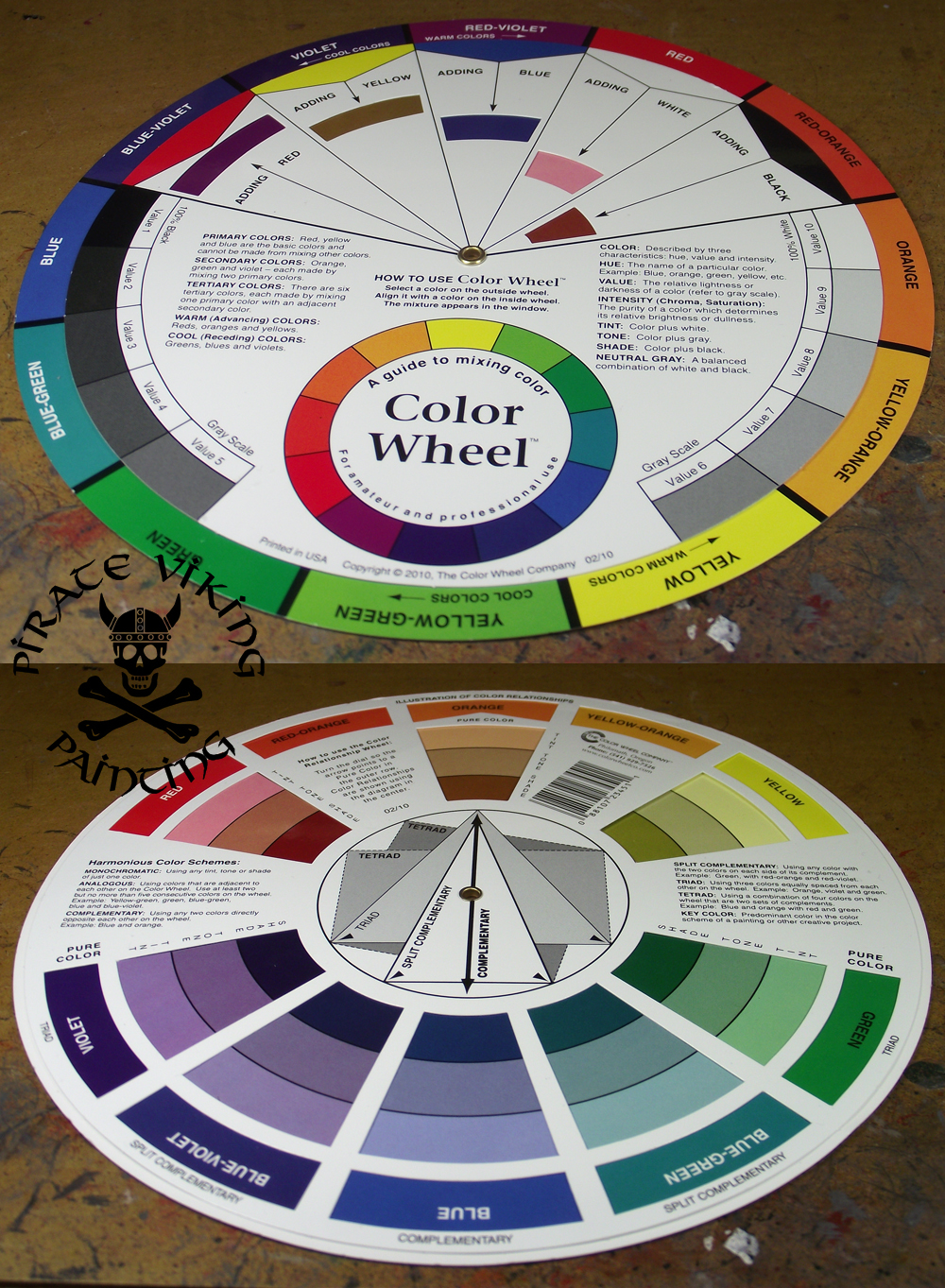
The last tool I want to talk about is my colour wheel. Artists tend to have this information plugged into their heads as naturally as breathing. Scientist types like me need to look it up! A colour wheel is the first stage of mastering colour theory (a massive subject for another time). This one rotates, shows complimentary, contrasting and discordant shades, effects of adding one colour to another and the different hues and shades that work together. I got from Jackson Arts but they are everywhere. They really, really help with the designing of colour schemes.
And so we come to the end of part 2! Part 3 will be on finishing, weathering and basing. Until then:
TTFN
Welcome to the second in our three part series on the tools that the Pirate Viking Painting Studio (I.E. me!) comes equipped with, today... Painting:
When painting there is one obvious tool you cannot do without (unless you are five and using your fingers) and that is good brushes:
I certainly haven't shown all of the brushes that I own. I have old brushes relegated to glueing and weathering duties, brushes designed for drybrushing, brushes that I don't mind getting enamel paints and turpentine on. But these are my workhorses. They are Raphael brand brushes available from Jackson Arts in the UK and Secret Weapon Miniatures if you are in the States. These really, really are not cheap brushes. Each will set you back at least £5. This is one case where I cannot recommend being thrifty. There are some things that you have to buy the very best that you can afford. These aren't the only premier brushes out there. A lot of people swear by Winsor and Newton Series 7. Experiment and find your niche. The key elements are:
- Kolinsky Sable: Sable is the sort of Russian weasel that the best brush hair comes from. The Kolinsky Sable is only taken from the tip of the tail where it naturally tapers.
- A decent reservoir: The biggest error I hear novices make is saying "wow that is detailed, you use a brush with like one hair?". No, I don't, most of my painting is done with a size 0 brush. Highlights are with a 3/0. Eyeballs with a 5/0. You need the hair in the brush to hold paint in the belly of the brush ready to be fed to the tip of the brush like a fountain pen. A good brush will have a point so fine you struggle to measure the thickness of the line.
- The Test: Before you buy it (or before you use it if you buy online). Take the cover off, moisten the back of your hand and draw the brush along it. Does the hair split into a fishtail? Is there a rogue hair sticking out? Does it curl at the tip? If the answer to any of these is "yes" then reject the brush. You are paying £5 for a stick with some hair at the end. Make sure that you are getting the craftsmanship you deserve for the price.
| Left to right: Master's Brush Cleaner; Turpenoid; W&N Brush Cleaner |
So, once you have bought your elite, designer brushes you want to care for them right? Brushes are made of hair, your hair needs washing and conditioning to get the best results right? The first and most obvious form of brush washing is water:
Two pots of water in fact. One for metallic paints, one for normal paints. The reason for this is that the metallic paints are made with flecks of aluminium to make them shine. This turns into a suspension in the washing water. Looks beautiful but leaves tiny flecks of metal on random bits of your model from then on. Incidently the next time Vistaprint offer me a free mug I am getting this one:
Heh, heh! After each project though I give the brushes a bit of tlc. I use the Masters Brush Soap to clean out all the little clinging particles of paint from the brush. Then roughly once a month or so they go for bath in Winsor and Newton Brush Cleaner and Restorer. Note the dark colouration. This shouldn't happen! I foolishly let the handles sit in it and it stripped the paint from them too! Trouble with this product is it is really very harsh on the bristles. Strips all the natural oils from them. As a result they need conditioning. You can use regular hair conditioner for this but something in my mind rebelled against this so I bought some Turpenoid brush conditioner. If you do this regimen then your brushes should be in tip-top condition for years. Put it this way. I use my brushes roughly 2-300% more than the casual hobbyist and they lasted a year and a half before I felt I needed to replace them.
So now we have a good brush we need a good surface to paint upon. Just as an artist prefers a prepared canvas we need to use primed figures. A mistake that novices - and mums of novices - always make is assuming that the spray paint is just a price fiddle. When you prime a model you are not just painting it black or white (or grey, some hobyists swear by grey). You are putting a tough layer of primer that has a bit of "bite" to the surface. Just as you sand a wall before painting it to allow the paint to grip so you also need to prime a model. The Testors paint at the front is actually a Matt varnish and the best one on the market in my opinion. Use this when you have finished a model to protect the paint. Only really necessary on metal models. The paint is tougher than the plastic or resin and so will not chip or scratch.
Finally! Some paint! My choice of paint for 22 years has been Citadel Acrylics. They are wonderful paints and are only getting better with the Foundation and Wash ranges. Forget the internets snootyness. These are brilliant paints.
They are not though the be all and end all. Citadel Acrylics are brilliant at highly saturated, bright colours with a strong tone. They don't do so well with the desaturated military look. Now given that I paint dark and grungey for the most part it shouldn't surprise anyone that I wanted this desaturated military effect! I found it in Vallejo's model colour range. Loads of shades, lots of them keyed to specific uniforms and camo schemes (English Uniform, German Camo Black Brown etc). I now use them a lot. They have their weaknesses. Their metallics aren't quite as good as the Citadel and it is advisable to use Vallejo Thinner medium with the water when thinning them down as they don't react as well to just the water. In consistancy they are quite tarry until thinned but the dropper bottles mean you don't have to gum up your brushes transferring it to the pallette. Oh yeah, Palletes!
A pallette is any suface that you can mix and thin paint upon. I use cheapo small white plates, but I have used tiles, tin foil all sorts. The key thing is that it must not be porous. Ceramic is easy to clean, tin foil can be tossed away at the end of the session. Don't waste money on expensive dimpled palletes. Those are for watercolours. Just buy a 10p plate.
Another Vallejo product that I have been using a lot is Inks. Now this may surprise the people who know me but hear me out. When washes came out they were so wonderful that I turned my back squarely upon the inks and swore never to use them again. Much, much later I discovered that they were the best tool for adding intensity to bright colours and for shading polished metalwork as they didn't dull the finish like a wash does. The key thing is to add Glaze Medium. Also available from Vallejo. This kills the high gloss finish, breaks the surface tension and stops the formation of tide marks. Essentially it turns an ink into a bright toned wash. Very useful but ONLY for the jobs that I have mentioned! Washes still win everywhere else.
The last tool I want to talk about is my colour wheel. Artists tend to have this information plugged into their heads as naturally as breathing. Scientist types like me need to look it up! A colour wheel is the first stage of mastering colour theory (a massive subject for another time). This one rotates, shows complimentary, contrasting and discordant shades, effects of adding one colour to another and the different hues and shades that work together. I got from Jackson Arts but they are everywhere. They really, really help with the designing of colour schemes.
And so we come to the end of part 2! Part 3 will be on finishing, weathering and basing. Until then:
TTFN
Subscribe to:
Posts (Atom)