Showing posts with label Cathode Ray Conquerors. Show all posts

Sunday, 11 September 2016

Alright, but dogs CAN look up!

There I was, looking through some really cases that I hadn't opened in quite some while (you know how it is) and found a model languishing in there that I had all but forgotten about.


Yep, it's Ed! Waaay back in - oh dear god, 2013 - I painted Hasslefree mini's "totally not Shaun of Shaun of the Dead" and I started his "totally not Ed" friend too. Then one thing or another happened and he got put in a case for transport/storage/some reason. The other day I found I found him and discovered that the mighty quantity of work required to finish him was... a spade, a hat and his shoes... WHY DID I NOT JUST FINISH IT AT THE TIME? Sheesh. So I took a half hour and finished him off.


I've finally realised what the pleasure I get at doing these Cathode Ray Conquerer type miniatures is. It's not an expectation of ever really using them, it's a kind of cosplay. I like trying to match the scheme from the movie (which is why the shape of the spade caused me pain ;) ). With Ed, he's mostly the beige T-shirt with "I've Got Wood" on it - expand the image, it's there - and some jean shorts. Quickest way to get sculpted trousers to look like blue jeans not just blue trousers? Add the orange stitching and raised seam. It's barely visible in photos but it gives the correct impression. You'll notice I'm not giving too many colour details on this... it was three years ago, gimme a break...


Details help with this sort of project. This Ed is less a single moment from the film but a bit of a montage of his character, the "bench" cap from the electro sequence (yeah, I tried the 90's Bench logo and then just left a suggestion of red), the mobile phone (added a suggestion of buttons and screen) and the spade. I used weathering pigments damped down with odourless turps to give bulk to the dirt. It's little things like all of that and the tiny red swooshes on his trainers that help finish a miniature cosplay project like this. Lots of fun, and now I have the dynamic duo for both Shaun of the Dead and Hot Fuzz. Cornetto?

So what's the oldest model you haven't finished hanging around? I don't mean abandoned projects, I mean something you actually want finished but for some reason is hanging around unloved. As you might have guessed from this post I am working on a slow assembly/conversion project at the moment (which is so shiny and indeed so chrome) so little breaks to finish old stuff is a nice treat. More shinies soon.

TTFN

Saturday, 14 June 2014

The Star Spangled Man With A Plan

It's Superhero Saturday once again here at Casa PVP, today's offering is the First Avenger, the Star Spangled Man, it's Knight Model's Captain America:


Before we go any further, a minor grr, none of the photos I took of dear Ol' Cap. were terribly sharp, the focus just seemed to wander off of the details. Mentally sharpen them up would you folks? For those not terribly familiar with the character you may dismiss this chap - as I did until I got to know the character - as a jingoistic propaganda tool, a (literally) wrapped in the flag stereotype. For the longest time I did too, but that was because I had only seen the rubbish story-lines. At his worst handled Captain America is essentially Team America World Police: The Super Hero Years. With clumsy authoring he is almost unbearably "America! F*** Yeah!". But get him in the hands of someone who knows what they are doing and he becomes something very interesting indeed. He's a tragic character, trapped out of time without the cushion of years to soften the transition between the 1940's and today. He is, also, genuinely a hero, he embodies most of the Ideal of the classic hero which America like to freight those they consider heroes and then are furious when they don't live up to them. The Cap is the other way around, he genuinely is all those things and it is the world around him that constantly lets him down.

Even his powers are just juiced up regular human, peak of physical ability with just a slight push into the super-human. He regularly is a leader, not the lone gun so many super heroes are. Heck in the war years he had a whole commando unit he led plucked from the various allied nations. He also has a very rare thing within superheroes, he's fine with killing. He is a soldier, was made as such. Where Batman will go to sometimes ridiculous lengths to save the lives of those he hunts, Captain America will pick up a gun and shoot if the person he is firing at presents a danger or is a threat too dangerous to live. With all this he occupies an interesting place in the super hero canon. Humble, self-sacrificing, disciplined, a leader and a soldier first, he is the soul of Shield and keeps them on the straight and narrow as much as he can. He's a genuine hero.

And I really, really didn't get him until recently.


Enough of that though, painting! That's why we're here! Knight's first Captain America model (I'm not-so-secretly hoping for a war years one with the Howling Commandos and - please, pretty, please Knight - a Red Skull and Hydra lackeys) is modelled on the original comic book version rather than the movies. This means the Puerto Rico flag outfit (seriously, check it out, it's not the American flag at all). I knew I wanted the colours to be a little muted and naturalistic rather than the rather strident scheme you normally see (except the shield, more later). So starting with the blue I went with a grey blue worked up from The Fang, through Russ and Fenrisian Grey. This was then glazed in two layers of thinned blue ink with the usual Lahmian Medium thrown in. This made for a denim blue that pleased me so on with the show. The red I handled in two different ways, the cloth was just painted straight red with the usual highlighting, the gloves and boots I wanted as red leather so they got Rhinox Hide added at each stage of the highlighting process. The white was just the usual half dozen tedious thin layers of ever lighter grey. Yawn.


The Shield though, that needed to be all kinds of bright and shiny. Again, it hasn't photographed terribly well but I hope you can get the idea. I used the same trick as I did with Iron Man. Just buffed the white metal part up with finer and finer sanding sticks until it was a mirror, used inks to colour the bits that needed colouring, scratched a few dings and nicks into the paintwork and then glossed the whole thing to prevent the metal oxidising back to a matt grey finish. Easy, but effective, the shield really stands out from the whole.


Fun thought, the pose of the Cap works really, really well paired off against the Hulk. I can see my Avengers being deployed in the cabinet in one of their all-too-regular missions: Stop the rampaging Hulk.

yes those are three of The Watchmen behind the paints
And finally, something that made me smile. A model with a colour scheme that simple, needed that many paints... So any new painters out there, when your folks ask you "Do you really need all those paints?" the answer is... "yup!"

Happy painting.

TTFN

Tuesday, 13 May 2014

It's what I do that defines me...

Music maestro! Yep, it's the cowled crusader, the dark knight, the world's greatest detective (never been too sure of that one), he is, in fact:


The God-damned Batman
Greetings folks. It's been a while hasn't it? A combination of an injury from a long LRP-ing weekend (sword hit on the very point of the radius where it joins the wrist. Caused a massive egg that turned near enough my forearm into one giant bruise) that slowed me down and some unexpectedly fiddly models meant that nothing had been finished in almost ten days. Frustrated at the slow progress I cast my eyes across the waiting-for-paint shelf of assembled models for something quick and easy, what can be quicker than batman thought I?


I was right. Iron Man is no longer my fastest character model. Batman is. This was, wait for it, 90 minutes of painting. Because there really is nothing to paint! Once the cloak is German Grey and highlighted a couple of times and the bodysuit is the (brilliant new paint for PVP) Ammo's "Rubber and Tires" and that's highlighted then there is only a couple of washes and 95% of the model is done! The belt is an odd colour in the film (I'm using The Dark Knight model so used the film as reference) so a 1:1:1 mix of Runelord Brass, Sycorax Bronze and AP Shining Silver was shaded/glazed with Seraphim Sepia. Paint the face and you are done!


I've mentioned before that Knight Models are scaled a smidge larger than 28mm (they say 30-odd) and here is Batman with a protest goblin to prove it. Knight now have a generous five Batmen to choose from, but for my money the Dark Knight variant wins on both sculpting and overall badassness (totally a word). The only thing I didn't like was the random floating corner of building they had Bats standing on. If it had covered the whole base that would have been fine, but it doesn't, so you've either got to sculpt some more or be left with random masonry. I ditched the included scenic part and replaced it with a pile of Secret Weapon bricks and rubble. Much better.

Batman is one of those heroes for me. Not a real super-powered chap like the Hulk or Superman but instead just a man whose implacable will, resources and training make him a super-hero. Much in the same mould as Iron Man. I much prefer these heroes and I think it is why they resonate so strongly (just think how many screen adaptations of Batman there have been). Everyone can imagine being strong and trained and having that drive not to quit. Harder to imagine being granted magic powers by a yellow sun...

That's all for me for today. Unexpectedly fiddly figures finished soon! Pics to come.

TTFN (I'm Batman)

Wednesday, 9 April 2014

Son, You've Got A Condition...

The drying time model (something I paint while batches of wash are drying and so on) over the last week or so has been a big 'un.


Yep! It's the Incredible Hulk! Knight Models have been absolutely knocking them out of the park with the Marvel Universe sculpts and Hulk is no exception. At first I was baulking a little at the cost of him (he ain't cheap). However, a combination of knowing that licensed models like this are a bit "smoke 'em if you got 'em" - i.e. they can up and vanish like Knight Models excellent Star Wars line - combined with seeing the sheer size of the model convinced me. Oh, the size you say? Surely that's a normal sized base right?

you can see more of Iron Man here
Nope. Hulk is HUGE. The biggest solid metal model I've worked with in years. I had to remember a bunch of tricks from back in the day to get him together. Most companies with models this big use resin. Not Knight Models, oh no, this bad boy is solid white metal and heavy with it. I needed to put him down for a rest several times during painting. Something remarkable though is the balance. Hulk's centre of mass is absolutely slap bang on that base. He doesn't even wobble. Really, really nice work Knight.

best photo of skin tone, convenient no? He really does have eyes btw...

So, to business! Painting wise, there is an obvious place to start, the skin. Because lets face it, it's The Hulk. You're gonna be painting green. But which green? Stick Hulk into google and scroll through some images. You are going to see every shade of green going. Most of them kinda highly saturated and very yellow. I wanted a bit more of an "Avenger's Movie Hulk Green" to give it it's car showroom name. This was a fairly easy fix. The Avenger's Hulk works because he is quite a fleshy green. So I started with Castellan Green for the khaki green base. I shaded it down with Athonian Camoshade to deepen the shadows. It was at this point that I knew that delicately blending every highlight on a model this size would send me insane. Just insane. Instead, given the texture of the model I decided to tap a little used technique for this kind of thing, drybrushing. Drybrushing takes a bit of flack in our hobby. It's seen as a newbie technique and that's largely because people don't do it right. You use as many carefully gradiated layers of colour as you would for blending. But instead you apply it with a very, very dry brush. If there is any moisture at all it will streak. Use a lighter and lighter touch with each successive layer, each layer was essentially just Castellan Green with increasing amounts of Kislev Flesh. Finally I glazed it with Val Black-Green Ink to intensify the green tone and deepen the shadows.


The whacking great lump of masonry in his hand presented an opportunity for a contrast colour so red brick was going to be the win. I've got a fairly reliable method these days. Val Saddle Brown is the base coat, add various brown and bone tones to the Saddle Brown and pick out a couple of bricks in each. It creates natural variation and makes a more believable effect. Lastly, I wash the whole thing in very thinned Val Stone Grey which is a decent analogue for old school mortar. I dabbed off the excess with some tissue leaving mortar in the cracks and some mortar dust on the bricks.


Mercifully, Knight sculpted the traditional torn and strained clothes onto El Hulko otherwise he would just be green and a bit more boring. The clothes break up the large areas of colour and maintain visual interest. It is, by the way, the reason for super heroes wearing trunks on the outside of costumes. It breaks up the colour. There were options for the trousers, they're sculpted as denim jeans. But a traditionalist spark in me made me reach for the colour that the Hulk's trousers have always been. Purple. Makes no sense, colour theory wise (had something to do with 3 colour printing from the silver age of comics) but looks right because, well, the Hulk's trousers are purple.

And that's all folks! I have Captain America on the drying time workbench but he'll have to wait. There'll be more Inq28 stuff by the end of the week. If that isn't enough for you though, the Goblin's Popular Front await on the Beard Bunker. Until then

TTFN

Thursday, 6 March 2014

I Am Iron Man

Hi folks, bit of a departure from the norm today. I recommend opening this up at the same time because:

"the truth is... I AM Iron Man"
This is the new Knight Models sculpt of one of my favourite superheroes, especially now he has a movie incarnation played by a man who frankly is Tony Stark. I've always had a soft spot for the heroes who are not super powered. I love the ones who use tech, grit and cleverness (the Iron Man's; Batman's; Judge Dredd's and Hawkeyes of the world) to win out against the super-powered types. I nearly called this post "The Easiest Model You Have Painted This Year" because as you'll see below, it was staggeringly easy to complete. First though, a word on the sculpt as it is one of the first Knight Models figures I've painted. Scale wise, the Knight Models are a little bigger than GW. They are 32mm rather than 28mm so they're about a head taller. Frankly though with the kind of games you'd use a model like this for (ultra small skirmish) it is not really a problem. The quality of the sculpt and pose is excellent. A little thin laterally but not so bad that it is an issue. But lets get to the really fun bit, painting!

this is the best shot for the accurate colours

I'd had a bit of a brainwave when I was on-line window shopping for this bad boy. The red needs to be metallic to be "right" for the modern look Iron Man. But as I have found with the Corsairs, metallic red is a bit of a bear. But then the penny dropped, transparent layers, inks! So the incredibly complex paint scheme goes like this:

  1. Paint primed model gold - I used Vallejo Liquid Metal Gold and burnished it with a cotton bud (Q-tip) to make it really shiny.
  2. Wash with thinned brown ink. I add a bit of Lahmian medium to all the inks to kill off the shine and help them flow.
  3. Once dry apply two smooth layers of red ink (I added a tiny dot of brown ink to this) mixed with Lahmian Medium. Leave to dry.
  4. Shade the key edges with a 5:1 mix of brown:red ink.
  5. Paint some glowy blue bits.
  6. Gloss varnish the red
  7. Done.
Well, not quite done, I did edge highlight some of the gold with a silvery-gold mix to define them better but otherwise, yep, done.


I'm delighted with how he came out. Has just the same effect as the movie armour. Now, I am really, really hoping that they are planning the rest of the Avengers. Would be awesome. Until next time folks.

TTFN

Friday, 3 May 2013

You've got red on you...

Arr me hearties, happy Friday to one and all. Well, as usual with the start of a new project the first few days consisit of assembly, fixing problems, removing mold lines and the like before mass base coating. Given that this would be far, far more boring to read about than to do I haven't shared any pictures of it! Instead, I'm going to show you all a model I've been itching to share but haven't been able to until now! (Because it is being entered in a WAMP contest and you have to post it in the competition gallery before it is shown anywhere else).


For those who aren't immediately familiar with this chap, this is Simon Pegg as Shaun from Shaun of the Dead. Again, this is a model with no real purpose in gaming (though I'm sure I'll find one eventually!) that I'm drawn to painting. I'm calling the series Cathode Ray Conquerers and you'll find more TV and movie-land characters under that tag. He is a Hasslefree miniatures sculpt and another corker: HFA052 Dynamic Ray. I've also got an "Ed" model converted to have a spade ready for some paint to join him. Oddly enough, this is the second time I've painted one of Hasslefree's Simon Pegg look-alikes (PC Nick Angel being the last one) that I've painted. Kinda hoping that there will be a third model in the Cornetto Trilogy...


First, I've got to say, this sculpt is brilliant, the pose; the weight distribution; the likeness; all are fantastic. But now to painting! Unusually for me I started from a white undercoat - as I knew the cricket bat, the flesh and the white shirt would all be happier for it! When you are trying to replicate a specific colour scheme for a project like this, reference material is all important. For things like face and hair colouring almost any still from the films will do, but it is often trickier to get a full length shot. So here is my top tip: action figures. These days almost every film (that would merit induction into the Cathode Ray Conquerers) gets collectable action figures, meticulously researched and nicely photographed. Like this one!


They really are a godsend for reference material. I toyed with painting him covered with blood but decided in the end (largely due to the pose of the Ed model) to set him in the garden right before the first zombie kill. If anyone knows of a "Mary" zombie let me know and I'll totally diorama this up!


Painting started with everything that wasn't white getting basecoated and shaded! Sadly, I didn't make notes on the paint colours used for everything and I painted him a few weeks ago so I can't really give full details. I can say that the shirt was painted with my new favourite white technique. A solid basecoat of Ceramite White is shaded with Val Pale Wash which is a very thin, sort of Fortress Grey colour. You can then very easily rehighlight and be left with a very clean, very straightforward white. Now to try doing those pesky Napoleonic British webbing straps again...


Little details like bothering to paint a watch face make a big difference in this sort of work. He's so simple a colour scheme that all you can really do is get the shades right and pick out small details to make him stand out. So, there y'go, one Shaun, very much not of the Dead. I'll stick Ed up when I get him finished. If you happen to be a WAMP member come on down and rate him would you? I'd quite like to win this one! There'll be Flecktarn Guard up soon so until then

TTFN

Thursday, 7 February 2013

So Say We All

A fond hello to all shipmates, today though we go to a rather different vessel. Into the depths of space and a ship that is heading right for us...


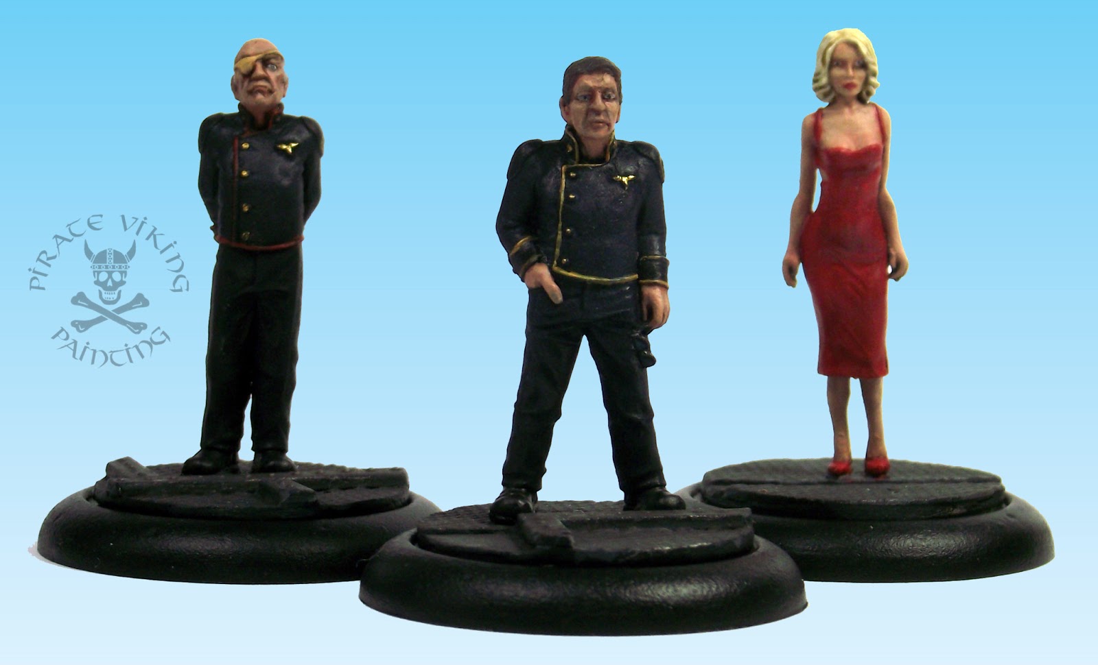
Yup, I recently picked up a few Hasslefree Sci-fi Adventurers bearing astonishing resemblences to three characters from one of my favourite shows: Battlestar Galactica [spoiler warning, if you still haven't seen the series then get on with it! Just look at the pretty pictures in this article]. As usual these are absolutely not Admiral Adama, Colonel Tigh and Caprica Six. I just painted them this way as part of the eclectic display I call Cathode Ray Conquerers.


The Cathode Ray Conquerers have no real place in any of my armies and are just display pieces painted for the sheer hell of it. So far I've done characters from Doctor Who, Hellboy and Hot Fuzz and I'm fairly certain there'll be more! Anyhow, on to the painting, lets start with the good Admiral:


Now to prove what a geek I am, the uniform as sculpted somewhere between the everyday blue uniform (which should really be belted) and dress greys (which ought to have a sash). I decided to err on the side of the everyday and paint the uniform as blue as the belt was a lot easier to ignore than a girt great sash. Getting the blue right was simple, Kantor blue mixed with Vallejo black (which I've shifted over to having become frustrated with the coverage and depth of colour of Abaddon Black), highlighted with pure Kantor Blue and then glazed back down with Drakenhof Nightshade (seriously, "blue wash" has eight letters and a space, sheesh) . I then washed the shoulder and cuff sections with Nuln Oil because they are a darker blue. Given that the Colonel Tigh model has just the one eye it places the models at a particular point in the continuity, thus, Bill Adama is an admiral and has the gold piping on the uniform. It does make me laugh, the continued adhereance to military code of dress. The president has to get a jeweller to make the admirals pips, they've got shortages of everything but plenty of uniform piping... Along those lines I also made an attempt at the colonial fleet insignia on his left arm, given that it is 3mm across it is tough to do anything but suggest its presence.


Saul Tigh is one of "those" characters. You like them when they are doing the job right and despise them when they are screwing up. Or being screwed up by the wife, yeesh. Anyway, Saul was painted the same way as Bill except that I added more grey to the skin tone and obviously needed to pick out the eyepatch. This is that classic "nobodies skin tone" colour that medical supplies tend to come in. Ungor Flesh made a nice analogue. Its worth mentioning the bases. These are Black Cat base inserts. For display models base inserts are great. Cheaper than buying the metal/resin for a full base and all of the character. Yes, I could probably have fabricated these out of plasticard but it would have taken as long as painting the models. And speaking of models in every sense of the word:


The "Gina" model (named for one of Six's many clones) by Hasslefree is a stunning piece of work. Anyone who knows the series knows that Kev White has captured perfectly Tricia Helfer's figure and stance, oh and "that" dress. Getting her skin tone and hair right needed a lot of fiddling around with very subtle differences in shade. Guy skin you can go for high contrasts (especially Edward James Olmos (Bill Adama) who has the craggiest face on any living human) but girl skin needs softer contrasts. As a result, the difference in shade between the highest highlights and the lowest shades on Six are very very slight compared to normal. The hair (which could have been even lighter and still been the right colour) started as a shade of bone so light it was almost white and than shaded down with seraphim sepia before being rehighlighted with the original mix. Annoyingly, I've just noticed the left eye (right from our perspective) which while looking fine in real life looks gods aweful in the photo. Grr. Something to fix.

All in all a very pleasant day and a bit of painting and something I can recommend to anyone. Its all very well doing my usual thing of keeping tightly focussed to army projects and "useful" painting but it can be a bit wearing. Doing occasional "pointless" painting like the Cathode Ray Conquerers is like a drink of water in a wine tasting, cleanses the pallete and leaves you fresh for more of the same. Plus, you run into unusual problems to solve which improves your painting. Using popular TV shows and comics and the like just give me another bridge to the "normals" in my friends and family who don't wargame in order to interest them in my output and hobby. Give it a go, have some fun and cleanse your hobby pallete.

Thats all for today, Purple marines on my workbench again before work starts on Pyladii Alpha. Work in progress as always on Today I've Mostly Been... which you can also follow on Facebook or Twitter, whatever takes your fancy really. Until next time

TTFN

Tuesday, 14 February 2012

Victory of the Daleks!

Greetings all, remember these guys?


Well, at the same time I acquired three more to represent the three daleks featured in the ace episode "Victory of the Daleks", really, spitfires in space? How can you beat that? I did a lot of work on them at the time and then forgot about them for ages. Tonight I finished them and can share with the world!


The three daleks are composed of one of the bronze/brass Daleks up in orbit and two Daleks pretending to be "Bracewell's Ironsides". We'll look at those first:


Obviously, Black Tree's Daleks don't come with the webbing that the Ironsides have. This was added by first skimming the "striped" middle area with ProCreate to cover that up. Into the soft putty was pressed two of the triple pouches from the Space Marine Assault Squad sprue. I then added the belts by rolling thin sausages of ProCreate and then pressing them flat. I cut the buckles into the strap and then left to harden. Colours needed to be the classic British WWII vehicle green (best match is Vallejo Russian Uniform) which was then toned with a glaze of Black-green ink and a thin wash of Badab Black. The webbing was painted in English Uniform and a mix of English Uniform and Khaki.


I deliberately chose the most warped and distorted casting (gods I wish Black Tree would commission some new masters as they are the ONLY place you can get these) to be the orbital Dalek. The Doctor mentions that they are old, damaged and at the end of their rope. Thus a slightly mangled casting worked well. The colours started with a very heavy drybrush of Tin Bitz. A 50:50 mix of Tin Bitz and Dwarf Bronze followed by pure Dwarf Bronze was then drybrushed over to build up the texture and the colour. Finally a mix of Dwarf Bronze and Mithril Silver provided the high point highlighting before a glaze of Brown and Yellow ink mixed in roughly a 1:2 ratio was applied to warm and deepen the shade. Finally the "Dalek Bumps" were painted in with Vallejo Brass. Finishing touches were picking out the silver elements with chainmail and the rubber elements with Charadon Granite and washed with Badab Black.

I'm still looking for a name to call all of these film and TV models I keep painting. Small Screen Soldiers didn't work for me nor did Celluloid Champions (although that one is better). Any bright ideas?

EDIT:

Thanks to Pete we now have a name for the range of TV and Film inspired miniatures that I've been painting, they will now be Cathode Ray Conquerors!


For those born more recently than I you can find out what the hell a Cathode Ray is by clicking here. Thanks Pete!

Thats all for now, more harlequins before the end of the week, until then...

TTFN

Wednesday, 8 February 2012

Hellboy

Greetings all! In a burst of productivity last night I added to my growing collection of movie and TV themed models with... Hellboy:


This model started out life as a Hasslefree miniatures "Harby" shown below:


I'm using the topknot alternative head and the "special" right arm. I added a couple of discs of plastic rod to the forehead to be Hellboy's ground-down horns. A sculpted mantle to his duster and the obligatory tail was also sculpted on.


The colour scheme is based on the movie version rather than the comics as the model more closely resembles the movie look. I started with the coat, a couple of thin coats of Snakebite Leather make for a clean basecoat. I added increasing amount of Bleached Bone to the Snakebite Leather for the highlights, shading was then lined in with Devlan Mud.


The skin started from Red Gore. I don't often use Red Gore for painting anything as it is somewhat irksome to use. It is weak in coverage and a bit 'rubbery' in texture. It is, however, the closest match for Hellboy's skin tone so there I went. A shading wash of Devlan Mud improved definition and then adding Blood Red made the highlights. Finally, the eyes were painted in with Tausept Ochre and pupils dotted in.

Sorry for the focus, the camera would just not resolve the red!

The clothing was one of the usual exercises in adjacent black painting. Charadon Granite for the shirt, Codex Grey for the trousers. Vallejo Leather Brown and Black for the boots and belt. A couple of coats of Badab Black darkened everything down to shades of black.


The base was a 40mm Black Cat bases offering. The feet drilled and pinned to the metal of the base insert for strength. The Tarmac was basecoated in Charadon Granite, the manhole cover was basecoated in a mix of Tin Bitz and Boltgun Metal. Once everything was dry I washed it with Badab Black and waited for that to dry too. Finally I dusted the whole thing in Forgeworld Weathering Powders (new toy! New toy!), a mix of Grey Ash and Light Earth for the tarmac and Aged Rust for the manhole cover.

That's it, nothing much, just a bit of fun. I really need to come up with a snappy name for the collection of movie and tv stuff. Any ideas?

TTFN

Thursday, 26 May 2011

Exterminate! EXTERMINATE!

Here they are, the on-ly tru-ly su-per-i-or be-ings in the gal-ax-y! The Daleks:


I couldn't let my Doctor continue for long without his arch nemeses. The problem with Daleks though is they are very definately recognisable as Daleks, you can't make "Pepper Pot Space Robots" and expect to get away with it. As a result there is only one source for 28mm Daleks out there: Black Tree Designs (formally Harlequin) who have the license for the pre-Eccleston years. Now I was not expecting perfection from these figures. They are after all really quite old sculpts, I was however expecting little more than the results when they arrived.


This is the back of the figures. Now this is after I spent some considerable time cleaning them up. There is a huge mold line up the front and the back row of nobbles were fused into long ovals. I ground out the nobbles with my dremel but short of carving out and resculpting the back section there was nothing to be done. After a good bit of grumbling I decided that I would just give them a fairly simple paint job rather than trying to make a silk purse out of a sow's ear. I suspect that the problem is mold degredation. Normally you would cast a new mold from tins taken from the master mold but I have a nasty feeling that it is the master mold that may be on the way out for these fellas. Still, they are Dalek shaped and that is the main thing.


On the positive side the eyestalks are ace! The plungers needed to be dremelled out to give them more of a plunger "dip" in the middle (could have said concave I suppose!). As far as painting I was in a quandry. There are many different shades of Dalek schemes, While I like the Eccleston/Tennant era bronze I was always more fond of the old school grey/black. I do have another three of these which are getting converted (two into the WW2 Ironside Daleks and one Bronze/brass one to represent the participants in Victory of the Daleks) to allow me to field all sorts of different era Daleks (how? With what rules? Under what circumstances? Who cares?! I'm geekin' out here). The paint scheme was created with an Adeptus Battlegrey and Boltgun Metal mix to give a metallic grey. The nobbles were painted a dark grey and given a gloss vanish. Any glowing blue bits were simply painted flat white and then glazed in blue ink. Oh and while we mention the nobbles there are 52 on each Dalek. That is 204 for the four. This was not a quick job.


To give the Daleks someone to O-bey, I painted the fourth Dalek as a black Dalek Supreme (mostly for variety). Essentially he is just highlighted black with a gloss varnish and nobbles painted in the same mix as his more basic comrades.

Well, there we go, not the greatest models on Earth but they are Daleks and thus cool! They are the right scale to fit in with Heresy's Dr Hugh and from the front aren't bad looking at all. Now if only someone would sculpt some cybermen worthy of the name! As a final thought, while Black Tree own the classic Doctor licence I can't understand why anyone hasn't gone for the new era license. With all the various companies and sculptors making tribute figures would it not be better to be able to make the Ood? The Sontarans? The Judoon? Heck, if everyone making tribute now was up for it I would apply for the license and retroactively commission the real figures. We could make quite the co-operative venture. Anyone interested drop me a line ;)

Check back on Saturday for my review of the Finecast Dark Elf Bolt Thrower kindly reserved by my FLGS (thanks Firestorm Games). I'll give it a fair and open review and I've got samples of Forgeworld and Privateer resin to compare against. Till then

TTFN

Thursday, 24 February 2011

Hot Fuzz

Sergeant Butterman, the little hand says it's time to rock and roll! Today is the turn of another in my series of "fun stuff" projects: Hasslefree's Officer Nick and PC Sam Ford.


Given their obvious suitability, I took them as another chance to try out authentic schemes. Hence I chose to get them as close as possible to Simon Peg and Nick Frost's characters from one of my favourite films: Hot Fuzz.


Both of these models presented me with an opportunity to practice painting adjacent areas of black. This is tricky and something I'll natter about while we check out Sgt Nicholas Angel:


The trick to painting adjacent blacks is in the highlight colour. If you highlight all of the black on a model like this with the same colour you will have one solid area of black. Now take a look at the images above (expand them as the camera really struggles to capture subtle differences. In this model you can see areas highlighted with Codex Grey (clothing and ballistic vest); Charadon Granite (bandolier); Fenris/Space Wolves Grey (Pouches and holster webbing); Scorched Brown (shotgun and baton) and Snakebite Leather (shoes and belt). I also used gloss varnish to act as contrast as well, see the shoes, radio, radio cable and the hatband on Danny's helmet:


By using all these different contrasts you can see every individual area of the model clearly despite them all looking black. It is a very subtle effect and needs practice but by keeping this in mind you can paint models with very monochrome schemes (whether black and white, shades of green or whatever) and still identify all the individual elements. Aside from all the black, I was happy with the end result of the white, it was achieved by boring patient work building up many, many thin glazes of white over an Astronomicon Grey base. This prevents chalkiness. The only thing I haven't figured is how I want to do the bases, do I make them fit in with the Doctor "Hugh" figs I already have? Or do I do a more "Sandford" scheme. Any thoughts?

Nattering briefly about the models themselves: The poses on both are great and the likeness close enough for my purposes. If I had one minor niggle it was that I had to do an enormous amount of freehand work on the hands and arms to give definition to the anatomy. These are very small models so they are tough to sculpt, but be aware that in order to get best results you will have to draw in all the muscle tone and bone detail you see on the models above. Even the face detail is painted in. Other than that these are wonderful models with lots of authentic and nicely scaled details (I almost removed the radio cable as flash it is that fine!). Can't wait to get my teeth into the next lot of insanity I see from Hasslefree. Perhaps some of the martial artists. That kimono on Hanako looks great. Anyhow, that's enough from me, back to the Death Korps!

TTFN