Showing posts with label Leviathan. Show all posts

Friday, 4 July 2014

Last of Leviathan and General Sturm

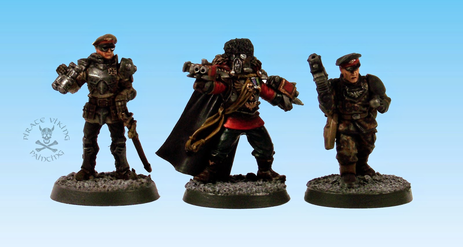
Hi folks, another quick update for you to round off the week, this time the very last of the Leviathan command staff project and one of them was rather a lot of work...


Lets go in order of difficulty, which means the first will be the Rommel X on the left there

Readers with good memories will remember this chap from this post. Well, while the head I'd used looked ok unpainted, once finished, neither the client or I were quite happy. So we agreed that I'd ditch the head we had for him and replace it with one of the eisenkern heads. It still isn't quite right, scale wise, but better than before. Happens sometimes.


Next up is one of the Lupus chaps from the Flecktarn Project. This fellow is their liason to the command staff and so has divested the normal gas mask that the Flecktarn suited sorts normally wear. I've talked about how to paint the camo in some detail before so I'll just leave that link there to explain. The head is again one of the Eisenkern accessory heads. I've mentioned in the post about them that Dreamforge are better at solid objects than organic ones. The faces on these are non-existent. All the features you see granting him any expression have been faked in there with paint. Without that you would just get nose and mouth. Not too much of a problem if you've been painting a while and have a grasp of facial structure but could be an irritation if new to the game.


Finally, we have the very last of the Leviathan command staff. This is a vostroyan looking-chap from the same regiment as the others. He's based off the lord commissar model but the brief was to make him both vostroyan-ish and to have the combined mini storm bolter/lightning claw weapons that General Sturm wears in the Dawn of War computer games. This turned out trickier than I first thought. I went ahead and sculpted my best interpretation of the classic vostroyan gas mask and furry hat combo. My sculpting still needs to come on a looong way but I can cover a lot of sins with paint. The weapons though were problematic. First, I thought that the grey knight storm bolters would be a starting point. Nope, those things are massive on an imperial guard arm. Ludicrous size. That's ok, thought I, I'll make 'em out of two bolt pistols, file them down on the inner surfaces, glue together. Nope. Still huge. So finally I realised that I would have to straight up fabricate them to scale.


They're made from stacked plasticard strip. The bottom strip was left about twice as long as the others and then the claws carved from that. Brand new blades for the knife the order of the day for this job. The stack is glued together and then sanded and scraped smooth. I rounded the corners a little in order to stop it looking like just a box. I cut the back end of a bolt pistol for the mechanisms at the back and used the magazine on the side. Finally a thin cut bit of plasticard strip carved to shape formed the familiar iron sight ridge along the top. Worked better than I'd imagined. Shoulda just jumped in to fabrication first rather than fiddling around with the first two options. Live and learn.

With that, the Leviathan project is finished! Just Inq28 and Corsair tanks to go.

TTFN

Wednesday, 25 June 2014

Steel Legion Officers (Rust proofing extra)

Hi folks, quickee for you. Just the two lads today:


They're from Project Leviathan and there's only two more to go on that project! Chap on the left is a normal plastic Cadian officer with a third-party metal replacement head, chap on the right is Rommel X from Kabuki models. Sadly his head was a tad on the small side for mixing well with the GW chaps and chapesses so the client asked me to replace it. A tank commander's head seemed to fit the bill nicely. They're both from the Steel Legion - an Armageddon based Imperial Guard army - so their colour scheme is identical. What is interesting is how different the models feel with the ratios of the colour scheme changed. They hang together well but are clearly different units.


Easy one first. To get that classic Steel Legion khaki, first basecoat in Steel Legion Drab (shocker right?) and shade with Agrax Earthshade. Highlight first by adding Baneblade Brown in ever increasing amounts then by adding a tiny bit of Karak Stone to the pure Baneblade Brown. Their leather is covered by Val Leather Brown again shaded by Agrax Earthshade and the dark trousers are Val German Camo Black-Brown shaded with two careful layers of Nuln Oil. There was only one armour colour for "Steel Legion" in my opinion... Steel. Dark metal would appear more soldierly than bright so I started from AP Gunmetal with a bit of black thrown in. AP Plate Mail Metal is the highest the highlighting goes on the armour. His bionic arm got some AK Interactive Engine Oil in the moving parts (that stuff is fast becoming an automatic addition to 40k models, anything with an engine or moving parts is finding itself lubed up these days).


Not-Rommel-X-No-More got treated in exactly the same way, but because he is mostly armour the character of the model is vastly different. I see him as a stormtrooper commander of the Steel Legion, fully armoured, straight backed and arrogant. A nice model to work on.

That's all folks, still ploughing through the last bits (wrist pain and job-hunting slowing me down a little) but we will get there! Until next time

TTFN.

Thursday, 27 February 2014

Officers and Gentlemen

Hi folks, this is - I think - the penultimate Leviathan project post. This time, there are quite a lot of other people's officers in the post...


You see, aside from the two on the left in the photo above, all the officers in this post come from armies of other bloggers - friends of my client - who are having liason officers represented as part of the command staff. I think this is a cracking idea. Gaming groups are great ways to have cross-pollination of armies. The Beard Bunker has things like zombies in the colour of Charlie's Empire, giants wearing trousers made of each other's banners. All sorts. It creates lovely instant visual stories. But first, lets take a look at the ones that don't "belong" to other people.


The first two had fairly straightforward briefs, one was to be a modern British Guards redcoat and the other was simply black uniform with green accents - he has a painted on armband that is almost invisible in the shots. Both got my usual trick of seperating areas of black by changing the highlight colour (Val German Camo Black-Brown for leather and Val German Grey for cloth), as always, much more apparent in real life than through the lens. With the black uniformed chap I decided that the faux-gold epaulettes that I had been painting for the others wouldn't work. He needed silver. That meant experimenting with not-really-NMM silver. I can't I have it quite there yet, need to prat about a bit more before I am confident giving a method for cloth silver. Essentially it boils down to deep contrasts. I think I could have pulled up the highlights a bit more, especially for photography, but it looked right so I stopped. One of these days I'll have it figured.


The not-really-NMM gold that I am using for the other epaulettes has mutated into a comfortable routine of:

  1. Basecoat XV-88 (stupid bloody name, worse than the fang, it's a tan-ish yellow)
  2. Wash in Seraphim Sepia
  3. Highlight two or three time with increasing amounts of white mised in with the XV-88, at a rough guess I'd say I normally go (XV-88:White), 1:2, 1:1, 2:1
  4. Glaze with Casadora Yellow, using the wash rather than the glaze imparts a warmer tone.
  5. Rehighlight with the top mix of XV-88:White.
It most certainly isn't NMM, that requires huge effort and not a little raw talent. This is a decent analogue for making gold coloured cloth so it doesn't look like you have solid metal shoulder plates. Incidently, I was struck by how nifty the "redcoat guards" scheme looked. Goes to show, when designing colour schemes, look at real world options. Someone out there has gone to huge effort to make it look good already, steal their work!


Speaking of other people's work. These two are the first of the other bloggers army section. They are both from the Palladian Guard belonging to Colonel Scipio (really hoping I've captured the look of all these armies by the way). My client had rounded up the reference material from his mates and got them to give me a nod about what colours they had used. Often, with the change in colour palettes I had to do some colour conversion jiggery pokery but I think they've worked out. In this case the interesting thing for me was the white. Ask any painter, getting black and white to work are real bears of problems. Especially if you want it fast. Well, I might have done it. If you have a bunch of white to paint on a model like this, use the following method: Spray undercoat white; paint with a thinned coat of Celestra Grey (you want it a little thicker than a wash but not much), finish with two thinned higlights of Ceramite White. Thinning the white gives it a translucent quality that allows you to build up intensity without the dreaded chalkiness. Seemed to work. Now working over a white undercoat creates other problems. Basecoats for other colours - especially dark ones - need about three/four layers to be solid. After this experiance I recommend mixing 50:50 basecoat and black for the first basecoat. Cuts the repeats down to two, three at worst.


The next is from the Glorious Mordian 7th. I don't have a blog to link to for this one but I was sent reference material. Worth noting that the black in this one is actually much more blue than the camera detected. I used Kantor Blue to highlight the black and gave the whole thing a Gulliman Blue glaze to really "blue" the black. Of course, the first thing the lighting does is shear through those delicate glazes and goes "Here ya go buddy, black. Enjoy!"


Finally, we have two Cadians. The first is from the Cadian 127th  featuring an almost leather brown uniform (Mournfang brown, shaded with Agrax Earthshade and highlighted with the addition of Skrag Brown to the Mournfang) and a curious green made from Caliban Green highlighted with Loren Forest. I rather like it. Filed for the future. I'm fairly chuffed with how the medals came out on this chap. Might finally have cracked how to make them look like medal ribbons (mostly colour selections and only vertical stripes).


And finally one of Admiral Drax's Cadian 24th. The two greens (Castellan and Caliban) work nicely together and create a decent soldierly look (not that the others weren't). Worth noting is that the Cadian Gate and the numeral were freehanded on both. I figured it would be quicker and easier to do so than applying transfers to curved surfaces, seemed to be right. If people are curious - and are fed up of transfers - here's a slightly "how to suck eggs" guide on getting the Cadian Gate in the right place on the shoulder pad.


Slightly counter intuitively, do not start at the top and work down, just like with lettering where you want to start with the middle letter and work outward so that spacing is correct, for example "CADIA":

D
ADI
CADIA

Meaning that you know it will fit in the space. In this case it is the circle (I think it represents Cadia itself). Place it where it should go on the pad. Start small and add more paint until it is the right size. Taking back is harder than putting on. Next paint a straight line across the top of the dot, mark a point above the midline of the line you've drawn that is the height you want the triangle. Now, using that as a guide, draw lines from the two ends of that first line to join is up. You always want to pull away from the corners as that is where the sharpest mark will be made with the brush. Do the same at the apex of the triangle to sharpen that. Finally, fill in the white and add the supports for the "roof". You'll find that the proportions are always correct even if the size varies slightly from model to model.

And with that we are done! There's only 3 or 4 of the Leviathan command staff left to go so this project is almost over. Still some eldar tankage to paint but then we'll be moving into the very last PVP commission project. Its a doozy too, a whole pile of individual Inq28 warbands and some vehicles to go with them. Can't think of a better way to finish this little adventure. Until next time folks.

TTFN

Tuesday, 28 January 2014

Two Ruperts and a Kick-Ass Wheelchair

Hi folks, yet more from Project Leviathan today!


I'm really appreciating being able to switch from the eldar with the tight, precise lines - that hurt my wrist if I do it too long - to the more familiar Imperial painting with a variety of schemes to keep things fresh. Today's Ruperts (the generic name for all officers in elements of the British armed forces) are a Bromhead from Black Scorpion and the charmingly bonkers Colonel MacDonald from Spartan Games. We'll start with Mr Bromhead: First Rank Fiahhhh!


The brief for the Bromhead figure was to make him similar to Col Winterborne's Praetorians. I'm guessing he is representing them in the command staff! Most of him is Val Khaki shaded with Agrax Earthshade, rehighlighted with Khaki and then with Khaki and Bone mix. Creates a lovely colour. I can't recommend Vallejo's military range highly enough. Citadel just do not make these strong but desaturated shades. They make a lovely pairing in a painters arsenal, Citadel for the strong saturated tones, Vallejo for the muted militaries and sadly, now only Army Painter (small shudder, but their acrylics are not bad) for half decent metals. The grey/black cape was typical of the victorian look and giving it the pop of a red lining made him look wealthier.


The Spartan Games Colonel MacDonald is just lovely in it's insanity. A massive steam powered bath chair with an aging officer at it's centre. I made one modification, a new plasma gun rig replaces the very cartoony blunderbus of the original. I figured that utilitarian was the order of the day. As always, I thought about the narrative of the model as I painted so that I could inform colour choices. I figured that he had been grievously wounded in battle and his troops had jury rigged this thing out of an old grav accelleration couch and a solid wood burner along with some cylinders from his wrecked command salamander or something. This implied that the paint job should be heavy, industrial steel and old, cared for leather. As yet another example of previous painting facilitating future projects, the leather tone I figured out for Sister of Biggles got used again here. Really captures that armchair-from-a-gentleman's-club look I was going for.

The tartan blanket just felt right! The trick with tartan is half and half shades. Start with your base layer - in this case Karak Stone - then the "Big Grid" of a 50:50 mix of the base layer and the grid colour (Castellan Green). Then the intersecting squares get painted pure Castellan Green. The red gets treated the same way, will look pink and weird until you get the red intersections sorted. I added some Val German Cammo Black-Brown thin grids too and then washed the lot with Athonian Camoshade to provide some definition.


The business end of the bath chair needed more weathering and wear than the grav couch. Thin washes of black ink mixed with Lahmian Medium and then AK-Interactive Rust Streaks gave a nice, dark, heavy, untreated iron look. The cogs and axles all got coated with AK-Interactive Fresh Engine Oil. Makes a lovely greasy look.

There you have it folks: Two Ruperts and a Kick-Ass Wheelchair! The next bit of Corsair lovliness is almost finished and will likely be the next thing on the blog. Until then,

TTFN

Wednesday, 22 January 2014

Sister of Biggles

Eyup folks! A quickee update today showing off a rather lovely miniature:


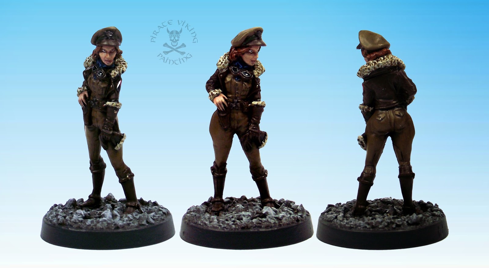
I'm pretty sure this is a Bombshell miniatures "Betty". She's part of the Leviathan command staff commission, I reckon she's either the naval officer's pilot or she's commander of the local air wing. "Betty" was one of those models that just loved to be painted! She looks tons better in the flesh than she does in the photos. I must find ways to improve my photography, constantly frustrated by the results!

Something to note on this model, I'm making much greater use of inks at the moment for toning and warmth. Mixed with a bit of Lamian Medium you get something that flows like a wash but keeps the really translucent quality of inks. The leather, for example, was painted Val Leather Brown, washed with Agrax Earthshade for the shadows, highlighted and then glazed with brown ink. The result? A delightful warm toned mid brown perfect for a sheepskin bomber jacket.

Likewise her hair, I went with red as brunette or blonde would be lost amidst the leather, khaki and fleece. Black somehow didn't fit. I keep playing with various red tones for hair and I think I've hit upon a good one here. A good clean coat of Deathclaw Brown is glazed with a heavy coat of chestnut ink (again mixed with Lamian Medium). This shades and tones the hair in one movement. Lovely.

Anyway, a quickee today. I only had a half day available so bashing out a 4-hour character seemed the best option! Until next time.

TTFN

Tuesday, 14 January 2014

In the Navy

Oh! I have slipped the surly bonds of earth...
...And, while with silent lifting mind I've trod
The high untrespassed sanctity of space,
Put out my hand, and touched the face of God.
Excerted from High Flight by Magee


There is something uniquely cool about the concepts of space travel. It evokes that romance of the age of sail with it's dangers, isolation and possibilities. Warhammer 40,000, of course, adds another few elements from the age of sail: brutality; press gangs and ruthless captains. These fine gentlemen are the focus of todays offerings! These are part of the leviathan command crew (I've now tagged all the Leviathan models as such) and represent the two fleet elements that have come together in the client's warzone. We decided that two would be in a classic British Napoleonic navy mode and the other two in an emerald green that we vaguely remembered being associated with the Segmentum Obscurus/Saturnine fleets. I'm afraid I do not know the manufacturers of these chaps so if anyone can illuminate me I'll re-edit to include the original manufacturers.


First up is the hawkish figure that I was referring to as The Admiral in my head while painting him. He's an older, gaunt, severe looking chap and well suited to the image of the senior officer. For the classic Napoleonic look I needed dark - almost black - blue dress uniform jacket and cream-white breeches. The blue-black really is practically black, I just mixed a drop of Val Prussian Blue into the black and then added The Fang for highlighting. The Fang a blue-grey for those unfamiliar with Citadel's current daft naming, honestly, The Fang, not The Fang Blue-Grey, just The Fang. Unless you are intimately familiar with the backstory of the Space Wolf chapter of Space Marines then this is meaningless. Sheesh!

The cream breeches are the same method of the wraithbone from the Corsairs, i.e. Zandri Dust mixed with white and highlighted with white. See? Solve one problem and open doors in the future. The trick is remembering all these mixes and tricks and the blog has been invaluable for that. One feature on this chap that I'm really happy with are the fairly naturalistic ostrich feathers. They're all over the place in empire armies and the like and I'm starting to warm to the idea of painting them undyed. This method uses Val Deck Tan and Val German Cammo Black-Brown (two really useful paints) shaded with Agrax Earthshade and rehighlighted with the original colours. Creates a lovely soft natural tone.


From the same fleet we have this chap, who I had in my head as a fairly recent promotion. He cuts a rakish, dashing figure and put me in mind of a hard charging ex-frigate captain recently elevated to the captaincy of a capital ship and thus a presence at this table. It has just occurred to me as I type this that were we to be doing this project for a diorama these fellas could have been painted glowing green to be hololithic projections around the command table while still being aboard their ships. Hmmm..... thinks.

Anyway! This paint scheme, focus Jeff! Something to mention about all of these models is that they have simultaneously incredibly dense AND incredibly fine detailing married to average castings. This is not a useful mix. The hair on this gentleman for instance is painted on despite having sculpted hair. It was so shallowly and finely sculpted that neither wash nor drybrushing could pick up the texture finely enough. Likewise, lots of the dense decorations and honours on the others might as well have been flat discs for all the help the sculpting gave to the painter. There is a reason that things tend to be a bit scale exaggerated at 28mm.

This photo just about manages to show the difference in tone between the blue-black uniform and the grey-black cloak (Val German Grey washed twice with Nuln Oil). Those highly complex areas of braiding at the corners of the uniform jacket were essentially painted as solid colour (my fake NMM) and then washed with very, very thin washes of the uniform colour in order to define the braid.


Speaking of braid, this chap is covered in it! Those tiny little tabs on the lapels - not, I have to report, brilliantly cast - were properly fiddly but very worth doing. We've moved into the Saturnine fleet colours, the green being bog standard Caliban Green highlighted with increasing amounts of Warpstone Glow. You'll notice on the other models that I've used the green as a spot colour and of course the red sashes. Here the dark blue-black is the spot colour. The upshot is that the four of them hang together quite nicely despite being very different principle colours. The other change is a reversal of the cream-white breeches and grey-white socks/gaiters. With the green I have used grey/white breeches as another change that nonetheless binds the models together.

I think this one is quite the vain individual. The coiffured hair and fine cravat speak to this but also, in 40k at least, the odd, flat face can be explained as repeated juvenat treatments. Quite the dandy I think.


Finally a blatent Nelson - although with a weirdly sculpted upper lip which became a mustache. When divvy-ing up the models I deliberately assigned him to the green pile to further diminish the Nelson look. The normally tricolour decorations on Nelson's uniform were retained but the traditional blue swopped out for imperial black. The black/white/red thing is very 40k Imperial and helps to make him more of a 41st century gent.

Hope you're all enjoying the Leviathan series, I certainly am as the variety is very much spicing my life. The Eldar are still rolling but these bright peacocks are really helping the corsair uniform scheme. More soon!

TTFN

Tuesday, 7 January 2014

Imperial Officer Corps

Here we are folks, first finished models of 2014.


These are from a whole bunch of Imperial-type chaps that are forming the command staff for an entire warzone. My client envisions them clustered around hololithic map tables on a Leviathan. Heck, he might even be making the leviathan!


First up, we'll check out the Vostroyans. I love these figures. If only, if only they'd been slightly affordable for the purposes of building an army. Metal figures and the massed infantry of the Imperial Guard don't make the happiest bedfellows. The briefs for all of these guys are fairly brief - love this, gives me huge artistic licence - and in this case was just red with green accents. The red is the normal Mephiston Red highlighted up through Evil Sunz Scarlet and Troll Slayer Orange. Greens are in short supply in the new range but Caliban Green mixed with Warpstone Glow doesn't make a bad shade. Armour was a point of musing, thought about painting it as, well, painted but the colours were giving me trouble. Adding more red to the model was a possibility but then red armour can look a bit naff and non-martial unless you do a lot of weathering or it is the dominant feature of the model. Green would work but would make it a dominant colour rather than an accent. In the end, bare steel seemed to be the win! These days I paint worn steel by first painting with Army Painter's chainmail substitute Plate Mail Metal then giving it a thin wash of a 3:2 mix of Black Ink and Brown Ink. The inks don't change either the shine or the tone as much as the washes.


The frogging down the front I felt needed a spot of colour other than green. As there was a lot of brass details on the model I thought gold thread would work. It was painted with my not-at-all-non-metalic-metal gold which I only use for fabric (not a fan of the overly cartoony effect from any NMM that isn't absolutely perfect). Last thing to mention on these chaps is the leather. The Vostroyans were absolutely crusted with detail. This is ace but can sometimes be incredibly busy. The armour could have had the eagle painted different colours, the pouches could have had the wing picked out. But these options would have distracted the eye and made the overall shape of the model harder to see. Instead I just highlighted them as either leather or steel. The sculpting is enough to make them a feature so you don't need to pick details out all of the time. Just a thought...


Next up, a pair of Heresy Miniatures trooper officers. I kinda wish all the troopers in Heresy's range looked like this, with the greatcoats. I know it marks the officers out but it is a really cool look and I much prefer the officers to the grunts. Just my preference. The brief for these included the words "shiny white armour, like a stormtrooper". So I went with it! The troopers in Star Wars are actually wearing a black bodysuit with the white plates attached to it. These chaps most closely resembled the Scout Troopers (the bikers from Endor in Return of the Jedi) so perversely there is quite a lot of black underneath the shiny white. I decided that the trench coat needed to have a bit of tough and grizzled about it to make them a bit more 40k so I broke out the leather.


The second trooper had that grizzled campaigner look about him so the client had asked for the armour to be more dinged up. Cue a sponge and some Vallejo German Camo Black-Brown for initial chipping with Army Painter Gun Metal in the biggest chips for ground shiny bare metal. A word on the armour, I tried a new-ish way of painting the white this time. A clean coat of Ceramite White is then counter shaded with layers of increasingly dark grey washes. Needs some practice and tweaking but it was easier than trying to cleanly blend up.

Well, that's it for today folks. I've got some Eldar vehicles on the workbench and will be bouncing between them and more normal painting on the Imperial Officer Corps in order to not destroy my wrist on the hexes.

TTFN

Thursday, 31 October 2013

You Want to Live Forever?!

Ahoy shipmates and a happy halloween (and a splendid Samhain to my more pagan friends!). Yep, I'm back and I brought a friend:


This Totally-not-Ibram-Gaunt-No-Siree-Bob model is a Brother Vinni Commissar. He's the first of a fairly big clutch of Imperial Guard characters that I am painting for a client as a command staff for his fairly huge Imperial Guard collection. The sculpting really isn't too bad, there's a tiny bit of wonkiness in the proportions of the hands and the face is a little "soft" but overall, not bad. Clearly Russian copyright law just laughs at external claims because he has this chap and a bunch of Fallout minis available (like mine). The paint job - for the most part - is fairly unremarkable, a mixture of grey and brown highlighted black (grey for the cloth, brown for the leather). My quick and dirty non metallic gold for the braid and the usual flesh. The cloak though...


When looking at the model I was initially intending to paint the cloak as anything other than camo as it would help dispel the "it really is Gaunt" thing. But the sculpt has a hood and is fairly ragged. It really is not a dress uniform type item. Definately functional. "Ah what the heck," thought I, "Gaunt won't be the only one with designs on not getting shot while stealthing." I did though want to do something a little bit different for it and I have been itching to have a go at the British armed forces new Multi-Terrain Pattern camouflage. It's too complicated to really have a chance at being painted well across a whole army (says the man who painted dozens of flecktarn wearing lads) but would contrast the dark uniform nicely. Karak Stone forms the base colour, then Val US Dark Green is applied in the wide stripes as the "2nd layer" of the pattern (spot the photoshop user). Next it is Val Beige Brown for the first layer of strange spindly shapes, Val German Camo Black Brown the next lot. Finally some dots and stripes of Val Deck Tan for the bright spots and a thinned wash of Agrax Earthshade to provide some shading.


So there you have it. For those wondering where I have been these past weeks, the answer is: Not Well At All. Nurgle visited me in a big way and left me with some serious frequent flyer miles at the doctors (five trips in two weeks is I think a record for me). I am now pretty much better but the time spent ill has really backed everything up so production will be spotty for another week (give or take a few days) but then I shall be back apace and racing to Christmas. Have fun with things going bump in the night one and all and until then.

TTFN