Thursday 29 May 2014

Eisenkern Imperial Guard

Hi folks, today I'm showcasing some of Dreamforge game's relatively new Eisenkern figures press-ganged into Imperial Guard service with some judicious weapon swapping:


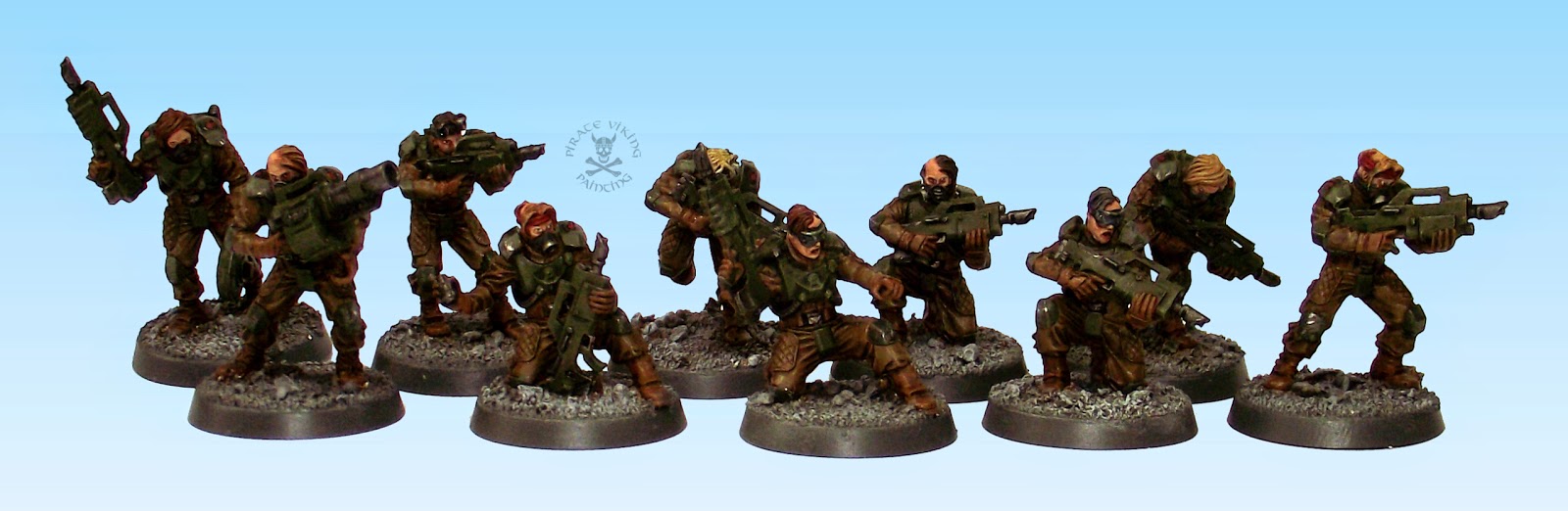
Dreamforge's weapons are nice enough but as these were part of the Inq28 commission my client wanted me to get some good solid Mechanicus approved firepower all up in their grill. I was happy to oblige. Most of the swaps were easy enough, you do need to shave down some of the stocks and sadly in a few cases remove them entirely for them to fit - the Eisenkern have some very tight poses in their arm pairs - but for the most part they posed no problems. The flamers (below) needed a bit of tweaking as the flamer tanks needed to be incorporated with the backpacks to look right. A length of ProCreate hose draped naturally around the model made for a decent enough rubber piping to carry promethium to the business end.


For the painting, the brief I had was "Like a TIE fighter pilot" so within the ability of a model to appear so, that's what I did! One of the difficulties is that you can't just paint them gloss black. Doesn't work. It'll look like you did no actual painting. Instead I painted the undersuit and gas mask in the AMMO Rubber & Tires paint - gave it that NBC-suit look - the armour in Val German Grey darkened with a little black. Painted the weapons and then hit the whole thing with a careful wash of Black Ink (with the usual Lahmian Medium and water added). After that it was a simple matter of picking out the details. Selectively gloss varnishing the armour plates, Brightening the metal where needed and basing. They look good and threatening and didn't take forever. Worth remembering.

apologies for the weird light levels on some of the colours, getting these things to resolve on camera is more difficult than vampires

While we're here, lets chat for a moment about the set itself because I've been watching Dreamforge with some interest. Its a kit that seems to straddle two eras of design. Like most modern kits there are a host of lovely, lovely extra parts on the sprues - like the nifty battlefield computer in the pic above - and the quality of the casting is superb. Then we go back in time with the cutting and spacing on the sprue, you have arms paired but in different places making you hunt for them, there are a lot of componants that could have been sculpted together to make it easier for assembly. The variety is nice but each trooper comes in at least 10 parts. That is with no optional extras attached. Like I say, two eras of design. I'm sure they'll get there though, this was their first infantry kit after all.


Something I will point to though is the posing. Like a couple of other companies, Dreamforge haven't quite nailed some of the organic details. They're great at the mechanical (the Mules are brilliant and coming soon) but the stances are often a little... off. It's tricky to see but the sgt above is a decent example. You see, when people move they go through a "controlled arrested fall" which involves pivoting the centre of mass of the body over the leading leg. In order to not fall over you need your weight centred over the foot on the floor or close to it, we also wobble from side to side to keep our weight over the foot on the ground. With the sergeant, he looks awkward because in that frozen moment that we see miniatures in he is falling over. His weight is way to the right and behind the leading foot and the rear one is a long way from coming through. Its subtle but you see it. Again, I expect this will improve in time and I can defiantly recommend their more mechanical offerings in the meantime.

That's all from me but I have two more items to share. Remember this fella? Well, a couple of days ago I got an email from the client who commissioned him. He'd finally managed to get Triarii Sinister to a gaming table after not quite a year! It was lovely to see some shots of ol' T. Sinister in the wild as it were and only lament that shiny model syndrome (and an eldar titan) kicked in and blew the poor fellow up:


And finally, I must direct you to Charlie at the Beard Bunker and a genuine labour of love. One of the nicest monster paint jobs I've seen in ages on a Banebeast Chimera. Lovely work.


Until next time folks.

TTFN

Saturday 24 May 2014

Antenoceti's Workshop Scout Car (and happy birthday to us!)

Greetings folks, today I have a shiny new thing to show you, a vehicle from a supplier new to me. Antenoceti's Workshop have for years supplied me with modelling tools and materials but this is one of their own design models:


It's a Warthog ADV according to the website from their Governance of Technology range. I'd been toying with the idea of checking out their range for a while, but lucky me, one of these was in the Inq28 commission pile as an Inquisition scout car. It's a mixed media kit with a resin body - nicely cast with only a few small air bubbles on the base - and wheels along with cast metal gun and axle assemblies and bumper. A brass etch carrying cage at the back finishes the kit. They aren't for novice modellers. The brass etch alone needs tricks I only knew about from reading a bunch of modelling magazines (razor blade and clamp is the way to get clean folds in brass etch). I wish I'd photographed the process but was concentrating too hard on getting it right to remember to document the process. One other thought, the struts that hold the wheels on are very, very thin. They're beautifully in scale but very fragile. Were I to make one again I'd replace them with stiff pinning wire as the soft cast metal is a smidge too bendy. Works fine here though. I also added some brass etch Inquisition plaques to indicate ownership.


The colour scheme - which has, as is the way with realistic camo, photographed poorly - is based on the urban camouflage used by the Berlin Brigade in the Cold War. We'd initially wanted to use some stencils to create hard edged digital camo effects to imitate the blocky Berlin Brigade. Sadly, the masking stencils we used were not suited to this sort of model, they're too stiff, they don't conform to the bends and lumps on this sort of model. The paint leaked underneath them and it just looked like finger painting. Yurgh. Instead I went with a softer edged disruptive scheme which can be seen much easier in this work in progress photo:


The colours used are Val German Camo Black-Brown, The Fang, Mechanicus Standard Grey, Val German Grey and Val Deck Tan. The reason the camera had trouble resolving these colours was the weathering stages that came later:


The weathering was the usual chips and dings then a few very thinned layers of AK Rain Marks sprayed through the airbrush and streaked away with Odourless Thinner. Using bursts of air from the airbrush over a brush laden with AK Rain Marks to be spatters and splashes. The lighting cuts through the delicate finish so imagine it a smidge more dusty than it appears. Good fun this one.


In other news it is the site's fourth birthday today! A bittersweet one this as I am going through the last twitches of the business wing of the site, doors close, others open. I'll be doing a proper "state of the nation" type deal when I am more concrete about the future direction of the site as my personal blog alone. I haven't forgotten the "Things I Learned Painting Models For A Living" series, it's just the second part is a little tougher to write as it is analysing the places where I went both right and
wrong so that it is of use. It'll come out when it's ready.

Until then, a very happy birthday to my little mascot Mulder and a very good weekend to you all.

TTFN

Sunday 18 May 2014

Quick painting Averland Empire (and Nuln!)

Greetings folks, today, we get a little sneak preview of my next Warhammer project. Something I've been waiting to get started for a while but have been constantly distracted away from, the army of Averland in The Empire.


This venerable metal drummer is my chosen test model for determining the optimum batch painting method before the conveyor belt starts and hundreds of state troops begin marching across my workbench. Partly to document this process and partly to share my findings I thought I'd share the process with you all! After the step by step below (which if you ignore the yellow works for nuln too) I'll share a few thoughts on the choices I made:


Step 1: Over a black undercoat, sequentially drybrush the steel areas. I used three quick layers, AP Gun Metal, Plate Mail Metal and Shining Silver. Basecoat the fabric in Val German Grey.
Step 2: When the first layers have dried, wash the entire figure in a 1:1:1 mix of Black Ink, Lahmian Medium and Water. Creates a decent but not perfect replacement for Badab Black.
[note, if you want to paint Nuln rather than Averland skip forward now to Step 6]
Step 3: Basecoat all the yellow areas with Val Tan Yellow.
Step 4: Two wash steps now, first a Seraphim Sepia shading wash and then a glaze of Casadora Yellow to deepen the yellow tone a little.


Step 5: Edge highlight all the yellow areas with Val Tan Yellow
Step 6: Basecoat all the areas requiring a brown wash, Val Beige Brown with streaks of Val Deck Tan for woodwork, Val Deck Tan for strings and ropes. Rhinox Hide highlighted with Mournfang Brown for the leather. On this one there was also a Val Stone Grey drumskin.
Step 7: Wash all the areas painted in Step 6 with Agrax Earthshade.
Step 8: Skin (my usual Cadian Flesh, Reikland Fleshtone, then highlights of Cadian Flesh to Flayed One Flesh through Kislev Flesh) and details
Done!

One of the reasons that this project has been much delayed was discovering which yellow to use. I was desperate not to have a very bright, modern yellow dye colour. I wanted a natural yellow, something you could achieve with natural yellow dyestuffs like onion skins. I tried dozens of combinations with most being too bright or too earthy or just needing too many layers to achieve the effect. Remember, this isn't character method. This is churn out hundreds method. The Vallejo Tan Yellow was a lovely finish and needing just that colour and the two wash steps makes it properly economical as well. Very happy.

Hope this inspires a few of you, happy painting!

TTFN

Friday 16 May 2014

Mechanicus Techno Barbarians!

Hi folks, something just a little off the wall for you all today:


These models (which haven't photographed terribly well) are part of another of the Inq28 warbands I'm finishing. I have not one clue where most of them are from so I shall await a knowledgeable soul in the comments to enlighten me! As usual when painting, I put together a little narrative for these guys in my head. To me they felt like a gang of partial servitors from some mechanicus outpost. Maybe a form of techno-pagan cult of the omnisiah, barbarians fighting over modifications and upgrades amongst the foothills of the hive factories... or something.


The big chap is weird enough proportioned that you can imagine some form of modified, vat grown slave with more muscle grafted on, surgeries to lengthen bones and the like. His tiny head makes him look modified rather than naturally that large so it works well. I decided early on that very, very pale skin, grown beneath a steel sky or beneath a constant blanket of sun choking pollution, would be a win. The process is essentially Rakarth Flesh, washed with Reikland Fleshtone and then highlighted with increasing amounts of Pallid Wych Flesh. On the big guys with the sacks'o'footballs sculpted musculature I added striations of corded muscle through streaks of highlight. It helps to overcome the plastic-ey cartoonish sculpting.


The two girls were fairly similar to one another, both smoothed out in an almost android sort of way so I thought I would emphasise that impression with the bright, artificial hair. Of all of the models, these somehow feel the least human, eyes hidden, bodies smoothed over. Very robot.


The bionics, of which this chap just wins the bonanza prize, I knew I could treat one of two ways. I could have gone very high tech, almost eldar, with coloured outer plates and clean mechanisms. But that didn't scream Imperial and certainly not techno-barbarian. So I went to a go to of chipped and worn hazard lines and oily steel. Much, much more Imperial.


The last one is a hodge-podge conversion of a marauder with a dark angel backpack and head & arms from - again - I know not where (client did all building and modifications see). With this chap I knew that the backpack could become quite dominant on the model if I let it. Too much colour and it would have looked tagged on rather than an integral feature. Thus it got the same oily steel and just a little dull brass for the details. Carrying the hazard stripes and the like over helped make this figure, that before painting stood out a bit, fall into place naturally with the rest of the group.

That's all folks, have a splendid weekend.

TTFN

Tuesday 13 May 2014

It's what I do that defines me...

Music maestro! Yep, it's the cowled crusader, the dark knight, the world's greatest detective (never been too sure of that one), he is, in fact:


The God-damned Batman
Greetings folks. It's been a while hasn't it? A combination of an injury from a long LRP-ing weekend (sword hit on the very point of the radius where it joins the wrist. Caused a massive egg that turned near enough my forearm into one giant bruise) that slowed me down and some unexpectedly fiddly models meant that nothing had been finished in almost ten days. Frustrated at the slow progress I cast my eyes across the waiting-for-paint shelf of assembled models for something quick and easy, what can be quicker than batman thought I?


I was right. Iron Man is no longer my fastest character model. Batman is. This was, wait for it, 90 minutes of painting. Because there really is nothing to paint! Once the cloak is German Grey and highlighted a couple of times and the bodysuit is the (brilliant new paint for PVP) Ammo's "Rubber and Tires" and that's highlighted then there is only a couple of washes and 95% of the model is done! The belt is an odd colour in the film (I'm using The Dark Knight model so used the film as reference) so a 1:1:1 mix of Runelord Brass, Sycorax Bronze and AP Shining Silver was shaded/glazed with Seraphim Sepia. Paint the face and you are done!


I've mentioned before that Knight Models are scaled a smidge larger than 28mm (they say 30-odd) and here is Batman with a protest goblin to prove it. Knight now have a generous five Batmen to choose from, but for my money the Dark Knight variant wins on both sculpting and overall badassness (totally a word). The only thing I didn't like was the random floating corner of building they had Bats standing on. If it had covered the whole base that would have been fine, but it doesn't, so you've either got to sculpt some more or be left with random masonry. I ditched the included scenic part and replaced it with a pile of Secret Weapon bricks and rubble. Much better.

Batman is one of those heroes for me. Not a real super-powered chap like the Hulk or Superman but instead just a man whose implacable will, resources and training make him a super-hero. Much in the same mould as Iron Man. I much prefer these heroes and I think it is why they resonate so strongly (just think how many screen adaptations of Batman there have been). Everyone can imagine being strong and trained and having that drive not to quit. Harder to imagine being granted magic powers by a yellow sun...

That's all for me for today. Unexpectedly fiddly figures finished soon! Pics to come.

TTFN (I'm Batman)

Saturday 3 May 2014

Inq28 - Elysian Commandos

Hi folks, me again, guess what! More Inq28 stuff! This time a squad of guard veterans, Forgeworld Elysian commandos with some replacement female (mostly) heads. Not sure from where, if anyone can let me know?


The conversion of the heads to the forgeworld torsos was fairly straightforward, you do need to cut the necks at quite an angle to fit the collars but they go nicely enough. I hadn't worked with Elysian's before and they're quite nice. I've liked the aesthetic for a while and the models in hand didn't disappoint. Had a few problems getting the arms to match up but that is fairly easily solved with some savage amputations and covering the gaps with greenstuff and the very handy shoulder armour plates which cover a number of sins!


I'd painted a lot of urban cammo'd types recently but these didn't feel like they warranted it. They're commandos, not urban pacification types. If for no other reason than to include some variety I figured I'd switch it up this time. Along with the models the client had sent a sheet of Warlord Games Bolt Action Royal Marine transfers, he wanted me to use the emblems on the girls somewhere. The only place with any space turned out to be the shoulder pads in the end but the transfers sparked an idea for the colours. Val English Uniform is the uniform colour for WW2 Tommys, commandos included and this formed a nice base for the uniform, highlighted with the addition of a bit of Val Deck Tan and shaded with Agrax Earthshade. The leather I chose to be more tan than my usual and so used Val Flat Earth shaded at the same time as the uniforms. Val Cam Olive green armour matched the colour of the WW2 british helmets and gave them a nice overall feel. The RM insignias are tough to see on the photos but are in the centre of each pad.

The heads were a mixed bag, some of them very nice, most with part shaved hair though a couple of them looking more like radiation sickness than "tough-girl" affectation. They changed up the look of the unit nicely though. A little less clean cut than the normal helmeted Elysians.

Well, with that I'm done for today. Fairly straightforward painting leads to fairly short post!

TTFN

Thursday 1 May 2014

Inq 28 - Scibor Miniatures

Greetings one and all, something that may have been of note is that there has been an awful lot of Inquisitorial warband figures painted lately but not a whole lot of actual Inquisitors, simple answer is that I've been saving the Inquisitors as treats for when the bulk of the work is done but this warband - for reasons that will become apparent - needed their Inquisitor painted at the same time. So without further ado I present a man so clad in bling that he can only be an Inquisitor Lord:


I was kinda pleased to be painting these, I'd long mused on Scibor mini's range and how useful it would be for me. I'm afraid that pleasure turned to ever lengthening irritation as the project went on though. More on that later with the acolytes. First we must turn our attention to the Lord. As you'll see in the pic above he is massive. He's actually been designed - I think - to be a Space Marine in "truescale" and he isn't far off on the size. To warn you, this chap towers over terminators, so think hard before adding one to your Astates. For our purposes, I think we can assume he has had some form of genetic modification. Probably a low-gravity world (thus tall) plus some kind of not-quite-Space Marine enhancements.

note that the Scibor shoulder pads have been replaced with plastic terminator Inquisition ones.

When I was musing on the colour scheme for this chap I went through several options. Gloss black was one, decorated steel to give him a utilitarian vibe was another. But one option just stood out. Gold. This is a man so pimped out that he has three vassals just carrying extra wargear for him. He is wearing ridiculously ostentatious armour and is carrying a sword the size of the M42. He is not a subtle man. Gold then. To get a nice rich gold I started from a Rhinox Hide and AP Greedy Gold mixed basecoat. This was then highlighted by carefully drybrushing about seven increasingly bright layers of gold, increasing the amount of AP Shining Silver in the mix each time until it was essentially a white gold for the top highlight. Two highlights in I re defined the shading with Agrax Earthshade and then thinned Druchii Violet. A purple glaze enriches the gold. I noticed that the washes were behaving a little oddly but given that the next few layers of highlighting obliterated all but the deepest tones it didn't matter. To contrast all this, black and a rich red seemed the win. The client brief for the linking colours between the Inquisitors was essentially "Belgian flag", yellow, black and red, with yellow mostly being represented by gold or polished brass. Simultaneously I moved on to painting the minions as I needed the gold to be the same across all of them.


Now, before I start, I should say that I like these models in terms that they have a lot of character and help tell a cool story. In concept, they are fine. The execution is terrible and unfortunately gets worse on the next group. I'll save most of my ire for there and instead explain the problems painting them here. Like the Inquisitor, the gold went on fine. Washes were a little prone to pooling but sorted that. Then I moved on to the rest of the job. The idea I had was that the robes and even the men themselves should fade against the magnificence of the wargear they carry. I basecoated the robes in Karak stone, applied a wash of Agrax Earthshade and watched as it pooled across the whole model exposing the horrendous cast texture. These are such rough molds/sculpts that washes actually sit in the texture and show it up. I had wondered why Scibors painters used such cartoony styles. Now I know. If you use washes and attempt subtlety you show up the casting flaws. You kinda have to obliterate it under layers of brightly coloured paint if you want it to look good on camera. In my case I just started afain and re-basecoated the whole lot leaving the wash only in the deepest recesses. But then:

books containing sigils of warding and banishment, scrolls transcribing the Inquisitor's pronouncements and journals of his deeds. Cool concepts.

You may have noticed that the faces aren't as defined as normal? You can't use washes or glazes here either. Not because of the casting texture this time. No. This is because the lines on the faces are so deep that any wash creates a ridiculously sharp contrast. It looks like you are drawing a comic version, all black lines and colouring in. So much as I wanted to make the fat fellas in the second group look florid and unhealthy with gentle glazing I couldn't. Because every time I got near them with anything thinner than normal paint the lines just eagerly lapped it up and you ended up with purple and red lines all over the place. Grrr. I painted the faces twice in the end. Once with a combination of glazes and fury and a second time working up from Bugman's Glow up.

Before I go though, I must have one final gripe and the reason I will not be buying these myself. The sculpting. In places it is ace. But in others? Hands are the particular problem here. They're different sizes on the same model, they lack definition, in some cases they are absent, just stubs of fingers leading into a wrist. This is often because of Scibor's apparent determination to cast one-piece figures. Understandable, saves a lot of time and thus money. But you end up with horrible chunky details (that feather is almost 3mm thick in places, doesn't sound a lot until you remember 28mm is about 6 feet, that feather is almost six inches thick in scale). The one piece casting also forces those absent hands or muddy detail where cloth blurs into metal and you have to fathom which is which. Add that to one of my least favourite design crimes which is slapping details on without thinking how they work or what they do and the result is a bit of a mess.

Like I say, I wanted to like these. They're the sort of models I wish there were more of. Strong, characterful, story driving. But the execution is very disappointing. Of course the real reason I'm so bummed about them is that I don't think the result is the best work I can do. Just the best work that the medium allowed. If you are a high contrast, cartoony painter then consider Scibor. If like me you like the down and dirty? I can't recommend these. Having said that and to be completely fair. The weapon bearers are better than the scribes. Caveat Emptor as almost no-one says.

More soon! I've been busy. This was supposed to have gone up on tuesday by the way, but Blogger had a moment and refused to do so for whatever reason. Elysians commandos coming next! Until then

TTFN