Thursday 24 February 2011

Hot Fuzz

Sergeant Butterman, the little hand says it's time to rock and roll! Today is the turn of another in my series of "fun stuff" projects: Hasslefree's Officer Nick and PC Sam Ford.


Given their obvious suitability, I took them as another chance to try out authentic schemes. Hence I chose to get them as close as possible to Simon Peg and Nick Frost's characters from one of my favourite films: Hot Fuzz.


Both of these models presented me with an opportunity to practice painting adjacent areas of black. This is tricky and something I'll natter about while we check out Sgt Nicholas Angel:


The trick to painting adjacent blacks is in the highlight colour. If you highlight all of the black on a model like this with the same colour you will have one solid area of black. Now take a look at the images above (expand them as the camera really struggles to capture subtle differences. In this model you can see areas highlighted with Codex Grey (clothing and ballistic vest); Charadon Granite (bandolier); Fenris/Space Wolves Grey (Pouches and holster webbing); Scorched Brown (shotgun and baton) and Snakebite Leather (shoes and belt). I also used gloss varnish to act as contrast as well, see the shoes, radio, radio cable and the hatband on Danny's helmet:


By using all these different contrasts you can see every individual area of the model clearly despite them all looking black. It is a very subtle effect and needs practice but by keeping this in mind you can paint models with very monochrome schemes (whether black and white, shades of green or whatever) and still identify all the individual elements. Aside from all the black, I was happy with the end result of the white, it was achieved by boring patient work building up many, many thin glazes of white over an Astronomicon Grey base. This prevents chalkiness. The only thing I haven't figured is how I want to do the bases, do I make them fit in with the Doctor "Hugh" figs I already have? Or do I do a more "Sandford" scheme. Any thoughts?

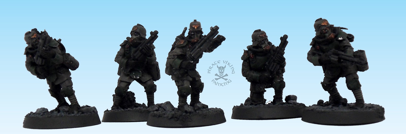
Nattering briefly about the models themselves: The poses on both are great and the likeness close enough for my purposes. If I had one minor niggle it was that I had to do an enormous amount of freehand work on the hands and arms to give definition to the anatomy. These are very small models so they are tough to sculpt, but be aware that in order to get best results you will have to draw in all the muscle tone and bone detail you see on the models above. Even the face detail is painted in. Other than that these are wonderful models with lots of authentic and nicely scaled details (I almost removed the radio cable as flash it is that fine!). Can't wait to get my teeth into the next lot of insanity I see from Hasslefree. Perhaps some of the martial artists. That kimono on Hanako looks great. Anyhow, that's enough from me, back to the Death Korps!

TTFN

Tuesday 22 February 2011

Death Korps Specials

Well, more finished Death Korps for you all to enjoy. This time it is the turn of the engineers along with some special and heavy weapons to be finished. First up, we'll check out the engineers:


I just love these guys. The design of them blends so nicely the look of the Death Korps infantry and some of the heavy WWII era engineer armours. They look like bomb disposal miners, the awesome revolver shotguns are a clever design too. Revolvers are very simple weapons and will generally fire even when fouled with dust or mud. Perfect for an engineer. The masks are more complex and seem to indicate a night vision capability. Even the chest armour includes a mining style lamp, I decided to paint these red to indicate those low-visibility red lamps that soldiers use to avoid enemy detection.


And if the fronts were impressive, here is the back! Each of the models has their own set of equipment, it looks so much better that they have a mix of equipment to tackle engineering problems rather than a repeating generic backpack. Again the designers really thought about what to include, we've got coils of rope, a reel of telegraph wire for secure battlefield communications, picks, shovels, bolt cutters, even bangalore torpedoes (sticks of explosive to be pushed under lengths of wire or other obstacles to clear a path). Painting wise, there really isn't much to talk about aside from the normal methods that I have described before. I did add a lot more chips and dings to these guys than normal as I figure that they will pick up a lot more knocks than the regular troopers.


In the second round of special weapon painting we'll have a look at the meltaguns first. These are (as with the engineers) pretty normal in terms of painting. I added a touch of dark red to the melta-chambers on the sides of the guns to add a spot of colour. I decided to paint all the weapons a solid metal rather than giving them coloured trim. This was to help them fit with the las-weapons in the units they will be joining.


The design again shows through, the weapon slings are tricky to fit but look ace when they are done right. The bronze shield on the shoulder is the mark of the command squads, delicately engraved with a nice gothic "C".


By contrast with the meltaguns the plasma gunners were the subject of some experimentation. Normally I paint plasma coils as copper wire to indicate magnetic containment. However I saw somewhere on the net (sorry can't remember where. Post a link in the comments if you know) a method of painting plasma weapons to appear as pulsing with energy as they fire. This is my attempt at it:


The method works by highlighting up from Orkhide Shade with Skull White, the highest points on the pulses are almost pure white. It is difficult to see in the photos but the highlights fade out either side of the high point to indicate the glow spreading through the coils. A coat of gloss varnish seals the high-tech deal making the coils look like a Star Trek-esque plasma tube. Quite happy with the result (looks better in the flesh!) and it will help the guns stand out in the units. Finally this week we have the lovely heavy stubbers:


These are very, very fiddly to assemble, once together though they are really something. The hefty chunk of concrete on the base adds weight and distance to the base and makes the stubber sit at a comfortable height. The design is very reminiscent of the bren gun and the gunner has it pressed to their chest armour with a decent braced leg pose. I kept the painting simple, same method as before but as these were grenadiers they had more armour. The extra plate on the helmet was painted green to match the other ballistic armour. Kinda figured all the green areas on these models were modern-style ballistic armour whereas the khaki helmets were steel. Adding a frontal ballistic plate to the steel helmets increases the protection to the head.


The other feature of the grenadiers is the skull face gas masks. I wanted to emphasise these without making them too stark. After washing down the canvas mask as normal I went back in and highlighted the edges of the mask with a couple of layers of mix of the original canvas blend (Dheneb Stone and Catachan Green) and increasing amounts of white. This picked up the skull without changing the colour of the mask itself.

Well, that's all folks. Still plowing through the Death Korps and picking up speed! As I am in touching distance of finishing the Blood Angels 2k army there will definately be some more of them coming soon. Still agonising over whether to paint Tycho in non-metallic gold, metallic gold or my Blood Angels red. Any thoughts?

TTFN

Wednesday 16 February 2011

Chaplain Lemartes and Cherubael

As a little respite from the seemingly hip deep sea of Death Korps I'm working through at the moment I've finished the first of the two special characters from the Blood Angels. Hence I present His Royal Nutcase-ness Chaplain Lemartes:


He was a lot of fun to work on, one of those models that seems to paint himself. I always find it odd when painting to notice details that you had never seen in the display pictures. For me that was the bone feet overlaying his boots! Bone is very much in evidence on this figure and merits discussion of technique, so here goes:


Do please ignore the slight overspill of wash around the gem, I didn't notice it until it was magnified and am going to go back in and finish it later. Given that the gem is only about a milimeter wide on the actual size model the spill is barely noticable. The bone begins with a solid basecoat of Khemri Brown, achieved with a couple of thin coats. Follow this up with a shading wash of a mixture of Devlin Mud and Badab Black, around a 3:1 mix. Then begin highlights, starting with Khemri Brown and then working up through mixes with Bleached Bone, the more blended layers you do the thinner the paint can be and the less chalky the finished result will be. I probably used six thin layers between the Khemri Brown and Bleached Bone mix and pure Bleached Bone. I then glazed the whole thing with Gryphonne Sepia. This livens up the colour and prevents a dead white effect. I then continued highlighting up with mixtures of Bleached Bone and white. Three thin layers brought the highlights almost up to white. I then used a couple of thin glazes of white with the tiniest dab of bone mixed in on the high points to create the polished bone look. This is most noticable on the large skull on the shoulder pad:


The large skull also got shaded with black in the eye sockets and nasel cavity. I deliberately kept the parchments closer to Khemri Brown to contrast with the bone. More contrast is achieved with liberal use of the normal Blood Angels red scheme I use:


One last thing to mention is the gold on the crozius arcanum (the club in his left hand). To make it look like a separate weapon to the rest of the armour's gold I warmed it up with a glaze of yellow ink. This actually turned out problematic, largely because in the absence of Vallejo Game Colour yellow ink (what I actually wanted) I bought P3 yellow ink assuming they would be pretty much the same. Boy was I wrong. Rather than the ochre yellow I was expecting this was a day-glo affair that I shall dub Paramedic Jacket Yellow. I had to do an emergency flood of water to clear it out and then repaint all the highlights just to fix it. Destined for the bin I think Mr P3. The theory holds true though and the yellow glaze gives it an older, mellower warmth.

Lastly for this post I thought I would start showing off some of my Inquisitor models (some which are getting stripped and repainted as I have learned a hell of a lot since I bought them). Inquisitor, for the uninitiated, is a narrative wargame (read: the combat system of an RPG) played with larger than normal figures (54mm tall) which allow a range of fine details to be portrayed that would never work on a smaller scale. The best model I own to showcase this is the daemonhost Cherubael:


Now, eagle-eyed readers will have noticed the "Mrs" above the PVP logo. This is because while the model is mine it was long ago yoinked by my wife for her warband. Lucy (Mrs Pirate Viking) fell in love with the model and lavished attention on him. This was her third painted model ever. Yep, I ground my teeth in frustration too but she did train as an artist and that has to count for something!


To illustrate the size difference take a look at the picture above. Lemartes is a big model by 28mm standards and even folded in half Cherubael towers over him. The locks and straps flying out all over the place give it such a sense of motion and the tortured pose has such character. But the best part of the model is its face:


Lucy went for a creepy dead-flesh-containing-demon vibe. The cyanotic blue lips coupled with the dead eyes and the nubs of horns pressing through the flesh convey the effect nicely. Lucy also worked to make the areas where the blessed locks and chains bind his flesh seem reddened and scalded by the pressure of the holy metal against daemon-infested flesh.


Well, that is all for this post, next one will be a bunch more Death Korps so keep visiting or follow us to get the latest.

TTFN

Tuesday 8 February 2011

More Blood Angels and trying new things

Heya folks, back from hiatus and with a Sternguard squad and the last of the Assault Marines to show off!


The first thing regular readers will notice is the swanky new backdrop, now I am still torn, I like the clean white I normally use in shoots but this seems to make the pictures richer somehow. At the bottom of this post I have included two identical shots with the only difference being the backdrop. Please tell me which you prefer, I need input! Anyway, on to the models! The Sternguard were a nice unit to paint without being terribly remarkable, possibly something to do with them being single pose metal models. When I was pulling up areas to showcase there was only one stand-out model available:


This fella uses all of the advice I gave in the scroll painting tutorial to make a nice looking scroll - or oath of moment if, like me, you have been completely converted by the Heresy series! Sharp eyed readers will also have spotted that the markings on the knees of this unit are that of the 1st tactical squad of the 3rd company. My reasoning for this is that I have always seen the 1st squad of a company as being the one to aspire to, so who better to occupy that position than some Sternguard veterans! I am still toying with whether the Vanguard vets that I have in the 3000 point list will be the other half of this squad or the other half of the 2nd Assault squad. Ideas folks?


Speaking of Assault Squads, this is the second half of the 1st Assault Squad. I split them in to two squads for rules purposes - i.e. a power weapon in both - I'm rationalising this in my usual fluff style by remembering that Space Marine squads used to have a Veteran as well as a Sergeant, kinda like a corporal, and that in the books there always seems to be a couple of guys in each squad who fight with unusual weaponry. The sergeant was a lot of fun in this squad, I feel I am finally getting the hang of the power swords:


Also the shoulder pad that I chose for him looks ace as in a Sergeant's colour scheme and reinforces that "veteran" thing by having more red on it than normal.


For those who are curious, "Elioud" is the name given to the children of renegade angels called the Nephilim. With this squad completed that is all the assault marines for the entire army painted! Phew, no more normal jump packs. Don't know why but in the same way as bikes they seem to add a whole extra model to paint! Takes ages but done now! You might remember the Assault Marine with the two swords from a previous post, well, here is his equal and opposite:


I love this guy, he's got such a John Woo thing going on, you can imagine him using the Gun-Kata from Equilibrium (great - if daft - film by the way). Just another example of my taste to include non-standard armaments in units.

Well, that is all folks, the Blood Angels are alarmingly close to being finished (up to 2000) which means I am ever closer to attempting a non metallic metal Captain Tycho, cue dramatic chords. Here is the project planning sheet as normal and then the two Sternguard images, do please let me know which you folks prefer. The comments are open to all these days and I aim to please!

TTFN


Tuesday 1 February 2011

A Madman with a Box

First off, apologies for my silence over the last week. To make up for it, here is the greatest space ship in all the galaxy!


Yes! The Doctor has his TARDIS at last. [See parts one and two for my other Dr Who themed models.] This is of course not a model of the TARDIS but rather the "Glaswegian Police Box" from Hasslefree which just so happens to resemble a TARDIS...


The model is a beautiful sculpt, cast in resin and cut at the lower edge of the roof to allow all that lovely cutout detailing in the roof sections to exist. The model had precious little flash, no voids and no casting blocks, quite a stark - but pleasant! - contrast for someone who has mostly bought Forgeworld resin. The quality of the casting is such that the POLICE markings are engraved in the resin:


And yes, I know that the TARDIS is supposed to have Police Call Box and all sorts but this is good enough damnit! Painting in this sort of detail is simplicity itself, just black out the section with the thinnest coat of black you can manage and then allow capillary action to pull thinned white paint from the brush into the detail. A couple of layers like this builds up the colour and the results are very nice. Another favourite outcome are the windows:


I debated whether to paint the windows glowing white as though the TARDIS was active. In the end though I decided that the simplicity of the model would work better with the inactive glass effect. This is really simple for those who haven't tried it: The trick is to avoid blue entirely and start with a basecoat of Fenris Grey, shade down the appropriate areas (i.e. top and side of a lens or low and side of windows like this). Once dry you can add a little Space Wolves Grey to the Fenris and add highlights, a little catchlight of white and a gloss varnish seals the deal nicely.

And that is that really, this last fortnight has been a bad one for the good people of chez pirate viking. In between deaths of family members-in-law and my car failing to save vs. immobalisation and getting scrapped there hasn't been a lot of room for painting. Once I am back from visiting folks I shall get with the mojo again and crank out some more exciting things for you all. Till then:

TTFN