Friday, 14 February 2014

Slayers Might Fly

Hi folks, been a bit quiet hasn't it? I've been on a family-visit-o-thon with Mrs PVP for the last week, slightly extended due to seriously atrocious weather (for Britain). As is my wont, I tend to warm up on a personal model after an extended break - its incredible how stiff even a week off can make me feel. Stupid wrist, grump - and what a model I had to work on:


Yep, for anyone who knows me, it is not even a small surprise that I laid my hands on the new Slayer the day he came out. I knew he was waiting for me at the shop when I got back from hols and figured a reletively simple colour scheme like him was the perfect choice to warm up. Before I natter about paint, I really, really need to talk about this model. Caution, probable hyperbole ahead ;)


Firstly, take a look at that sprue. At the cutting. Just drink it in. Seriously, this sort of thing just wasn't possible before CAD/Hybrid sculpting came in. The way the sculptor (I wish they signed these things on the sprues) has divided the parts in order to create undercuts on the finished model is genius. Look at the way the head seperates from the body. Then there is the hair. Oh my god the hair. The hair is an absolute masterstroke. I've never seen crested hair done better. When the inevitable plastic slayers come, if citadel don't do this for the units they have missed a massive trick. Oh, and even with such a simple model there are full instructions with the parts numbered in the order you assemble it. Take note Forgeworld y'slackers. One final note for the rumour mongers and doomsayers out there - people have been talking about cancelled armies for 2014 because of 2013's financials - look at the date. 2012. GW do not work on this years armies this year. This model has been ready for a minimum of 13 months. More like eighteen. Can we all calm down on excusing made up rumours as "GW cancelling things". If things are cancelled then they are not for this year. It's for 2015-16.


So, back to painting! I've talked about the basics of slayer painting (oddly over at the Beard Bunker for once) so I won't worry too much about the essence. I'll talk about what is different. Well, first, I've finally found a reliable black wash. It's Black Ink in Lahmian Medium. That's all. Not as good as Badab Black but as good as we're going to get in this dreary Nuln Oil coloured world. Nuln Oil has it's uses but for pure black: stick to ink. I also warmed the hair with ink having taken it a little too light. A glaze of chestnut ink brought it back nicely. Sadly all the wash and glaze layers while providing a lovely tone and contrast in real life don't pick up the shadows on camera. Sigh. There is a reason for "studio style" after all. I also took the time to paint the shadow of his shaved head on the sides. I followed a modified method from the old white dwarf article "Painting Faces Redux". Pdfs float about out there, I urge you to look it up. Great article. Mix Cadian Fleshtone at a 2:1:1 ratio with Val German Camo Brown-Black and Administratum Grey and then really, really dilute it. Two-three thin glazed layers make a lovely realistic 5 O'clock shadow. Rehighlight with the skin colours and you're there.


I wanted to minimise the stone dragon on the base. I think it pulls attention away from the Slayer in the studio scheme. Instead I thought I'd really go for the ancient forgotten stones of Karak Hoch (my hold in our Beard Bunker campaign). My usual go to of Skavenblight Dinge, Stormvermin Fur and Terminatus Stone made the base colour of the stonework. I then glazed it over with streaks of AK Winter Streaking Grim to get a general dirty green tint (stronger in real life, you can see it on the left better) and applied a few stipples of Tyrant Skull as lichen. Then some undergrowth to further age it. First a few clumps of moss tufts from Antenocetis Workshop. These are like the normal grass tufts but are trimmed to about 1mm. They make cracking moss. Also from Antenoceti, the ivy strands help to make it disappear behind undergrowth. Hopefully this means you see the Slayer first. Then notice an ivy covered lump, then identify the ivy covered lump as a nifty stone dragon. That's the theory anyway.

I can safely say that this is one of my favourite figures, I just love the design, the pose, the cleverness of the cutting and use of the material, the dynamic sense, everything. I almost rushed this one, so excited was I to be painting him. Plus he needed to match my existing Slayers. I strongly expect to paint him again at some point. Maybe as part of a duel, because I think I have finally found an opponant to one of my other favourite plastic models of recent years, this chap...

Image from Games Workshop purely for illustrative purposes.

So yep... that's gonna happen! I've not done a diorama before, could be fun! Anyway, I'm back to work now, finished the Slayer this morning so you can expect more pretty Eldar any day now. Until next time

TTFN

Thursday, 6 February 2014

Walk Without Rhythm, A Bones Review

Heya folks, in my quest to find ever weirder things to paint and for nifty roleplay scenario options. I found myself on Reaper's website looking at their Bones range. For those unaware of this, Reaper have made a range of ultra low cost plastic model backed by a ridiculously successful Kickstarter. They are mostly casts of existing Reaper models with a few genuinely new sculpts. I picked up a few of the more unique examples to have a go with and thought I'd share my thoughts.


The one that I got painted was the Purple Worm. I figured it would be a nice "natural" hazard, bursting from the ground to nom unsuspecting adventurers. Plus, I have a lingering fondness for Dune so it was a win in both respects. I added some rubble to the base and cleaned the mold lines - more on that below - but otherwise it is exactly how it comes from the blister pack.

I'd seen advice that the Bones models did not need priming. I was... sceptical to say the least but indeed the paint seemed to go on just fine EDIT: Yes... just fine, BUT you can't thin it on that first coat. Got to be neat otherwise what happened to Phil in the comments happens. I went for variations on Castellan Green, using Karak Stone as a highlight and going much further into Karak Stone on the "underbelly" if a cylinder can be said to have an "under" anything. You need to take care to shade the mouth to give a sense of depth (the sculpt is quite shallow to prevent the dreaded undercut) but otherwise, fairly straightforward. The plastic glues with superglue, not as well as resin, not as problematic as metal. Somewhere in between.

I've also got a blister of kobolds to see how the material worked with smaller componants. Now, they're almost impossible to photograph well without painting and they're not done yet so you'll have to take my word on this. The material is strange. Firm, certainly isn't a true "soft plastic". But it is certainly not rigid either, you can bend spears and other thin componants fairly easily. They don't snap but it's a bother to get them exactly back straight as the shape memory is good, but not perfect. Details are cast well enough, a little softer than a comparable hard plastic sculpt would be. But certainly not bad. The real problem is cleaning them. Oh dear gods, removing mold lines from these is horrible. On a par with Mantic and Privateer Press' "Restic" material. The yielding nature of the plastic means that you cannot scrape the lines, nor can you file them as the file chews through the material and will rapidly destroy your model. No, just like Restic you have to slice the mold lines off with a sharp knife. Essentially carefully judging curves and details so you don't cut anything off, take a look at the worms belly, see that flat section in the middle of the underbelly? Trying to remove mold lines.

I think I get why, these models really are not for people who want a competition level of painting. They're for people who want to slap a basecoat on, dip them in AP strong tone and slap them on a table. I'm sure they'll serve very well in that role. For me? Certainly not an everyday option. Big stuff with thick limbs and the like? Sure. Small and fiddly? Not so much. Andy over at Lair of the Breviks has a good review too which you should read in conjunction with mine. I'd be interested in your thoughts and experiances too, Bones, for you? Or not? Until next time folks

TTFN

Monday, 3 February 2014

War... War Never Changes


Greetings one and all, so there I was, grumbling about how photography hasn't been able to capture my work of late when I had a mini revalation. Instead of grumbling, I could spend a few laborious hours fiddling with settings with a book on photography on one knee and the camera manual on the other. After much trial and error - I still don't fully understand the interactions of the various values - I hit on the combination of aperture priority, the lowest f-stop I can crank it down to and the lowest ISO setting. You need good lighting and a tripod to do that but it really captures colours a whole lot better! The two posts after Sister of Biggles were both done with this setting and the colours are great. Suddenly, I realised: I'd painted a bunch of grungy fallout stuff (waaay back in May 2013) that had utterly failed to photograph satisfactorily! I could share it! So... here it is!


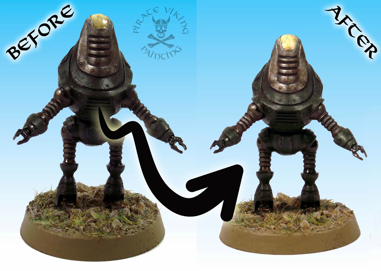
Fallout (3 especially) is one of those computer games that grabbed me from the moment you emerge blinking into the post apocalyptic dawn. At the earliest stages of Fallout 3 you are stumbling around a wilderness, disorientated and with minimal weaponry and then you hear strident martial music playing. It gets louder and then is revealed as belonging to what is essentially the mutant offspring of a boombox and a hoverboard. It's the Eyebot. These models are all the creation of Brother Vinni miniatures who seems to specialise in scantily clad people and well-executed copyright breaches. Seriously, though, his fallout inspired stuff is gorgeous and seems to be evading Bethesda's wrath.

The Eyebot is almost insultingly easy to paint. Steel colour. Wash black. Apply layers of AK Interactive Rust Streaks. Done. It'd make for a brilliant alternative to a servo skull for a less mystically involved Imperial character I reckon. In any Fallout themed game, it's a ball of steel with a boombox and a freakin' laser gun!


Next up are a couple of Brotherhood of Steel types. He's got three varients of which this one with the gattling laser is by far the best. I've loved the BoS power armour for a while. The helmet shape (so much like my beloved terminators) the hanging loops allowing the wearer to have the heavy torso winched off them.


Painting both of them was remarkably similar to the eyebot. I got a decent steel coat by the usual sequential drybrushes of the three AP steel colours. Then I drabbed it down and shaded it with Nuln Oil and once dry attacked it with AK Rust Streaks, Engine Oil and Winter Streaking Grime. The great thing about those enamel weathering paints is that you can faff about with them, adding and removing with turps to your heart's content. The Odorless Turpentine that is used does nothing to acrylic paint. So you can fiddle until done knowing that you aren't going to harm the base colours.


Another style of armour from the game, this Enclave Tesla Armour wound up getting identical treatment, but afterwards I went in and did a bunch of object source lighting around the glowing plasma elements to really bring the gun out. Don't ask me what I used, it was almost a year ago, I'm afraid I've forgotten. But the principles that I talked about in the Librarian (another candidate for new photos to be taken) article hold true. Establish how far you want the light to radiate and keep it consistant. Don't go for too much illumination or it will look like the model is in the dark, then the basing will look weird (it should be greys and blues at night see).


And finally, the faithful Protectron that started it all, I talked about it here. Brother Vinni has just released a decent Mr Gutsy so I might need to get my hands on that on that. Seeing and reshooting these folks again has rather reawakened my interest in Fallout gaming. I can see me fiddling a bit more with it on a very small scale basis. Anyhow, until next time folks.

TTFN

Wednesday, 29 January 2014

Void Dragon Phoenix

Hi folks, I said that the next post would be Corsair shinies didn't I? Oh, and what a shiny it is:


The Void Dragon Phoenix is one of my favourite Forgeworld designs, it just 'works'. The lines are so elegant, the ratio of plane to engine feels right and the weaponry is neatly designed. I will say that there was one massive dissapointment on this kit and that was despite my every effort I was unable to correct a problem that occurred during assembly. Due to Forgeworld's total lack of instructions - a perennial infuriation of mine - a casting plug, exactly the size of the bottom of the cockpits, neatly cast, with no indication that it's removal was required, caused the pilot's heads to be 1.5mm too tall to fit under the canopies. There is no way to seperate resin once superglued. Believe me, I tried. Acetone can soften superglue but the join was too perfect to allow the acetone in. In total frustration I ended up having to remove the pilots heads and paint the canopies (mercifully, the cockpits aren't up to much).

I'm afraid Forgeworld's much vaunted customer service was completely absent here. I wrote to them explaining the problem and expressing my frustration that a £69 model could be spoiled by so small an error and that as a result the lack of instructions was damn near unforgivable. All I got in return was "oh, we hadn't run into that one". Seriously Forgeworld. Get someone to build your overpriced kits and photograph the steps. Write a note or two. If you can't bear to pay for a couple of sheets of A4 in a kit then put them online as totally free to you pdfs. You have to assemble them to sell them. Do this. Earn your price tag. Harrumph, enough of this, on to more edifying things:


The paint scheme for the Phoenix is the same as the other corsair vehicles, the usual airbrushed basecoat, edging and then very Eldar asymmetrically applied red panels which get their hex scales. The canopies fit in with the red because the highlight colour for the red is achieved by mixing Hashut Copper with Mephiston Red. The canopies are Hashut Copper, I took the view that these vehicles are used in space as well as in atmosphere so a NASA style film coating of metal over the glass would prevent radiation damage and reduce blinding stellar light. On their own, they looked a bit plain so I added a suggestion of horizon lining (reflected landscape in the windows) with brown ink and then thin glazes of blue and green on the respective areas. You hardly see the colouring but it helps the illusion. Two layers of wet effects give it a high gloss shine.

It's worth mentioning gemstones on Eldar vehicles. There are two theories on them. Some people like to paint every single gem-shaped object on a vehicle as a gen. I think this is overkill. The designers say that most of the blisters are just armoured domes containing equipment. Areas that get a gemstone on vehicles that I paint are those that feel like there should be some sort of psychic control or detection. so on this one, the weaponry gets one each, the engines and rudders have them and the large sensing arrays are stuffed with them. I figure the gemstones are attuned to the crew and allow them to see through them or detect what is going on around them. It also means that you don't have to paint what can be an enormous number of gems. On a Wraithknight - apparantly - it is almost FOUR HUNDRED. Choose life, choose sanity...


I deliberately kept the underside plainer than the top. It isn't seen as much and somehow having a dark surface to not show up too much against the night sky (I see corsairs doing a lot of night raids) felt right. The air-to-ground missile pods got red accents and a whacking great sensing gemstone to aim them with! The underslung starcannons I painted like the nightspinner weapons, the wraithbone toned weapons encased in grey painted armour.

The four squares around the flying stand hole are not on the model. Those lovely cross-shaped flying stands didn't exist when this model was made and they have not made a retrofitting piece to fix this. Sadly, the stand will not support the model on it's own. Instead I made a few thick plasticard shims to create a cross-format shape for the stand to squeeze into. As a result we have a tight fit that allows the aircraft to be firmly on the stand without gluing.


I decided that the base needed a little bit of "extra mile" work as those whacking great oval bases are normally filled with some girt great beasty. In this case it is totally empty. Knowing that the client's basing is all for urban environments I thought that digging out some spares from the cities of death buildings would provide an accent. Adding this to some cork rubble and secret weapon mini's bricks led to a nice, rubble strewn environment for the Phoenix to strafe.

So with that, I shall leave you, until next time folks

TTFN

Tuesday, 28 January 2014

Two Ruperts and a Kick-Ass Wheelchair

Hi folks, yet more from Project Leviathan today!


I'm really appreciating being able to switch from the eldar with the tight, precise lines - that hurt my wrist if I do it too long - to the more familiar Imperial painting with a variety of schemes to keep things fresh. Today's Ruperts (the generic name for all officers in elements of the British armed forces) are a Bromhead from Black Scorpion and the charmingly bonkers Colonel MacDonald from Spartan Games. We'll start with Mr Bromhead: First Rank Fiahhhh!


The brief for the Bromhead figure was to make him similar to Col Winterborne's Praetorians. I'm guessing he is representing them in the command staff! Most of him is Val Khaki shaded with Agrax Earthshade, rehighlighted with Khaki and then with Khaki and Bone mix. Creates a lovely colour. I can't recommend Vallejo's military range highly enough. Citadel just do not make these strong but desaturated shades. They make a lovely pairing in a painters arsenal, Citadel for the strong saturated tones, Vallejo for the muted militaries and sadly, now only Army Painter (small shudder, but their acrylics are not bad) for half decent metals. The grey/black cape was typical of the victorian look and giving it the pop of a red lining made him look wealthier.


The Spartan Games Colonel MacDonald is just lovely in it's insanity. A massive steam powered bath chair with an aging officer at it's centre. I made one modification, a new plasma gun rig replaces the very cartoony blunderbus of the original. I figured that utilitarian was the order of the day. As always, I thought about the narrative of the model as I painted so that I could inform colour choices. I figured that he had been grievously wounded in battle and his troops had jury rigged this thing out of an old grav accelleration couch and a solid wood burner along with some cylinders from his wrecked command salamander or something. This implied that the paint job should be heavy, industrial steel and old, cared for leather. As yet another example of previous painting facilitating future projects, the leather tone I figured out for Sister of Biggles got used again here. Really captures that armchair-from-a-gentleman's-club look I was going for.

The tartan blanket just felt right! The trick with tartan is half and half shades. Start with your base layer - in this case Karak Stone - then the "Big Grid" of a 50:50 mix of the base layer and the grid colour (Castellan Green). Then the intersecting squares get painted pure Castellan Green. The red gets treated the same way, will look pink and weird until you get the red intersections sorted. I added some Val German Cammo Black-Brown thin grids too and then washed the lot with Athonian Camoshade to provide some definition.


The business end of the bath chair needed more weathering and wear than the grav couch. Thin washes of black ink mixed with Lahmian Medium and then AK-Interactive Rust Streaks gave a nice, dark, heavy, untreated iron look. The cogs and axles all got coated with AK-Interactive Fresh Engine Oil. Makes a lovely greasy look.

There you have it folks: Two Ruperts and a Kick-Ass Wheelchair! The next bit of Corsair lovliness is almost finished and will likely be the next thing on the blog. Until then,

TTFN

Wednesday, 22 January 2014

Sister of Biggles

Eyup folks! A quickee update today showing off a rather lovely miniature:


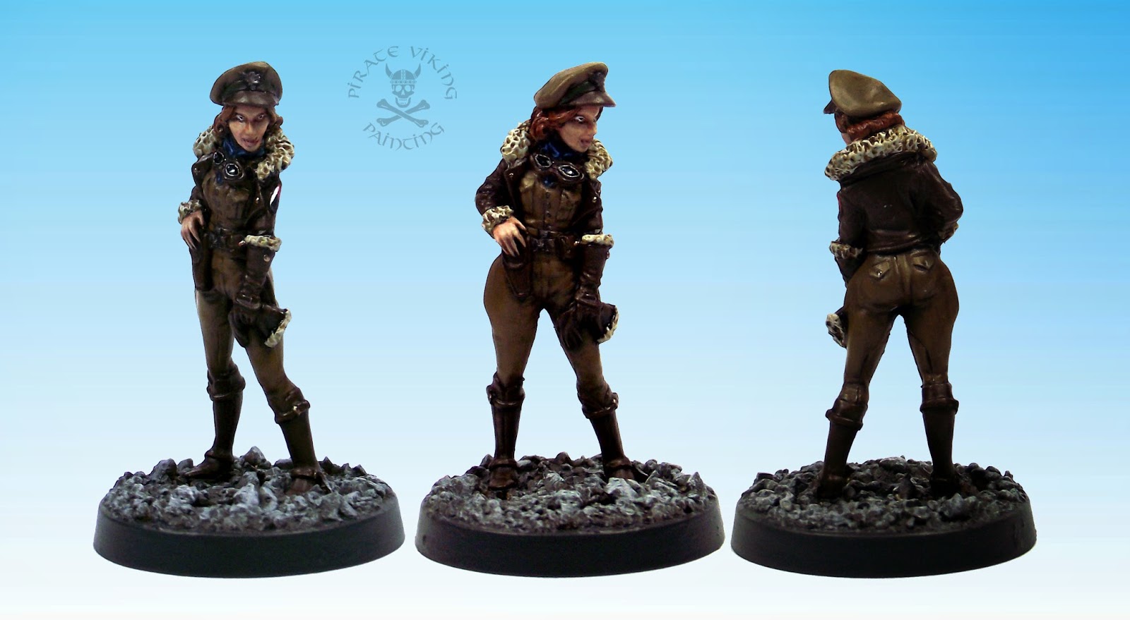
I'm pretty sure this is a Bombshell miniatures "Betty". She's part of the Leviathan command staff commission, I reckon she's either the naval officer's pilot or she's commander of the local air wing. "Betty" was one of those models that just loved to be painted! She looks tons better in the flesh than she does in the photos. I must find ways to improve my photography, constantly frustrated by the results!

Something to note on this model, I'm making much greater use of inks at the moment for toning and warmth. Mixed with a bit of Lamian Medium you get something that flows like a wash but keeps the really translucent quality of inks. The leather, for example, was painted Val Leather Brown, washed with Agrax Earthshade for the shadows, highlighted and then glazed with brown ink. The result? A delightful warm toned mid brown perfect for a sheepskin bomber jacket.

Likewise her hair, I went with red as brunette or blonde would be lost amidst the leather, khaki and fleece. Black somehow didn't fit. I keep playing with various red tones for hair and I think I've hit upon a good one here. A good clean coat of Deathclaw Brown is glazed with a heavy coat of chestnut ink (again mixed with Lamian Medium). This shades and tones the hair in one movement. Lovely.

Anyway, a quickee today. I only had a half day available so bashing out a 4-hour character seemed the best option! Until next time.

TTFN

Tuesday, 21 January 2014

Eldar Ruining Picnics

Hi folks! Today we have pretty pictures of wasps for you. No not the stripy insects composed of sting, wing and a hatred of all living things. No, not White Anglo-Saxon Protestants either. No, these are Eldar Corsair Wasp Assault Walkers:

with all the clear componants, cutting them from the background was a NIGHTMARE, cue retro white!
Even normal Eldar walkers make their Imperial cousins look lumpen and clumsy. These things though are another level again. They've got jump packs. Yup, those nozzles you can see beneath them are essentially the same design as on the corsair squads. The models come with large resin flying stands to allow you to model them in full motion so I took advantage!


By playing with heights and angles I was able to get (left to right) coming in to land; leaping into the air; taking long jump assisted bounding strides. Incidently, those canopies should be standard for the war walkers. They look awesome and make so much more sense than just hanging out with a "kill me" sign on your face.


As with most long running projects I am starting to run out of things to say about the painting. I've been over most of the themes in previous corsair posts so I'll leave it to you to cruise around them at your leisure. Will be a coin toss whether it's infantry or vehicles tomorrow for the Corsairs but as it is the dreaded MOT day it's debatable how much I'll get done. Fingers crossed that Bertha the Big Blue Battlewagon (my venerable diesel Scenic) passes with not too many more nails needing to be banged in!

TTFN