Thursday 26 August 2010

Workbench Tutorial: Basic Tank Weathering

Following a conversation with Admiral Drax about weathering his Baneblade I decided that it would make sense to turn the advice I gave him into a tutorial. Given that I have had that factory finish Razorback waiting for some love since june this was just the spur I needed to get started. This tutorial intends to show that you can achieve great results without expensive weathering pigments or an awful lot of mucking about.


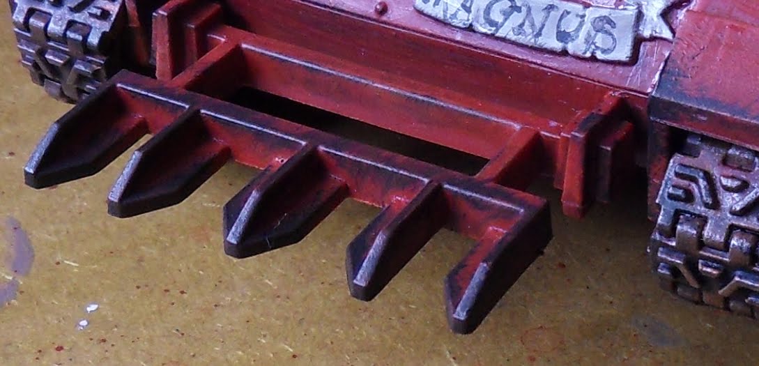
Here we go then, this is the factory-finish Razorback, technically the weathering has already started as I painted the tracks in the heavy looking Jeff-rust. You might notice some little flecks of white or brush strokes. That was the disasterous Tamiya Flatbase. Grr. Oh and the mug was a free sample, cool eh?

First step is to get ALL decals, markings and any other painting done. You cannot go back once you have begun. Next it is to get all of the scratches and dings painted in. I use a sponge for this, just one of the pick and pluck columns from a figure case is good enough:


Next, mix a 1:1 batch of Scorched Brown and Chaos Black. Keep the mixture fairly thick as you want it to sit on the surface of the sponge rather than soaking in. Dip the sponge in the paint and lightly dab the paint off on the tile to test coverage and remove excess.


Then you start the part that needs practice and observation. Use the edge of the sponge to dab dings and knocks onto the edges of the tank that would hit things:


Notice that for example, the inside edges of the front of the tank, the edge of the exhaust housing furthest from direction of travel etc. are not bashed up. This is deliberate as these areas are not in regular contact with trees, walls, hedges, stray dogs or anything else that would scratch or bash the paintwork. Next look for areas of the tank that would be affected by the crew's actions, hatch covers clanging open, armoured feet clambering up stairs and ladders etc:


The next phase is painting in the metallic scratches in the centre of these dings and scrapes. Now some people have suggested using very bright metallics for scratches and so on. This looks great but rewards a cartooney style of painting that is not my preferred style. I like a healthy dose of realism with my fantasy and sci-fi (no surprise I preferred Battlestar Galactica and Babylon 5 to Star Trek). I use a 1:1:1 mix of Chaos Black, Scorched Brown and Boltgun Metal to paint in the scratches. When doing this think "fried egg". The sponged on Black/Brown mix is the white and the metallic shade is the yolk. You want some white around the yolk and indeed on the smaller dings and scratches no yolk at all. This is tricky, you will need practice, start with the edges of the scratched areas and then paint the scratches out from that. The effect is subtle so difficult to see in the pictures, also it looks quite crude in the high magnification close ups but trust me, in scale it looks ace:


The next step is getting a wash of dust over the tank, you need to choose complimentary colours to your chosen basing, no point having desert dust on a woodland base right? For best results choose one of these colours: Graveyard Earth, Kommando Khaki or Desert Yellow. Why these shades? Because they are really insipid in their pigmentation so they do not overpower the paintwork beneath. If you want to go heavily muddy (a discussion for another time) you go with scorched brown to be the barely liquid mud splashed over the tank but this WILL change the paint scheme. Water down your chosen colour a lot, I'm talking like weak tea here, I've tried to photograph the sort of dilution you need but it's tricky, if you look carefully you can see the marks on the tile through the wash. It's that thin:


Next load up a brush and start to paint it onto anywhere the dust would gather on the tank, I've taken lots of reference shots of the Razorback but as a rule of thumb if the wash won't gather neither would dust:


Right, I need you to trust me here, really load the wash onto these areas, it needs it, it looks ridiculous but trust the Pirate Viking. I know of what I speak:


What you need to watch for is gravity drops of wash that will dry with a tide mark, leach these away with a clean brush:


Now leave it alone! Really! I left it for as long as it took to do all of the digital photo jiggery-pokery and to write the tutorial up to this point. It's been about an hour and a half all told. Now make a cuppa and head back to work:


There, it dries to a nice dusty finish, aren't you glad you trusted me? You can take the dust washing further but on this tank there is no need, I wanted to keep the bold red. Finally we need to kick up dust from the tracks and dirty up the lower parts of the Razorback. This is achieved with drybrushing, start with Graveyard Earth, this is worked in a circular motion and follows the line of the tracks and anywhere the tracks would kick dust onto:


Next mix up a 1:1 mix of Graveyard Earth and Bestial Brown, drybrush this over the same regions except use less and leave a band of Graveyard Earth showing:


The last stage is to drybrush a small amount of Bestial Brown along the closest regions to the tracks. And you are done!


Once I have my photographic set up out again I shall take some decent shots of the end result but this should give you the general idea. Hope this tutorial has been useful. Please comment if you have suggestions for improving the tutorial style or if you want more.

TTFN

Wednesday 25 August 2010

World Eaters: a veritable brigade of Berserkers

Cue: The Boys are back in town.


They are finished! All ten pre-Heresy style World Eaters in all their gory glory. I went through the painting process in quite some detail last time so I will just run the edited highlights of the latest five:


I deliberately went bloodier on some of the Berserkers to give a more ragged appearance to the squad. Believe it or not, even random techniques like the blood spraying can appear uniform if the whole squad has the same amounts of blood spatter.


Note that on the running Berserker, the blood formed two large slashed on his thigh, I had to dive in with a small brush and pull down some dribbles or it would have seemed comedically out of scale. Also, something odd happened with the gore mix for the chainswords. Whereas last time the flour and blood mix remained quite thin, this time it gooped up considerably.


Happily it is not too much of a problem. It just looks as though the chain blade has clotted with the volume of blood and tissue going through it. (NB: I really hope no one is eating while thinking about this!). Again, this helps to avoid uniformity throughout the squad.

The other thing I thought I would share with you is the set up I use for the photography these days. Having finally become fed up with the inconsistant nature of Cardiff sunshine (who knew? I hear you cry) I made a Heath Robinson light box to take shots with:


The first thing to notice is that there is a LOT of light going in to that box. Two 100W daylight bulbs are providing the necessary oomph there. The anglepoise lamps by the way are from Ikea and are the cheapest you can get (£8), I heartily recommend them for anyone with inadequate light while painting. Use energy savers in them for long term painting though as the incandescent bulbs get extremely hot and you will have them near your face.The box itself is made of five pieces of A3 Foamcard, simply masking tape them together into a five sided box. Before you add the lid you need to eradicate the lower corner of the box or it will show up in every single photo:


It's a bit tricky to see so I highlighted the curve in red on the second picture. Run a line of double sided tape along the front edge of the box and a two more lines about two inches from the lower corner on both the bottom and inside back of the box. A final line of tape on the top edge of the inside back and you are ready to rock. Don't expose the "double-sided" bit of the adhesive yet as it will make the job harder. Now take a long piece of white paper (I used wallpaper backing as it is dirt cheap) of an appropriate width - it needs to run from side to side of the box. Expose the adhesive on the front line of tape and attach the paper to it, then move back along the rows of tape glueing down the paper as you go so that the highlighted curve is formed between the middle two rows. For neatness I allowed the paper to overlap at both ends and folded them under with a bit of masking tape to secure them.


A good tripod is essential to miniature photography. I used to use a mini tripod precariously balanced on a chair, eep! But an early birthday present of this spanky new one has eliminated that problem (thanks Dad! If anyone is curious my actual birthday is the 30th!) The pillow is an optional extra and doesn't do a darn thing except look messy on photos, sheesh. Always use either a remote shutter control or use the self timer feature to eliminate hand shake. For gear-geeks like me: the camera I use is a Samsung WB500. This is an ace piece of kit. The most important feature it has is a 10x optical zoom. Now go look at how much it costs on amazon and then compare some other 10x optical zoom prices! For non photographers out there, the optical zoom is important because all that most cameras do is enlarge the centre of their field of vision to zoom. All this really does is crop the image and thus reduces the resolution every time you zoom in. An optical zoom uses all of the available pixels in the reader and just makes the camera focus all that resolution on a smaller area.

Well, that is enough rambling from me, time to go post a lucky client his brigade of Berserkers and his troop of Thousand Sons. There'll be a bit of a break before the next commission work arrives so I think I shall treat myself to some Blood Angel painting for my own army.

TTFN.

Tuesday 17 August 2010

And then there were ten... Thousand Sons

It's really unfair, isn't it? You finally get to paint models that you've liked the look of for ages and they turn out to be really, really fiddly. That was the story of the Thousand Sons commission. They are lovely figures and I am really happy with the results but oh lord did they take time. Anyway, here they are in all their automatous glory!


I decided that they needed a little extra decoration - especially on the bare shoulders - and so researched a few hieroglyphics. These were painted on to simulate an eldritch glow, as though the symbols were how the warrior within communicated with the outside world. I imagined them morphing and shifting to respond to the sorcerer's commands.


The Tzeentch symbol shoulder pads are really nicely moulded. I hope they are released as a bitz pack some day. They would look lovely on the Tzeentchian warriors that were not the Thousand Sons. Anyhow, on to the main event. The Sorcerer leading the squad was worthy of a little extra attention:


It's hard to see, but the sculpting on the robe is excellent. The knees of the greaves tent out the robes amongst all of those folds. Brilliant work. Here's some detail shots of the various nifty sections:


The sword needed something to help it stand out. Being Tzeentchian a warping blade was a useful device, so a warpstone effect seemed the logical choice. The blade was highlighted from Dark Angels Green through Scorpion Green all the way up to a 1:1:1 mix of Scorpion Green, Sunburst Yellow and Skull White. The blade was then glazed with several thin coats of Thraka Green and a thin glaze of snot green. The edges were then re-highlighted and re-glazed. A coat of gloss varnish finished the job and gave the blade a crystaline shine. Thin washes of Snot Green and Scorpion Green were applied to strategic regions of the gloves, hilt and shoulder pad to indicate a glow from the corrupted blade.

That's all for this update, am now working on the last five World Eaters then maybe a few more Blood Angels.

TTFN

Saturday 7 August 2010

Slaaneshi Soul Grinder

While visiting friends this week I found one of my earliest commissions still in their collection! The Soul Grinder of Slaanesh was created to be used in a game of Inquisitor (yup, if you want your players terrified for their character's lives then this is a good way to go!). The brief was for very pallid flesh and a real appearance of fused flesh and machinery. The Slaaneshi colouring was to tie the daemon engine in to the main bad guy of the campaign.


The skin was painted in the same way as the Berserkers from the previous post. Instead of stopping at a fleshy colour I continued to highlight up through bleached bone to almost white at some points.


All of the flesh to metal interfaces were painted with the blood mix from the Berserkers and then glazed in with a mix of brown ink and gloss varnish to simulate oily fluids. This is one of the tips from the Forgeworld Masterclass book and I really, really cannot recommend this enough.


The sword is painted with the rusting technique discussed in the Ork trukk article. The only change is the addition of the sharp scratches along the edge to simulate a sharpened blade on that plank of a sword!

The purple sections were base coated in Liche Purple and highlighted by adding Bleached Bone to the Liche Purple. The lightning flashes were taken up higher with the addition of more Bleached Bone and white to the mix.The entire area was then glazed down with Leviathan Purple. The highest points were re-highlighted to add vibrancy.


So there he is! Should have the other Thousand Sons finished by the middle of next week with the Sorcerer getting some special attention (they are really lovely models) followed by the last five World Eaters as a bit of a treat, then who knows, I might even paint something for me if no other commission stuff has arrived ;).

TTFN