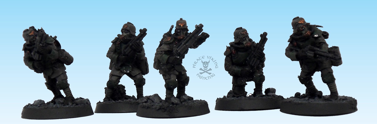
Remember this picture?
And how I said I was really looking forward to turning into a painted version? Well wait no longer because here it is!
Yep! Every single Death Korps lasgunner is painted, with the grenadiers also finished and the majority of the heavy and special weapons done, the project is fast approaching completion. With only "fun stuff" remaining (some heavy weapons, lots of characters) there should be more blog entries about them too! Glad I've got them sorted because the mass effect is quite something.
Now the eagle eyed amongst you might have noticed that the colours have come out a lot better this time. This is because I have a new toy! (Squee!) It is a Fuji Finepix S1800 that I cheekily pinched from my father when he upgraded to a new model. This thing is the bees knees, elbows and nostrils. As it comes with the proper collar for filters and magnifying lenses I thought I would try re-shooting one of the models that I was most disapointed with the photo shoot. The Blood Angels Librarian. Check out the original shoot first.
Now, the new pictures:
How much better are they? The colours are more vibrant and you can even see the marbling on the staff! I will be playing with my new toy some more to try and get the best out of it but I think Pirate Viking Painting just got a whole lot shinier! Till next time...
TTFN
Saturday, 2 April 2011
Friday, 25 March 2011
Cygnar Cyclone
It's a Cygnar Cyclone heavy warjack, it is in Privateer Press' odd plastic - closer to resin than normal plastic. Assembly is not overly problematic (although the usual superglue annoyances apply) I wound up pinning the arms as I didn't trust the joins too well. Now it is no secret that I am not fond of the style that Privateer use to paint their models. Its kinda nineties GW, lots of overly bright colours and clean armies. To say that this doesn't fit with my style is understating the issue a bit! I resolved to try and paint a recognisably "Cygnar" warjack but in my style.
I wanted a rich blue as a base and so brought up the colour from a basecoat of Regal Blue over Necron Abyss. Highlighting proceeded by gradually adding Enchanted Blue to Regal Blue until the colour was pure Enchanted Blue. Final highlights were added with Enchanted Blue and a spot of Space Wolves Grey. I used probably ten intermediate layers to get a smooth blend. Finally a Asurman Blue glaze bound the layers together and deepened the colour. I added chips and dings to the lower surfaces (that infantry can reach with swords and bayonettes) by first painting the chips in the final blue highlight, then in the centre of the bigger scratches I painted a Scorched Brown and Chaos Black mix. Finally I painted a tiny scratch of Boltgun Metal into the centre of the dark scratch. This gave a nice "deep" look to the scratches and dings. The face mask I wanted to paint as though lit by fires from within. The only way to do this is loads of highlighting up to yellow-white, shading back down to red with glazes and rehighlighting. Its a pain but it is the only way. Looks cool though.
The power plant on the back is one of my favourite parts of the model. I painted the same hot glow in the slits of the furnace door, used verdigrised copper for piping and generally made everything look dirty and sooty. This is a steam powered robot after all! To fit in with that image I checked out lots of steam locamotive reference and mixed a metallic shade to give that heavy worn iron look. It's basically Boltgun Metal and Black, drybrushed very lightly with Boltgun Metal and shaded back down with first Badab Black and then a thin glaze of Devlan Mud. This gives that nice "heavy" feel to the metal that I was after.
Top down shot to show off a few things, first, the Cygnar swan (took me an embarrassingly long time to connect Cygnar and Swan to Cygnid... i.e. swans...) which was freehanded from a pdf sheet of icons that Privateer gave Bell of Lost Souls. Secondly the rust. I wanted some rain run-off rust streaks. Not rusted to hell, just subtly weathered. This was achieved in a similar way to the copper, a mix of Dark Flesh and Vermin Brown (two key constituents of Jeff Rust) was thinned and applied to the lower edges of anywhere I wanted to pull a rust streak, I then pulled thin streaks down from the reservoir of paint and feathered them out with a dampened brush. I finished the weathering with very selective washes of a mix of Bestial Brown and Graveyard Earth to show accumulated muck.
The final thing that the top-down shows nicely is the basing. I wanted to go to town on these. I am unfamiliar with the big rounded lip Privateer bases and felt that they leant themselves to a more "cabinet" than "tabletop" look than my usual style. Hence I resolved to put extra effort into basing the Cygnar army to make each a mini diorama. Deciding to base the army in the Thornwood Forest I figured a woodland theme would suit them nicely. I built up the contours of the base with layers of superglue and sand and painted this in a nice earthy leafmold brown (Bestial basecoat over Calthan, Devlan Mud wash, gentle drybrush of Vomit Brown). I then scoured the back yard for weeds and pulled them up until I had found a nice branch-like root. This got cleaned up, sealed in PVA and applied to the base. I then added the twisting sticks and weeds you can see. Believe it or not, this is actually pencil shavings from an electric sharpener we have. These were pva'd down and all the wood was basecoated Graveyard Earth. Layers of washes followed to define the colours, all the brown and green ones were used. Finally I added spots of PVA and applied two colours of static grass (Scorched Grass and Glade Grass) to add a little more realism. Believe it or not I am not done yet. Anetoceti do a lovely leaf litter flock that I am getting my hot little hands on soon and will be adding that to finish the woodland feel.
One last picture to show off the chipping and scoring around the arms of the warjack (it fights other 'Jacks by punching them after all).
All in all I was thoroughly pleased with my first Warmachine fig. I had been put off in the past by Privateer's painting style which I think does their figures no favours at all. Having finally seen some in the flesh (
TTFN
Saturday, 19 March 2011
Death Korps Officer and Grenadiers
It is Death Korps time again! To open we have one of my favourite models in the range:
The model is simply stunning, the quality of the sculpting (particularly the coat) is beyond compare. The colour scheme had to fit with the army and yet stand out as special. I remembered seeing photographs of Belgian officers in the Great War with polished brass helmets (I believe the origin of the phrase "brass hats" for senior officers) and thought that it would fit with the arrogant hauteur of the Death Korps officer corps. The remainder of the scheme is identical to the basic troopers (but with more blending). With dark green as the contrast colour for the army Dark Angels Green was used as a spot colour for coat lining and trim.
While this shot was technically to show off the shading on the cloth it is really to show off the amazing sculpting of the greatcoat draped across the officer's shoulders. I'll pause there and allow you all to admire that... so onwards!
I didn't want the epaulettes and braid to be metallic as there was already a lot of brass and bronze on the model and as a result had a go at non-metallic metal. I used the method described in white dwarf for the Sanguinor with a few tweaks suggested by Darran Latham on his blog as, lets face it, he painted the darn thing in the first place! Now I know what I did wrong here, there is too much shade tone and not enough highlight for it to look like shiney gold but handily it does look rather spanky as braid so serendipity strikes again.
A closer look at the details of the model. The brass helmet was painted using many blended layers of metallics starting from vallejo Brassy Brass (well done guys) - the equivilent of the old brazen brass - working up through their Brass paint (yep, that is different) up to Brass with a little Mithril Silver added. Glazes of brown and chestnut ink helped to intensify the colour and define areas of detail. The little medals on his chest were a lovely touch and made him look all the more unlikely as a front line fighter while adding a splash of colour.
Now I mentioned in my last post that it was grenadier week. Well, that turned in to grenadier fortnight with one thing and another but finally, here they are:
A word of advice for anyone building these things. The cables are specific to the gun and arm combination. For the love of your sanity stick these things on as you build them. Attaching them later was the work of many hours and much swearing but they look wonderful for it.
The general scheme for the grenadiers is the same as the basic troopers (hence my camera's usual problems in picking up subtle colours, grrr.) with the adjustments discussed in the heavy stubber post. The obvious changes are the additional green body armour which changes the tone of the colour scheme considerably while keeping them in line with the normal troopers. The face masks have that creepy skull motif picked out in the same mix of catachan green and rotting flesh with skull white to lift the design off the canvas.
The back mounted hellgun power cell is connected by those fiddly power cables, these were painted dark angels green and charadon granite with a wash of badab black to pick them out. The hellguns themselves have nice thermal sleeves strapped around the barrels to prevent the heat of discharge from burning the user. I tried this in green at first but it altered the balance of the colour scheme too much. Way too much green! Khaki worked nicely and also visably tied the sleeves to being fabric.
As usual the armour plates and helmets received dings and chips by first painting them in with a mix of scorched brown and chaos black and then highlighting the inside of the chip (the yolk of a fried egg) with boltgun metal. This is a nice quick way to create weathering and interest within a unit.
Well, thats all folks. More death korps are already on my painting table along with the honour guard of my Blood Angels and my very first ever Warmachine figure (A Cygnar Cyclone Warjack for the curious).
TTFN
The model is simply stunning, the quality of the sculpting (particularly the coat) is beyond compare. The colour scheme had to fit with the army and yet stand out as special. I remembered seeing photographs of Belgian officers in the Great War with polished brass helmets (I believe the origin of the phrase "brass hats" for senior officers) and thought that it would fit with the arrogant hauteur of the Death Korps officer corps. The remainder of the scheme is identical to the basic troopers (but with more blending). With dark green as the contrast colour for the army Dark Angels Green was used as a spot colour for coat lining and trim.
While this shot was technically to show off the shading on the cloth it is really to show off the amazing sculpting of the greatcoat draped across the officer's shoulders. I'll pause there and allow you all to admire that... so onwards!
I didn't want the epaulettes and braid to be metallic as there was already a lot of brass and bronze on the model and as a result had a go at non-metallic metal. I used the method described in white dwarf for the Sanguinor with a few tweaks suggested by Darran Latham on his blog as, lets face it, he painted the darn thing in the first place! Now I know what I did wrong here, there is too much shade tone and not enough highlight for it to look like shiney gold but handily it does look rather spanky as braid so serendipity strikes again.
A closer look at the details of the model. The brass helmet was painted using many blended layers of metallics starting from vallejo Brassy Brass (well done guys) - the equivilent of the old brazen brass - working up through their Brass paint (yep, that is different) up to Brass with a little Mithril Silver added. Glazes of brown and chestnut ink helped to intensify the colour and define areas of detail. The little medals on his chest were a lovely touch and made him look all the more unlikely as a front line fighter while adding a splash of colour.
Now I mentioned in my last post that it was grenadier week. Well, that turned in to grenadier fortnight with one thing and another but finally, here they are:
A word of advice for anyone building these things. The cables are specific to the gun and arm combination. For the love of your sanity stick these things on as you build them. Attaching them later was the work of many hours and much swearing but they look wonderful for it.
The general scheme for the grenadiers is the same as the basic troopers (hence my camera's usual problems in picking up subtle colours, grrr.) with the adjustments discussed in the heavy stubber post. The obvious changes are the additional green body armour which changes the tone of the colour scheme considerably while keeping them in line with the normal troopers. The face masks have that creepy skull motif picked out in the same mix of catachan green and rotting flesh with skull white to lift the design off the canvas.
The back mounted hellgun power cell is connected by those fiddly power cables, these were painted dark angels green and charadon granite with a wash of badab black to pick them out. The hellguns themselves have nice thermal sleeves strapped around the barrels to prevent the heat of discharge from burning the user. I tried this in green at first but it altered the balance of the colour scheme too much. Way too much green! Khaki worked nicely and also visably tied the sleeves to being fabric.
As usual the armour plates and helmets received dings and chips by first painting them in with a mix of scorched brown and chaos black and then highlighting the inside of the chip (the yolk of a fried egg) with boltgun metal. This is a nice quick way to create weathering and interest within a unit.
Well, thats all folks. More death korps are already on my painting table along with the honour guard of my Blood Angels and my very first ever Warmachine figure (A Cygnar Cyclone Warjack for the curious).
TTFN
Thursday, 3 March 2011
Legends of the Old West - Lawmen
Yee-haw pardner! We're headin' way out west for this update. Having recently had a surge of keen for all things Old West (A combination of Red Dead Redemption and True Grit no doubt) I dug out the figures that I bought when the craze first hit. Dividing them up I discovered to my delight that I had enough for three complete warbands, a Lawmen gang, a vicious Outlaw band and a gang of Cowboys to cause trouble. Basing them up on pennies (so if you are curious about their actual size, the thing they are standing on is a UK penny) gave a nice weight and after a weekend of fevered painting this is the result:
These fine gentlemen are the Coyote Creek Sheriff's Office and Citizens Vigilence Committee. Otherwise known as the Law in these here parts stranger... Before we take a look at the individuals making up this stalwart body here is the rules-ey bit:
So first on the list, and rightly so, is Sheriff Dayton Goodwin (all the members of my various gangs are named after real lawmen, outlaws or cowboys):
Sheriff Goodwin has to look the part so he dresses smart and severe, from the stripy vest to neat cravat he is every inch the respectable gentleman. The model doesn't come with a badge so I painted one on, adding shadows around the rim to give it a three dimensional feel. Now the Sheriff can't do it alone so I added a pair of deputies. First up is Deputy J.J. Sharp:
Now I am not normally given to criticising miniatures (as I cannot sculpt better myself) but this guy has some serious problems. Firstly, he is HUGE, take a look at the group shot and imagine him standing straight. He is head and shoulders taller than the rest. I took the photo from a flattering angle but the coat is nearly a 1/4" thick in places around his legs and the hands are just... one is skeletal (the one in shot), the other is massive, puffy and posessing a thumb the size of three other fingers combined. Add to that the horrible undercut that joins the gun to the body (a massive plug of metal that cannot easily be removed) and this is not a figure that I could ever recommend. Unfortunately, due to Foundry's policy of only selling in packs you can't avoid him. Ho hum, did the best I could. As it has photographed well here I'll talk a little about the technique for painting the woodwork. I wanted a varnished wood look for these chaps so started from my usual Khemri Brown with Bleached Bone woodgrain. I then glazed the whole thing with Chestnut Ink, this gave a semi-gloss finish as well as enriching the browns to that lovely varnished colour. The added advantage is that you can use streaks of ink to enhance the wood grain.
Providing the other half of Sheriff Goodwin's backup is Deputy Clint Davenport, both of the deputies are painted to have a much more practical look. I imagine the Sheriff remaining in Coyote Creek while his deputies ride into the hills looking for miscreants hiding from the law and chasing off Apache scouts. Both deputies have copper badges rather than the bright silver that the Sheriff sports. I made extensive use of foundation colours in painting all these fellows as the desaturated shades were perfect for my purposes.
The dapper looking chap above is Lyman Wakefield, chairman of the Coyote Creek Citizen's Vigilance Committee. These are a bunch of local business owners who take advantage of their respected status to enforce the bylaws of the town. In other words, interfering busybodies. But handy enough with a gun that when trouble rides in to town the Sheriff has an able posse to ride em out. A handy tip when painting watch chains and the like is to "blob" the paint along the length of the chain as it adds to the texture.
Another member of the Vigilence Committee is Roscoe Rankin, the town's Saloon keeper. I love how the jacket looks hastily buttoned over the usual bright vest of the barkeep and the hat looks dumped on. It's as though he was disturbed from his customers by the arrival of trouble and only had time to grab his shooting iron and throw on some clothes!
This is George Maledon; the town's general store owner. I love this guy, he just looks unflappable, standing aiming his piece with no more emotion than he would show a customer asking for credit. Little touches like a red necktie on a model like this with predominantly brown tones "lift" the scheme and add some interest.
The final member of the vigilance committee is A.J. Caldwell and his trusty rifle 'Betsy-sue'. Note on this figure the various areas of colour stand out well from one another. This is due to a technique called Black-lining. Simply put you run a thin line of black or brown-black into the gap where one colour meets the next, it outlines the regions of colour and gives you a sharper finish. I just use Badab Black.
The last member of the posse is the local Upstanding Citizen, retired Major William "Bucky" O'Neil. Though he is getting on a bit for the day-to-day activities of the vigilance committee, his input is always valued as is his skill with his shotgun. To make the model appear older, in addition to the grey hair, is to add Fortress Grey to the highest highlights of the skin. The last thing to mention is the basing. To match the look of the Arizona desert (where I have based Coyote Creek) I needed to paint the sand a pinkish dust colour. This started from Vermin Brown with increasing amounts of Bleached Bone added with three sequential drybrushes until the mix is almost bone. Finally a little white is added to give that parched look.
So there you have it! The first of my Legends of the Old West gangs. Next post will be more Death Korps as it has been Grenadier Week here at PVP HQ, they are looking spanky and just a few details to finish up. Finally a bit of photoshop silliness for our enjoyment:
TTFN.

These fine gentlemen are the Coyote Creek Sheriff's Office and Citizens Vigilence Committee. Otherwise known as the Law in these here parts stranger... Before we take a look at the individuals making up this stalwart body here is the rules-ey bit:
So first on the list, and rightly so, is Sheriff Dayton Goodwin (all the members of my various gangs are named after real lawmen, outlaws or cowboys):
Sheriff Goodwin has to look the part so he dresses smart and severe, from the stripy vest to neat cravat he is every inch the respectable gentleman. The model doesn't come with a badge so I painted one on, adding shadows around the rim to give it a three dimensional feel. Now the Sheriff can't do it alone so I added a pair of deputies. First up is Deputy J.J. Sharp:
Now I am not normally given to criticising miniatures (as I cannot sculpt better myself) but this guy has some serious problems. Firstly, he is HUGE, take a look at the group shot and imagine him standing straight. He is head and shoulders taller than the rest. I took the photo from a flattering angle but the coat is nearly a 1/4" thick in places around his legs and the hands are just... one is skeletal (the one in shot), the other is massive, puffy and posessing a thumb the size of three other fingers combined. Add to that the horrible undercut that joins the gun to the body (a massive plug of metal that cannot easily be removed) and this is not a figure that I could ever recommend. Unfortunately, due to Foundry's policy of only selling in packs you can't avoid him. Ho hum, did the best I could. As it has photographed well here I'll talk a little about the technique for painting the woodwork. I wanted a varnished wood look for these chaps so started from my usual Khemri Brown with Bleached Bone woodgrain. I then glazed the whole thing with Chestnut Ink, this gave a semi-gloss finish as well as enriching the browns to that lovely varnished colour. The added advantage is that you can use streaks of ink to enhance the wood grain.
Providing the other half of Sheriff Goodwin's backup is Deputy Clint Davenport, both of the deputies are painted to have a much more practical look. I imagine the Sheriff remaining in Coyote Creek while his deputies ride into the hills looking for miscreants hiding from the law and chasing off Apache scouts. Both deputies have copper badges rather than the bright silver that the Sheriff sports. I made extensive use of foundation colours in painting all these fellows as the desaturated shades were perfect for my purposes.
The dapper looking chap above is Lyman Wakefield, chairman of the Coyote Creek Citizen's Vigilance Committee. These are a bunch of local business owners who take advantage of their respected status to enforce the bylaws of the town. In other words, interfering busybodies. But handy enough with a gun that when trouble rides in to town the Sheriff has an able posse to ride em out. A handy tip when painting watch chains and the like is to "blob" the paint along the length of the chain as it adds to the texture.
Another member of the Vigilence Committee is Roscoe Rankin, the town's Saloon keeper. I love how the jacket looks hastily buttoned over the usual bright vest of the barkeep and the hat looks dumped on. It's as though he was disturbed from his customers by the arrival of trouble and only had time to grab his shooting iron and throw on some clothes!
This is George Maledon; the town's general store owner. I love this guy, he just looks unflappable, standing aiming his piece with no more emotion than he would show a customer asking for credit. Little touches like a red necktie on a model like this with predominantly brown tones "lift" the scheme and add some interest.
The final member of the vigilance committee is A.J. Caldwell and his trusty rifle 'Betsy-sue'. Note on this figure the various areas of colour stand out well from one another. This is due to a technique called Black-lining. Simply put you run a thin line of black or brown-black into the gap where one colour meets the next, it outlines the regions of colour and gives you a sharper finish. I just use Badab Black.
The last member of the posse is the local Upstanding Citizen, retired Major William "Bucky" O'Neil. Though he is getting on a bit for the day-to-day activities of the vigilance committee, his input is always valued as is his skill with his shotgun. To make the model appear older, in addition to the grey hair, is to add Fortress Grey to the highest highlights of the skin. The last thing to mention is the basing. To match the look of the Arizona desert (where I have based Coyote Creek) I needed to paint the sand a pinkish dust colour. This started from Vermin Brown with increasing amounts of Bleached Bone added with three sequential drybrushes until the mix is almost bone. Finally a little white is added to give that parched look.
So there you have it! The first of my Legends of the Old West gangs. Next post will be more Death Korps as it has been Grenadier Week here at PVP HQ, they are looking spanky and just a few details to finish up. Finally a bit of photoshop silliness for our enjoyment:
TTFN.
Thursday, 24 February 2011
Hot Fuzz
Sergeant Butterman, the little hand says it's time to rock and roll! Today is the turn of another in my series of "fun stuff" projects: Hasslefree's Officer Nick and PC Sam Ford.
Given their obvious suitability, I took them as another chance to try out authentic schemes. Hence I chose to get them as close as possible to Simon Peg and Nick Frost's characters from one of my favourite films: Hot Fuzz.
Both of these models presented me with an opportunity to practice painting adjacent areas of black. This is tricky and something I'll natter about while we check out Sgt Nicholas Angel:
By using all these different contrasts you can see every individual area of the model clearly despite them all looking black. It is a very subtle effect and needs practice but by keeping this in mind you can paint models with very monochrome schemes (whether black and white, shades of green or whatever) and still identify all the individual elements. Aside from all the black, I was happy with the end result of the white, it was achieved by boring patient work building up many, many thin glazes of white over an Astronomicon Grey base. This prevents chalkiness. The only thing I haven't figured is how I want to do the bases, do I make them fit in with the Doctor "Hugh" figs I already have? Or do I do a more "Sandford" scheme. Any thoughts?
Nattering briefly about the models themselves: The poses on both are great and the likeness close enough for my purposes. If I had one minor niggle it was that I had to do an enormous amount of freehand work on the hands and arms to give definition to the anatomy. These are very small models so they are tough to sculpt, but be aware that in order to get best results you will have to draw in all the muscle tone and bone detail you see on the models above. Even the face detail is painted in. Other than that these are wonderful models with lots of authentic and nicely scaled details (I almost removed the radio cable as flash it is that fine!). Can't wait to get my teeth into the next lot of insanity I see from Hasslefree. Perhaps some of the martial artists. That kimono on Hanako looks great. Anyhow, that's enough from me, back to the Death Korps!
TTFN
Given their obvious suitability, I took them as another chance to try out authentic schemes. Hence I chose to get them as close as possible to Simon Peg and Nick Frost's characters from one of my favourite films: Hot Fuzz.
Both of these models presented me with an opportunity to practice painting adjacent areas of black. This is tricky and something I'll natter about while we check out Sgt Nicholas Angel:
The trick to painting adjacent blacks is in the highlight colour. If you highlight all of the black on a model like this with the same colour you will have one solid area of black. Now take a look at the images above (expand them as the camera really struggles to capture subtle differences. In this model you can see areas highlighted with Codex Grey (clothing and ballistic vest); Charadon Granite (bandolier); Fenris/Space Wolves Grey (Pouches and holster webbing); Scorched Brown (shotgun and baton) and Snakebite Leather (shoes and belt). I also used gloss varnish to act as contrast as well, see the shoes, radio, radio cable and the hatband on Danny's helmet:
By using all these different contrasts you can see every individual area of the model clearly despite them all looking black. It is a very subtle effect and needs practice but by keeping this in mind you can paint models with very monochrome schemes (whether black and white, shades of green or whatever) and still identify all the individual elements. Aside from all the black, I was happy with the end result of the white, it was achieved by boring patient work building up many, many thin glazes of white over an Astronomicon Grey base. This prevents chalkiness. The only thing I haven't figured is how I want to do the bases, do I make them fit in with the Doctor "Hugh" figs I already have? Or do I do a more "Sandford" scheme. Any thoughts?
Nattering briefly about the models themselves: The poses on both are great and the likeness close enough for my purposes. If I had one minor niggle it was that I had to do an enormous amount of freehand work on the hands and arms to give definition to the anatomy. These are very small models so they are tough to sculpt, but be aware that in order to get best results you will have to draw in all the muscle tone and bone detail you see on the models above. Even the face detail is painted in. Other than that these are wonderful models with lots of authentic and nicely scaled details (I almost removed the radio cable as flash it is that fine!). Can't wait to get my teeth into the next lot of insanity I see from Hasslefree. Perhaps some of the martial artists. That kimono on Hanako looks great. Anyhow, that's enough from me, back to the Death Korps!
TTFN
Tuesday, 22 February 2011
Death Korps Specials
Well, more finished Death Korps for you all to enjoy. This time it is the turn of the engineers along with some special and heavy weapons to be finished. First up, we'll check out the engineers:
I just love these guys. The design of them blends so nicely the look of the Death Korps infantry and some of the heavy WWII era engineer armours. They look like bomb disposal miners, the awesome revolver shotguns are a clever design too. Revolvers are very simple weapons and will generally fire even when fouled with dust or mud. Perfect for an engineer. The masks are more complex and seem to indicate a night vision capability. Even the chest armour includes a mining style lamp, I decided to paint these red to indicate those low-visibility red lamps that soldiers use to avoid enemy detection.
And if the fronts were impressive, here is the back! Each of the models has their own set of equipment, it looks so much better that they have a mix of equipment to tackle engineering problems rather than a repeating generic backpack. Again the designers really thought about what to include, we've got coils of rope, a reel of telegraph wire for secure battlefield communications, picks, shovels, bolt cutters, even bangalore torpedoes (sticks of explosive to be pushed under lengths of wire or other obstacles to clear a path). Painting wise, there really isn't much to talk about aside from the normal methods that I have described before. I did add a lot more chips and dings to these guys than normal as I figure that they will pick up a lot more knocks than the regular troopers.
In the second round of special weapon painting we'll have a look at the meltaguns first. These are (as with the engineers) pretty normal in terms of painting. I added a touch of dark red to the melta-chambers on the sides of the guns to add a spot of colour. I decided to paint all the weapons a solid metal rather than giving them coloured trim. This was to help them fit with the las-weapons in the units they will be joining.
The design again shows through, the weapon slings are tricky to fit but look ace when they are done right. The bronze shield on the shoulder is the mark of the command squads, delicately engraved with a nice gothic "C".
By contrast with the meltaguns the plasma gunners were the subject of some experimentation. Normally I paint plasma coils as copper wire to indicate magnetic containment. However I saw somewhere on the net (sorry can't remember where. Post a link in the comments if you know) a method of painting plasma weapons to appear as pulsing with energy as they fire. This is my attempt at it:
The method works by highlighting up from Orkhide Shade with Skull White, the highest points on the pulses are almost pure white. It is difficult to see in the photos but the highlights fade out either side of the high point to indicate the glow spreading through the coils. A coat of gloss varnish seals the high-tech deal making the coils look like a Star Trek-esque plasma tube. Quite happy with the result (looks better in the flesh!) and it will help the guns stand out in the units. Finally this week we have the lovely heavy stubbers:
These are very, very fiddly to assemble, once together though they are really something. The hefty chunk of concrete on the base adds weight and distance to the base and makes the stubber sit at a comfortable height. The design is very reminiscent of the bren gun and the gunner has it pressed to their chest armour with a decent braced leg pose. I kept the painting simple, same method as before but as these were grenadiers they had more armour. The extra plate on the helmet was painted green to match the other ballistic armour. Kinda figured all the green areas on these models were modern-style ballistic armour whereas the khaki helmets were steel. Adding a frontal ballistic plate to the steel helmets increases the protection to the head.
The other feature of the grenadiers is the skull face gas masks. I wanted to emphasise these without making them too stark. After washing down the canvas mask as normal I went back in and highlighted the edges of the mask with a couple of layers of mix of the original canvas blend (Dheneb Stone and Catachan Green) and increasing amounts of white. This picked up the skull without changing the colour of the mask itself.
Well, that's all folks. Still plowing through the Death Korps and picking up speed! As I am in touching distance of finishing the Blood Angels 2k army there will definately be some more of them coming soon. Still agonising over whether to paint Tycho in non-metallic gold, metallic gold or my Blood Angels red. Any thoughts?
TTFN
I just love these guys. The design of them blends so nicely the look of the Death Korps infantry and some of the heavy WWII era engineer armours. They look like bomb disposal miners, the awesome revolver shotguns are a clever design too. Revolvers are very simple weapons and will generally fire even when fouled with dust or mud. Perfect for an engineer. The masks are more complex and seem to indicate a night vision capability. Even the chest armour includes a mining style lamp, I decided to paint these red to indicate those low-visibility red lamps that soldiers use to avoid enemy detection.
And if the fronts were impressive, here is the back! Each of the models has their own set of equipment, it looks so much better that they have a mix of equipment to tackle engineering problems rather than a repeating generic backpack. Again the designers really thought about what to include, we've got coils of rope, a reel of telegraph wire for secure battlefield communications, picks, shovels, bolt cutters, even bangalore torpedoes (sticks of explosive to be pushed under lengths of wire or other obstacles to clear a path). Painting wise, there really isn't much to talk about aside from the normal methods that I have described before. I did add a lot more chips and dings to these guys than normal as I figure that they will pick up a lot more knocks than the regular troopers.
In the second round of special weapon painting we'll have a look at the meltaguns first. These are (as with the engineers) pretty normal in terms of painting. I added a touch of dark red to the melta-chambers on the sides of the guns to add a spot of colour. I decided to paint all the weapons a solid metal rather than giving them coloured trim. This was to help them fit with the las-weapons in the units they will be joining.
The design again shows through, the weapon slings are tricky to fit but look ace when they are done right. The bronze shield on the shoulder is the mark of the command squads, delicately engraved with a nice gothic "C".
By contrast with the meltaguns the plasma gunners were the subject of some experimentation. Normally I paint plasma coils as copper wire to indicate magnetic containment. However I saw somewhere on the net (sorry can't remember where. Post a link in the comments if you know) a method of painting plasma weapons to appear as pulsing with energy as they fire. This is my attempt at it:
The method works by highlighting up from Orkhide Shade with Skull White, the highest points on the pulses are almost pure white. It is difficult to see in the photos but the highlights fade out either side of the high point to indicate the glow spreading through the coils. A coat of gloss varnish seals the high-tech deal making the coils look like a Star Trek-esque plasma tube. Quite happy with the result (looks better in the flesh!) and it will help the guns stand out in the units. Finally this week we have the lovely heavy stubbers:
These are very, very fiddly to assemble, once together though they are really something. The hefty chunk of concrete on the base adds weight and distance to the base and makes the stubber sit at a comfortable height. The design is very reminiscent of the bren gun and the gunner has it pressed to their chest armour with a decent braced leg pose. I kept the painting simple, same method as before but as these were grenadiers they had more armour. The extra plate on the helmet was painted green to match the other ballistic armour. Kinda figured all the green areas on these models were modern-style ballistic armour whereas the khaki helmets were steel. Adding a frontal ballistic plate to the steel helmets increases the protection to the head.
The other feature of the grenadiers is the skull face gas masks. I wanted to emphasise these without making them too stark. After washing down the canvas mask as normal I went back in and highlighted the edges of the mask with a couple of layers of mix of the original canvas blend (Dheneb Stone and Catachan Green) and increasing amounts of white. This picked up the skull without changing the colour of the mask itself.
Well, that's all folks. Still plowing through the Death Korps and picking up speed! As I am in touching distance of finishing the Blood Angels 2k army there will definately be some more of them coming soon. Still agonising over whether to paint Tycho in non-metallic gold, metallic gold or my Blood Angels red. Any thoughts?
TTFN
Wednesday, 16 February 2011
Chaplain Lemartes and Cherubael
As a little respite from the seemingly hip deep sea of Death Korps I'm working through at the moment I've finished the first of the two special characters from the Blood Angels. Hence I present His Royal Nutcase-ness Chaplain Lemartes:
He was a lot of fun to work on, one of those models that seems to paint himself. I always find it odd when painting to notice details that you had never seen in the display pictures. For me that was the bone feet overlaying his boots! Bone is very much in evidence on this figure and merits discussion of technique, so here goes:
Do please ignore the slight overspill of wash around the gem, I didn't notice it until it was magnified and am going to go back in and finish it later. Given that the gem is only about a milimeter wide on the actual size model the spill is barely noticable. The bone begins with a solid basecoat of Khemri Brown, achieved with a couple of thin coats. Follow this up with a shading wash of a mixture of Devlin Mud and Badab Black, around a 3:1 mix. Then begin highlights, starting with Khemri Brown and then working up through mixes with Bleached Bone, the more blended layers you do the thinner the paint can be and the less chalky the finished result will be. I probably used six thin layers between the Khemri Brown and Bleached Bone mix and pure Bleached Bone. I then glazed the whole thing with Gryphonne Sepia. This livens up the colour and prevents a dead white effect. I then continued highlighting up with mixtures of Bleached Bone and white. Three thin layers brought the highlights almost up to white. I then used a couple of thin glazes of white with the tiniest dab of bone mixed in on the high points to create the polished bone look. This is most noticable on the large skull on the shoulder pad:
The large skull also got shaded with black in the eye sockets and nasel cavity. I deliberately kept the parchments closer to Khemri Brown to contrast with the bone. More contrast is achieved with liberal use of the normal Blood Angels red scheme I use:
One last thing to mention is the gold on the crozius arcanum (the club in his left hand). To make it look like a separate weapon to the rest of the armour's gold I warmed it up with a glaze of yellow ink. This actually turned out problematic, largely because in the absence of Vallejo Game Colour yellow ink (what I actually wanted) I bought P3 yellow ink assuming they would be pretty much the same. Boy was I wrong. Rather than the ochre yellow I was expecting this was a day-glo affair that I shall dub Paramedic Jacket Yellow. I had to do an emergency flood of water to clear it out and then repaint all the highlights just to fix it. Destined for the bin I think Mr P3. The theory holds true though and the yellow glaze gives it an older, mellower warmth.
Lastly for this post I thought I would start showing off some of my Inquisitor models (some which are getting stripped and repainted as I have learned a hell of a lot since I bought them). Inquisitor, for the uninitiated, is a narrative wargame (read: the combat system of an RPG) played with larger than normal figures (54mm tall) which allow a range of fine details to be portrayed that would never work on a smaller scale. The best model I own to showcase this is the daemonhost Cherubael:
Now, eagle-eyed readers will have noticed the "Mrs" above the PVP logo. This is because while the model is mine it was long ago yoinked by my wife for her warband. Lucy (Mrs Pirate Viking) fell in love with the model and lavished attention on him. This was her third painted model ever. Yep, I ground my teeth in frustration too but she did train as an artist and that has to count for something!
To illustrate the size difference take a look at the picture above. Lemartes is a big model by 28mm standards and even folded in half Cherubael towers over him. The locks and straps flying out all over the place give it such a sense of motion and the tortured pose has such character. But the best part of the model is its face:
Lucy went for a creepy dead-flesh-containing-demon vibe. The cyanotic blue lips coupled with the dead eyes and the nubs of horns pressing through the flesh convey the effect nicely. Lucy also worked to make the areas where the blessed locks and chains bind his flesh seem reddened and scalded by the pressure of the holy metal against daemon-infested flesh.
Well, that is all for this post, next one will be a bunch more Death Korps so keep visiting or follow us to get the latest.
TTFN
He was a lot of fun to work on, one of those models that seems to paint himself. I always find it odd when painting to notice details that you had never seen in the display pictures. For me that was the bone feet overlaying his boots! Bone is very much in evidence on this figure and merits discussion of technique, so here goes:
Do please ignore the slight overspill of wash around the gem, I didn't notice it until it was magnified and am going to go back in and finish it later. Given that the gem is only about a milimeter wide on the actual size model the spill is barely noticable. The bone begins with a solid basecoat of Khemri Brown, achieved with a couple of thin coats. Follow this up with a shading wash of a mixture of Devlin Mud and Badab Black, around a 3:1 mix. Then begin highlights, starting with Khemri Brown and then working up through mixes with Bleached Bone, the more blended layers you do the thinner the paint can be and the less chalky the finished result will be. I probably used six thin layers between the Khemri Brown and Bleached Bone mix and pure Bleached Bone. I then glazed the whole thing with Gryphonne Sepia. This livens up the colour and prevents a dead white effect. I then continued highlighting up with mixtures of Bleached Bone and white. Three thin layers brought the highlights almost up to white. I then used a couple of thin glazes of white with the tiniest dab of bone mixed in on the high points to create the polished bone look. This is most noticable on the large skull on the shoulder pad:
The large skull also got shaded with black in the eye sockets and nasel cavity. I deliberately kept the parchments closer to Khemri Brown to contrast with the bone. More contrast is achieved with liberal use of the normal Blood Angels red scheme I use:
One last thing to mention is the gold on the crozius arcanum (the club in his left hand). To make it look like a separate weapon to the rest of the armour's gold I warmed it up with a glaze of yellow ink. This actually turned out problematic, largely because in the absence of Vallejo Game Colour yellow ink (what I actually wanted) I bought P3 yellow ink assuming they would be pretty much the same. Boy was I wrong. Rather than the ochre yellow I was expecting this was a day-glo affair that I shall dub Paramedic Jacket Yellow. I had to do an emergency flood of water to clear it out and then repaint all the highlights just to fix it. Destined for the bin I think Mr P3. The theory holds true though and the yellow glaze gives it an older, mellower warmth.
Lastly for this post I thought I would start showing off some of my Inquisitor models (some which are getting stripped and repainted as I have learned a hell of a lot since I bought them). Inquisitor, for the uninitiated, is a narrative wargame (read: the combat system of an RPG) played with larger than normal figures (54mm tall) which allow a range of fine details to be portrayed that would never work on a smaller scale. The best model I own to showcase this is the daemonhost Cherubael:
Now, eagle-eyed readers will have noticed the "Mrs" above the PVP logo. This is because while the model is mine it was long ago yoinked by my wife for her warband. Lucy (Mrs Pirate Viking) fell in love with the model and lavished attention on him. This was her third painted model ever. Yep, I ground my teeth in frustration too but she did train as an artist and that has to count for something!
To illustrate the size difference take a look at the picture above. Lemartes is a big model by 28mm standards and even folded in half Cherubael towers over him. The locks and straps flying out all over the place give it such a sense of motion and the tortured pose has such character. But the best part of the model is its face:
Lucy went for a creepy dead-flesh-containing-demon vibe. The cyanotic blue lips coupled with the dead eyes and the nubs of horns pressing through the flesh convey the effect nicely. Lucy also worked to make the areas where the blessed locks and chains bind his flesh seem reddened and scalded by the pressure of the holy metal against daemon-infested flesh.
Well, that is all for this post, next one will be a bunch more Death Korps so keep visiting or follow us to get the latest.
TTFN
Subscribe to:
Posts (Atom)