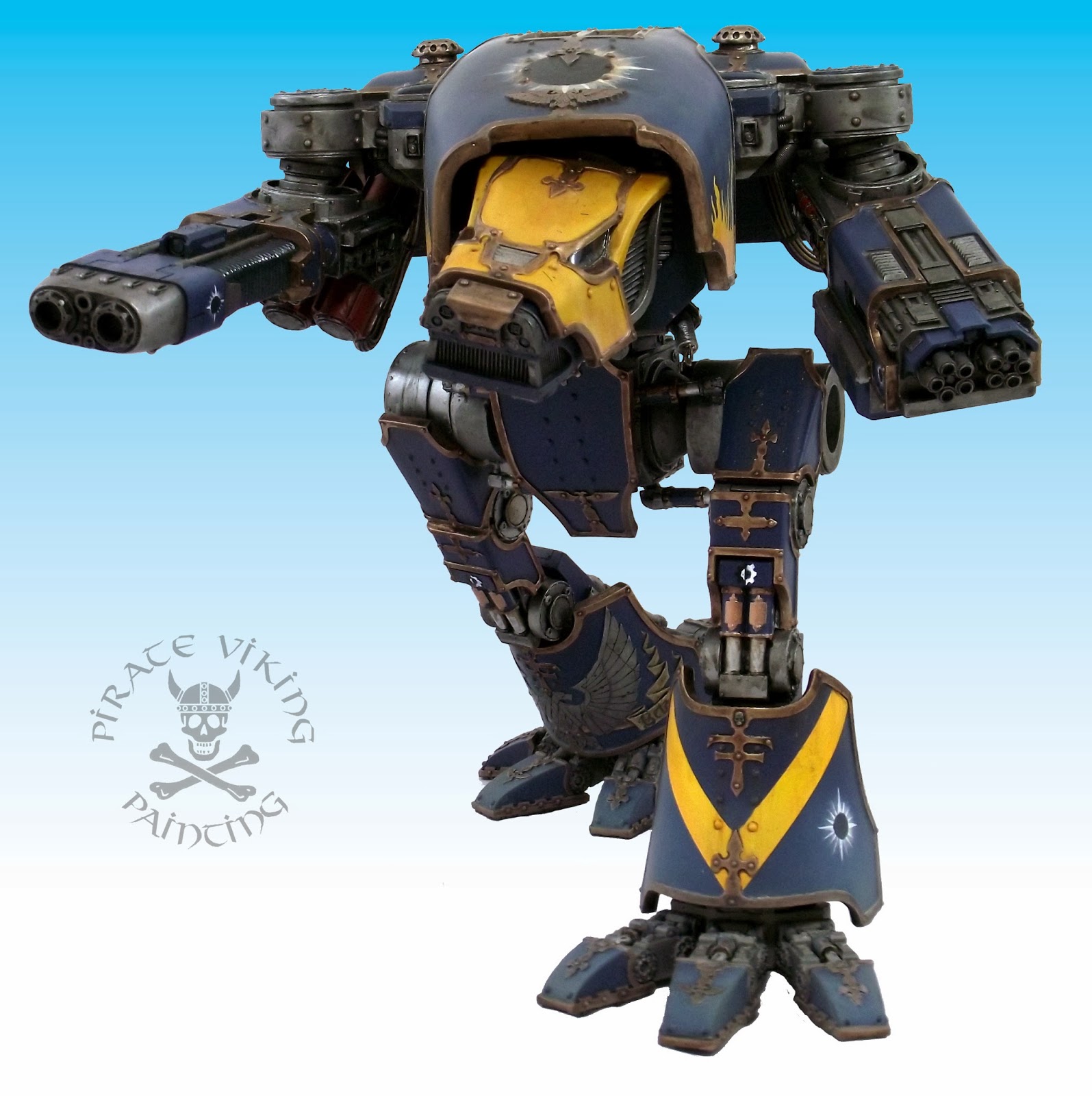
Tuesday, 14 January 2014

In the Navy

Oh! I have slipped the surly bonds of earth...
...And, while with silent lifting mind I've trod
The high untrespassed sanctity of space,
Put out my hand, and touched the face of God.
Excerted from High Flight by Magee


There is something uniquely cool about the concepts of space travel. It evokes that romance of the age of sail with it's dangers, isolation and possibilities. Warhammer 40,000, of course, adds another few elements from the age of sail: brutality; press gangs and ruthless captains. These fine gentlemen are the focus of todays offerings! These are part of the leviathan command crew (I've now tagged all the Leviathan models as such) and represent the two fleet elements that have come together in the client's warzone. We decided that two would be in a classic British Napoleonic navy mode and the other two in an emerald green that we vaguely remembered being associated with the Segmentum Obscurus/Saturnine fleets. I'm afraid I do not know the manufacturers of these chaps so if anyone can illuminate me I'll re-edit to include the original manufacturers.


First up is the hawkish figure that I was referring to as The Admiral in my head while painting him. He's an older, gaunt, severe looking chap and well suited to the image of the senior officer. For the classic Napoleonic look I needed dark - almost black - blue dress uniform jacket and cream-white breeches. The blue-black really is practically black, I just mixed a drop of Val Prussian Blue into the black and then added The Fang for highlighting. The Fang a blue-grey for those unfamiliar with Citadel's current daft naming, honestly, The Fang, not The Fang Blue-Grey, just The Fang. Unless you are intimately familiar with the backstory of the Space Wolf chapter of Space Marines then this is meaningless. Sheesh!

The cream breeches are the same method of the wraithbone from the Corsairs, i.e. Zandri Dust mixed with white and highlighted with white. See? Solve one problem and open doors in the future. The trick is remembering all these mixes and tricks and the blog has been invaluable for that. One feature on this chap that I'm really happy with are the fairly naturalistic ostrich feathers. They're all over the place in empire armies and the like and I'm starting to warm to the idea of painting them undyed. This method uses Val Deck Tan and Val German Cammo Black-Brown (two really useful paints) shaded with Agrax Earthshade and rehighlighted with the original colours. Creates a lovely soft natural tone.


From the same fleet we have this chap, who I had in my head as a fairly recent promotion. He cuts a rakish, dashing figure and put me in mind of a hard charging ex-frigate captain recently elevated to the captaincy of a capital ship and thus a presence at this table. It has just occurred to me as I type this that were we to be doing this project for a diorama these fellas could have been painted glowing green to be hololithic projections around the command table while still being aboard their ships. Hmmm..... thinks.

Anyway! This paint scheme, focus Jeff! Something to mention about all of these models is that they have simultaneously incredibly dense AND incredibly fine detailing married to average castings. This is not a useful mix. The hair on this gentleman for instance is painted on despite having sculpted hair. It was so shallowly and finely sculpted that neither wash nor drybrushing could pick up the texture finely enough. Likewise, lots of the dense decorations and honours on the others might as well have been flat discs for all the help the sculpting gave to the painter. There is a reason that things tend to be a bit scale exaggerated at 28mm.

This photo just about manages to show the difference in tone between the blue-black uniform and the grey-black cloak (Val German Grey washed twice with Nuln Oil). Those highly complex areas of braiding at the corners of the uniform jacket were essentially painted as solid colour (my fake NMM) and then washed with very, very thin washes of the uniform colour in order to define the braid.


Speaking of braid, this chap is covered in it! Those tiny little tabs on the lapels - not, I have to report, brilliantly cast - were properly fiddly but very worth doing. We've moved into the Saturnine fleet colours, the green being bog standard Caliban Green highlighted with increasing amounts of Warpstone Glow. You'll notice on the other models that I've used the green as a spot colour and of course the red sashes. Here the dark blue-black is the spot colour. The upshot is that the four of them hang together quite nicely despite being very different principle colours. The other change is a reversal of the cream-white breeches and grey-white socks/gaiters. With the green I have used grey/white breeches as another change that nonetheless binds the models together.

I think this one is quite the vain individual. The coiffured hair and fine cravat speak to this but also, in 40k at least, the odd, flat face can be explained as repeated juvenat treatments. Quite the dandy I think.


Finally a blatent Nelson - although with a weirdly sculpted upper lip which became a mustache. When divvy-ing up the models I deliberately assigned him to the green pile to further diminish the Nelson look. The normally tricolour decorations on Nelson's uniform were retained but the traditional blue swopped out for imperial black. The black/white/red thing is very 40k Imperial and helps to make him more of a 41st century gent.

Hope you're all enjoying the Leviathan series, I certainly am as the variety is very much spicing my life. The Eldar are still rolling but these bright peacocks are really helping the corsair uniform scheme. More soon!

TTFN

Tuesday, 7 January 2014

Imperial Officer Corps

Here we are folks, first finished models of 2014.


These are from a whole bunch of Imperial-type chaps that are forming the command staff for an entire warzone. My client envisions them clustered around hololithic map tables on a Leviathan. Heck, he might even be making the leviathan!


First up, we'll check out the Vostroyans. I love these figures. If only, if only they'd been slightly affordable for the purposes of building an army. Metal figures and the massed infantry of the Imperial Guard don't make the happiest bedfellows. The briefs for all of these guys are fairly brief - love this, gives me huge artistic licence - and in this case was just red with green accents. The red is the normal Mephiston Red highlighted up through Evil Sunz Scarlet and Troll Slayer Orange. Greens are in short supply in the new range but Caliban Green mixed with Warpstone Glow doesn't make a bad shade. Armour was a point of musing, thought about painting it as, well, painted but the colours were giving me trouble. Adding more red to the model was a possibility but then red armour can look a bit naff and non-martial unless you do a lot of weathering or it is the dominant feature of the model. Green would work but would make it a dominant colour rather than an accent. In the end, bare steel seemed to be the win! These days I paint worn steel by first painting with Army Painter's chainmail substitute Plate Mail Metal then giving it a thin wash of a 3:2 mix of Black Ink and Brown Ink. The inks don't change either the shine or the tone as much as the washes.


The frogging down the front I felt needed a spot of colour other than green. As there was a lot of brass details on the model I thought gold thread would work. It was painted with my not-at-all-non-metalic-metal gold which I only use for fabric (not a fan of the overly cartoony effect from any NMM that isn't absolutely perfect). Last thing to mention on these chaps is the leather. The Vostroyans were absolutely crusted with detail. This is ace but can sometimes be incredibly busy. The armour could have had the eagle painted different colours, the pouches could have had the wing picked out. But these options would have distracted the eye and made the overall shape of the model harder to see. Instead I just highlighted them as either leather or steel. The sculpting is enough to make them a feature so you don't need to pick details out all of the time. Just a thought...


Next up, a pair of Heresy Miniatures trooper officers. I kinda wish all the troopers in Heresy's range looked like this, with the greatcoats. I know it marks the officers out but it is a really cool look and I much prefer the officers to the grunts. Just my preference. The brief for these included the words "shiny white armour, like a stormtrooper". So I went with it! The troopers in Star Wars are actually wearing a black bodysuit with the white plates attached to it. These chaps most closely resembled the Scout Troopers (the bikers from Endor in Return of the Jedi) so perversely there is quite a lot of black underneath the shiny white. I decided that the trench coat needed to have a bit of tough and grizzled about it to make them a bit more 40k so I broke out the leather.


The second trooper had that grizzled campaigner look about him so the client had asked for the armour to be more dinged up. Cue a sponge and some Vallejo German Camo Black-Brown for initial chipping with Army Painter Gun Metal in the biggest chips for ground shiny bare metal. A word on the armour, I tried a new-ish way of painting the white this time. A clean coat of Ceramite White is then counter shaded with layers of increasingly dark grey washes. Needs some practice and tweaking but it was easier than trying to cleanly blend up.

Well, that's it for today folks. I've got some Eldar vehicles on the workbench and will be bouncing between them and more normal painting on the Imperial Officer Corps in order to not destroy my wrist on the hexes.

TTFN

Wednesday, 1 January 2014

Happy New Year Folks!


Yep, it’s that time again, 2013 has shuffled off and we have a whole new integer. In fact, as the third millennium AD is now fourteen years old it is on track to be starting to slam doors and tell us it hates us. Painting bedrooms black is next year.


So, as has become somewhat traditional here it’s time to take stock of the year gone and think about the year ahead. 2013 has been the most stable year for Mrs PVP and I since this blog started. At its inception we were living with friends, last year we had two house moves within 6 months. This year? Quiet, stable, nice. It shows up in the Pirate’s Progress numbers, 2012 had 285 models painted over its course. 2013 has had 388 models painted; three of those were titans…


It still only counts as one!

Yeah I know, probably worth about 30-50 figures, but when I decided to start tracking progress like that I figured that it would be too much of a pain in the neck to figure out equivalences! The blog itself has been doing well, audience numbers continue to rise, thank you ever so much. Especially to the now 215 of you who follow PVP and all those who left comments this year. It’s harder now to track whether anyone is really reading, as there are click-baiting advertising sites that spam your page with views in the hopes that you will follow the link back to see where the surge in traffic has come from. As a result, it is only by knowing that there are followers and commenters out there that I really, really know that I am not just broadcasting to an empty room!

Bet you thought I’d forgotten this right? Wrong! All this year Operation Remove-A-Toddler-From-Jeff’s-Waistline has been in action and it has paid dividends. This time last year I weighed 137.1kg (that’s 21 stone 8 lb or 289 lb for readers over the pond). I had a visceral fat (the fat that clags your organs and well, kills you) score of 21 which was off the scale for assessing healthy. It wasn’t the worst I had been – I almost hit 24 stone at one point – but it had been stable for too long.

Today I weigh 118.8 kg (18 stone 9 lb or 261lb). One pesky pound off losing three entire stones this year. That’s the average weight of a four year old child. Frankly, I am feeling good about this! My visceral fat is still too high at 17 but it is now on the charts and heading in the right direction. Need to lose at least another two stone before I feel content (I’m built like a rugby prop forward or an AFL line-backer, almost 50” chest and all so 16 stone will feel right) but damn this has been promising. So with that out of the way, let’s see how I did on the ol’ resolutions huh?

Judge Mulder now in session
So last year I resolved to:
  1. Take part in the Beard Bunker's Next Big Thing for 2013.
  2. Finish (I.e. workometer full) an army project from this list: My Flames of War Paratroopers, My Night Goblins, and My Warmachine Cygnar.
  3. Paint a minimum of six bases of Waterloo Napoleonics this year or abandon the project in 2014. No more kidding myself!
  4. There will be a gaming table in Mulder House (PVP headquarters).
And for the blog/business:

  1. Like last year, no dry spells, hobby content all the time.
  2. Put out more video tutorials, maybe one a quarter. So 4 by 2014.
  3. Take the time to improve skills, airbrush, sculpting etc.
  4. Produce at least one product I can sell.

So how have I done? Well, on the personal front, the Next Big Thing for the Beard Bunker didn’t really happen, we were all enjoying the ongoing campaign and had had rather a falling out of love with 40k for a while so nothing much of an organised nature happened there. We’re fixing that for next year as we know now we do sooo much better with a plan!


Finishing a workometer: Well, this one went better, I am now just one unit shy of the original 2500 Night Goblin army and in fact have added more stuff to it. I’m loving my gobbos and these lads will continue to grow. Flames of War had absolutely nothing done to it. Not a sausage. I might have hit my limit on 15mm stuff for the time being. Mojo will doubtless return at some point. The Cygnar I am selling so I think we can all see what the deal was there but hey! Goblins! 

 
Yeah, so nothing at all was done on Napoleonics, time to box that project for a little while. I love the models so I am sure that the urge will rise again. Trouble is they are a massive effort/reward ratio. In the time to paint 10 Brits I can paint 50 gobbos. With personal painting time limited the choice becomes a tough one. This is going to change (see below) so I imagine the lads will be unboxed at some future date and run with.

Finally, gaming table, yes! I have all the components I need now, I just need to get it painted and flocked and it is ready to go. I had a hugely over ambitious plan earlier in the year which has come down to a sensible: Get a Suitable Surface For a Realm of Battle Board Ye Prat. This has happened so there will be movement on this over the next year too.


The business resultions took something of a beating. I don’t think I left any gaping dry spells – although the flare up of my RSI was an annoyance. The video tutorial thing turned into another effort/reward gap. Each of the videos I’d done before has had a couple of hundred views. The text and image based tutorials by contrast are in the thousands. It takes hours to produce one YouTube tutorial, minutes to type one. Unless I run into something difficult to describe I think I’ll be sticking to text. 

I have certainly taken the time to improve my skills. I’ve used the airbrush a lot this year and while I think it will never be a primary weapon for me it is a valuable tool in the box. I’m much more comfortable and confident with sculpting and increasingly reach for it to get exactly the model I want. Still not at producing whole figures Charlie style but getting there…

Now the last one, produce something to sell kinda brings me on to the problem with 2013. I tried a couple of different routes to making things. All were dramatically out of affordability. Even with things like kickstarter I don’t think I could have done it. Kickstarter has kinda been ruined by all the established companies using it as a hype generator and pre-order system. People aren’t investing in things that don’t give them endless stretch goals and the like and I don’t blame them. There is only so much hobby wallet out there and it has to go where we will get the most benefit.

Speaking of wallet. Sadly, after three years of building PVP I have had to acknowledge that I simply cannot paint fast enough to make the business a viable source of primary income. I’m going to do a proper post on the experience of being a painter for hire – and it has been a really good one – but I have been working full time hours for far less than minimum wage for too long. We were ok initially, but three straight years of inflation beating wage rises and ridiculous bumps in things like the price of energy means that we are struggling to cope just on Mrs PVP’s wages month in month out. As a result, the painful decision has been made that I have to return to the ol’ gainful employment dance.

Don’t feel sorry for me, the last three years have been ace but our government hasn’t done well at making the “recovery” work for normal people and we’ve finally hit the tipping point. I have committed to one final project after the Eldar are done and will be wrapping up the business April time. The site will remain though it will mutate to be simply my own hobby on screen. How this works we will see. Obviously I’ll have simultaneously more time to work on my own stuff and less time as I have to, y’know, work for a living. We’ll see how it goes.

So with that, 2014!

I’m going to keep the objectives very, very simple as frankly, it works better that way. In 2014 I shall do the following:


  1. Support the Beard Bunker in 2014’s Next Big Thing (there will probably be a new Warhammer army in this, I’m torn between Nurgle, Dark Elves and Empire at the moment)
  2. Wrap all professional obligations in the first third of the year. Close PVP as the business and mutate the site into my personal hobby boudoir.
  3. Get the gaming table ready and play AT LEAST one game in my own home.
  4. Continue the fitness quest and add in more exercise.

That’s it. I think that’s do-able! To finance some of these I shall be selling off some of the stuff I have gathering dust. This will include some 54mm Inquisitor bits so keep your eyes peeled Inquisitor fans!

TTFN

Monday, 30 December 2013

Corsairs and Scorpion Lords

Ha! I wondered whether I would get these lads finished in 2013, and I did! Just... ;)


Today is the turn of the Guardians to have difficult-to-focus-or-colour-balance photos taken of them! Mostly, they are nigh on identical to the Dire Avengers and the Corsair Guardians. I think they'll all hang together quite nicely on the table. Of greater interest is the grav platform:


I did a tiny bit of head scratching on the grav-platform. I wanted the thing to hang with the army but not just be uniformly grey. After a few minutes it occured to me what I was looking at. A teeny, tiny corsair vehicle. With this notion I treated it exactly the same as all the other Corsair Grav Tanks. Even down to the hex panels. It seemed to work rather nicely.


Our final offering today - indeed for 2013 - is this Chapterhouse Striking Scorpion Phoenix Lord. This is one of the better Chapterhouse models, the pose is nifty. Of course that isn't saying much, not much facial definition, legs different sizes and irregular sculpting (lines are different thicknesses along their length for example). However, enough carping. We replaced the original chapterhouse weapon with the citadel striking scorpion exarch weapon. Much better, check out the original and see what I mean:


Fortunately the citadel one fit fairly well. I needed to resculpt a bicep and fill in a shoulder blade but mostly fine. The pose works very well with the weapon. Looks like she's crouching behind a barricade ready to spring up and decapitate some unsuspecting human. Painting wise, I was left with very few choices to make. The grey armour was taking care of itself. The red hands needed some balancing with the ridges on the shoulders - as the model lacks a helmet and thus lacks a red faceplate. Just like the Prince Yriel model I decided to use the Wraithbone basecoat (Zandri Dust and Skull White mix) for the hair. All in all, straightforward! Although I did need to put some effort into defining the facial features. Would have been a bit flat featured otherwise.

And with that, 2013 is done! I'll be doing a new year post in couple of days but until then, I want to wish all of our readers a happy, enjoyable and safe New Year's Eve. See you in 2014!

TTFN

Thursday, 19 December 2013

Lord of the Corsairs

Ahoy me hearties! Set sail on the sea of stars and fall upon those worthless humans like the wolves we are, solar sails set and this guys hand on the tiller:


Yep, today's offering is Prince Yriel, recast as a Corsair Autarch complete with nifty wings, all the better to join his men. I've always loved this figure, right from the moment they released him. I worked for GW Oxford at the time and we even chose Iyanden as the store army just to better fit in with him. So the chance to paint one as part of the corsair force was a treat.


The first thing to fathom was which colours were going where. Initially I thought to make him stand out more from the pack and use red on the coat. I was worried that the shades of grey would blend together. Trust me, this didn't work. So instead I launched into plan B. The coat would be a darker shade, the armour plates lighter. The metallic red alternating feathers would provide enough bling for him. For reference, the wings and the main body of the model were painted seperately. It would have been madness to stick them on first. One more note on the coat before we move on. Yriel has lovely brocade-esque detailing around the garment, this created a problem as the dark and brooding thing was working. I didn't want to introduce another colour - the only options from the pallete being turquoise, bone or red - as it would have dramatically changed the tone of the model. Instead, I had a brainwave. I darkened the detailing to black and added a layer of gloss varnish. This created a contrast of texture rather than colour and while it looks ok in photos it is lovely in real life.

Speaking of turquoise, eagle eyed types will notice that the sash around his waist and the band around his arm are also a dark shade of turquoise (Stegadon Scale Green with a Coelia Greenshade wash and some highlighting if curious). This allowed me to subtly break up areas of detail without drawing the eye from the main foci - face, spear, wings, that gurt great gem on his chest. Using a darker shade of an existing colour from the pallete is a neat way of maintaining a colour scheme while minimising areas of detail that you don't want to pop out.


While there isn't a whole lot of painting to talk about on it I just had to post a picture of the spear tip. It's been my favourite part of the model for ages. Of course it's actually a halbard but then most GW spears are anyway ;)


Now, the picture above may look a bit mad but it illustrates something that I talk about from time to time, balancing colours across models. In this case the red and the bone were important. I knew I wanted the wings to alternate red and grey feathers so I needed some red low down on the model to balance that. The lining of the coat, darker, but the same hue took care of that. The outstreatched hand was also balanced by making the ribbons hanging from the weapon red. I thought of turquoise or grey but it needed that balance.

Simarily, the spear is huge and occupies a lot of the model. While I was pondering hair colours it occurred to me that I could balance the spear accross the model by using the tyranid bit on the base and his hair. You wouldn't think to look at it but the hair is the exact same colour as the spear. It has just been treated differently afterwards. In this case a wash of Agrax Earthshade rather than Seraphim Sepia changes it juuust enough. The tyranid bit is different, it's Karak Stone but the colours are close enough to work. This is the sort of process that your brain goes through automatically when you've been painting a while, you instinctively balance things or at least know when something is "wrong". But every now and again - like the hair - you stop for a moment trying to figure out what to do. It is then you shift from instinct to an active process and start mentally drawing triangles all over the place! Most colour decisions on my models are made using a mix of this process and a colour wheel.

Anyway, that's all for today folks, the guardians are nearly finished and will be up on the blog very soon. But for now.

TTFN

Tuesday, 10 December 2013

Hammer of Daemons

While the Grey Knights range - and indeed my army - have been reinforced with power armoured troops, dreadnoughts, huge walking thingies and the like. There has always been just one true pattern of Grey Knight. The Grey Knight Terminator.


I'm going to go out on a limb here and say that these are my favourite terminators in general circulation (the space hulk ones are my favourites). They're just so well designed, the poses are natural and if you pick the right componants in the right places they're dynamic too. Like the power armoured lads, their details are crisp and nicely cast - the script on the shoulders and knees is excellent - and their weapons look even more badass than the power armoured chaps are! These have actually been hanging around for a while, painted before my wrist started hurting again but lacking a couple of highlights and basing. So I finished them off! Lets take a closer look at some of them.


As with the power armoured ones, the daemonhammer is the only slightly disapointing pose. It always looks a little "weak". I know the huge shoulders cause them posing difficulties but slung over a shoulder or planted on the ground might have looked better. I went for "turned sideways urging the men into battle" as the only viable option. Nice, but not as nice as:


These two are awesome. The two handed grip on the haft coupled with the moving feet makes for a lovely dynamic pose. The one on the left seems to be shifting his weight ready to step forward with his right foot and pivot through it to deliver a savage chop. The one on the right, winding up to strike with the butt-end of the weapon, driving his target back to open room for a chop or stab. It is this sort of thought in sculpting - and careful experiments in dry fitting and part selection - that can make or break a miniature. So many of these models end up looking a little stiff or awkward where a few moments work experimenting with rotating waists and altering head positions can make all the difference. Stand up and get into the pose the model is in. If it is not comfortable or stable then the model will always look awkward. It's why models with poorly sculpted centres of mass look like they are falling over. You know instinctively where a body should be to be stable.


The psycannon was a tiny conversion. I didn't like the passive arm it is designed to go on, I wanted a much more action-packed pose. By trimming some bits to help the fit I was able to get the cannon on to the aiming arm and by putting it on one of the braced pairs of legs I was able to give a nice impression of the Grey Knight lowering his weight, bracing himself and then letting rip with a savage volley of gunfire. Seemed to work!

You'll notice that I talked about posing a lot this time rather than painting. Two reasons why, first, I talked about painting these guys extensively in the power armour article and not a lot has changed since then. Secondly. I really believe that we overlook posing at our peril. Too many of us race through assembly and into painting to get them onto the table. Well, the best painting in the world will not change a bad miniature. You cannot make a silk purse out of a sow's ear. When the miniature is a solid, totally sculpted one then you kind of have not a lot of choice. When it is parts that you assemble and pose yourself? You are doing your collection a great disservice not to spend just ten more minutes experimenting and acting the prat standing in poses. Heck, we spend enough money on them. Lets make 'em good. Until next time folks.

TTFN

Tuesday, 3 December 2013

Shoulders of Giants

Hi folks, get the reference? Well, let me help, today is all about the people who guide the fate of the Corsairs, the Farseers:

If we have seen further than others it's cos we stood on the shoulders of giants...
So, unnecessarily niche Newton quotes aside... These pair are a GW farseer (left) and a Chapterhouse farseer on the right. Now, this model seems to no longer be available - probably as a result of the legal wranglings between Chapterhouse and GW. I really, really don't want to reignite the debate here so I'll just say I have no problem with "totally not a one-of-those" style models where a nod and a wink is enough to indicate a homage. Chapterhouse straight up steal. They use the race names and even unit entries. That's just out of order in this humble bloggers opinion. I think GW go too far sometimes where their IP is concerned but I could not blame them for a moment going up against Chapterhouse. Call 'em armoured space elves and provide alternatives. Call 'em Eldar and you've crossed a line from nod-and-wink homage to theft. My twopennethworth. Not that it means a damn thing! Lets talk more edifying things. Painting models!

trying a new on-table lighting set up, pics are a bit stark this time, continue the research Igor!

With these, the challenge was to differentiate the areas of the model without loosing the overall feel of the colour scheme. I knew that I wanted to have predominantly grey robes as I had already started down that road with the warlocks. The trick was adding red contrast while minimising the visual impact of it. The descision eventually boiled down to the inner robes being the best choice. They're mostly covered by the wraithbone runic "circuitry" and stuff like bags and cloths. The robes and the armour, while both starting from the same colour were treated very differently, with the robes being shaded almost to black and the armour recieving nice stark highlights. The effect is a differentiated model while retaining the pallete. The by now familiar wraithbone and turquoises do their work balancing and contrasting the red/grey and leaving a rather attractive finish. Certainly the model that I am happiest so far within the Void Dragon scheme.


So, on to the Chapterhouse farseer. First thing to note is how boring the back view of both of these models are! C'mon, some runic stuff would have killed the designers? Anyway, minor gripe over with. I sharpened the sword as I mentioned in the warlock post (farseers spear too) and set to painting. Turned out to take about half the time of the Citadel one as there really weren't all that many detail areas to worry about. If you were looking for a clean canvass for some freehand work, this would be your man. The vane things on the helmet had a couple of different colours used on them before giving up and going for plain grey. They just are so out of scale with the rest of the model that calling too much attention to them makes them look weird. In situations like that, minimise the impact of the part by using the same colour as the majority of the field and have a nice strong adjecent area of colour to draw the eye away from it. Happily, in this case the face was perfect for it!

There isn't much more to say about these fellas. Guardians and Wasp walkers this week. Pictures, as always, coming soon!

TTFN