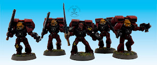
The first thing regular readers will notice is the swanky new backdrop, now I am still torn, I like the clean white I normally use in shoots but this seems to make the pictures richer somehow. At the bottom of this post I have included two identical shots with the only difference being the backdrop. Please tell me which you prefer, I need input! Anyway, on to the models! The Sternguard were a nice unit to paint without being terribly remarkable, possibly something to do with them being single pose metal models. When I was pulling up areas to showcase there was only one stand-out model available:
This fella uses all of the advice I gave in the scroll painting tutorial to make a nice looking scroll - or oath of moment if, like me, you have been completely converted by the Heresy series! Sharp eyed readers will also have spotted that the markings on the knees of this unit are that of the 1st tactical squad of the 3rd company. My reasoning for this is that I have always seen the 1st squad of a company as being the one to aspire to, so who better to occupy that position than some Sternguard veterans! I am still toying with whether the Vanguard vets that I have in the 3000 point list will be the other half of this squad or the other half of the 2nd Assault squad. Ideas folks?
Speaking of Assault Squads, this is the second half of the 1st Assault Squad. I split them in to two squads for rules purposes - i.e. a power weapon in both - I'm rationalising this in my usual fluff style by remembering that Space Marine squads used to have a Veteran as well as a Sergeant, kinda like a corporal, and that in the books there always seems to be a couple of guys in each squad who fight with unusual weaponry. The sergeant was a lot of fun in this squad, I feel I am finally getting the hang of the power swords:
Also the shoulder pad that I chose for him looks ace as in a Sergeant's colour scheme and reinforces that "veteran" thing by having more red on it than normal.
For those who are curious, "Elioud" is the name given to the children of renegade angels called the Nephilim. With this squad completed that is all the assault marines for the entire army painted! Phew, no more normal jump packs. Don't know why but in the same way as bikes they seem to add a whole extra model to paint! Takes ages but done now! You might remember the Assault Marine with the two swords from a previous post, well, here is his equal and opposite:
I love this guy, he's got such a John Woo thing going on, you can imagine him using the Gun-Kata from Equilibrium (great - if daft - film by the way). Just another example of my taste to include non-standard armaments in units.
Well, that is all folks, the Blood Angels are alarmingly close to being finished (up to 2000) which means I am ever closer to attempting a non metallic metal Captain Tycho, cue dramatic chords. Here is the project planning sheet as normal and then the two Sternguard images, do please let me know which you folks prefer. The comments are open to all these days and I aim to please!
TTFN


You are right, the back drop does make the image seem richer. The white is a much harsher background and I personaly perfer the richer side of images. But thats just me I think this is a personal taste one.
ReplyDeleteQuick question, how did you get that backdrop to work I've been tinkering but can't get anything as good as that.
Oh and before I forget completely, awesome blood nagels, i am working on marines of my own, we shall have to meet up at some point and have a rumble as dispite the number years knowing each other, we've never played a game wierd huh?
Love the new background.
ReplyDeleteThanks folks, I think I prefer the blue as well.
ReplyDeleteLongbeard: The background is the result of careful fiddling with photoshop as the blank white backdrop is still best for photography, just not the best for presentation. You need the blank white to balance the colours in the image first. Also, I cannot believe that we haven't played but thinking back I can't think of a single instance. This must be rectified! If you are ever Cardiff way there is a totally awesome game shop called Firestorm games that has 30 tables out back. Come on down, the rumble is right!