Saturday, 23 October 2010

Heavy Metal

Greetings all, this week has been something of a hobby non-entity. Family matters have kinda killed my hobby mojo (get better soon Grandad!) and while I have got stuff done; nothing is finished for photography. So I present an older army, my Imperial Guard, the glorious Gethsemanite XVth! This time we will focus on my favourite element of the guard. Their armoured vehicles. So here are the tanks of the third company:


The colour scheme for the army is Charadon Granite and olive drab green (Catachan Green with a Badab Black wash). The tanks add black and a thin Khemri Brown stripe to the mix. The painting starts with a mix of black and Catachan Green drybrushed up through Catachan Green and then a Catachan and Rotting Flesh final highlight. The broad bands of Charadon Granite are painted on and drybrush highlighted with Charadon
and Khemri Brown mix. Next comes a thin stripe of Khemri Brown to break up the quite similar green and brown. Finally thin short bands of black (with a little Scorched Brown added to soften the colour) are painted following the line of the Khemri Brown. The metalwork is painted with Jeff-rust. The weapons are painted the same way as the rest of the army. I wanted to achieve a black anodised look to the guns - imitating the look of modern firearms. This was achieved by painting the gun barrels black and adding thin edge highlights of chainmail to the edges of the metalwork. Once dry a quick gloss varnish brought up the shine and finished off the effect.


Once the painting was finished the weathering - my favourite part - could begin! Now I talked at length about tank weathering in a previous article. These models take the process much, much further. Instead of running the wash into the panel lines I sloshed a very thin Scorched Brown wash over the entire tank. Gravity takes care of pulling the wash to the lower reaches of the tank, it really does look dreadful until it dries! Have faith! I then used the same dust drybrushing as on the Blood Angels razorback. The main difference between the two methods comes before the wash stage. When doing the chips and dings there are some large areas of scoured metalwork (noticably the dozer blades and track guards) that are painted with streaky drybrushing of Jeff-rust.


This old model Hellhound showcases the dozer blade scoured metal quite nicely. I intend to be replacing these with the gorgeous, gorgeous new versions eventually. This design will become a Banewolf as the external tanks seem a good idea when you have filled them with corrosive man-dissolving chemicals.

EDIT: Totally forgot! The tracks also have a wash of Forgeworld's masterclass oil wash (brown ink and gloss varnish) which gives them that nice "heavy machinery" look.


The Chimera below has had quite a lot of small conversion jobs performed on it. The first is the track guards, ordinarily the GW track guards only cover the first quarter of a chimera's tracks. This seemed a trifle silly so I cut the slanted edges off the long "angled" track guard and attached it behind the others.


The second small conversion is on the lasgun ports:


I don't like the lasgun "hedgehog" on the unaltered kit. I know that the idea is to show that the chimera interior is a sealed unit but I prefer to show the squad using their own lasguns to fire out. I decided to make shutters that the unit would open to fire out of. This was achieved with a couple of small bevelled pieces of plastic-card per opening. These were glued behind the opening before assembly.


The pintle-mounted heavy stubber showcases the black anodised effect on the weapons nicely.


Finally some sentinels! These show the squadron markings quite nicely: the coloured triangle denotes the platoon that the squad is attached to, the squad is identified by a greek letter (in this case sigma) and a number to show the position in the squad. For anyone thinking of playing Imperial Guard consider a squadron of sentinels with autocannons. They are fast and manouverable and can get behind other armoured vehicles easily enough. An autocannon is fine for dealing with thin rear armour and scares infantry a lot more than the single shot lascannon. Well, that's all for the armoured showcase! Hopefully my mojo will return soon so that the next update will have shiny new models!

TTFN

Wednesday, 13 October 2010

Children of the Emperor

Here's some shots of the latest commission work! These Emperor's Children were painted with the brief of "classic pink and black". Now pink is one of those colours. It is as difficult as white or yellow to get a smooth coat and is really hard to cover mistakes. This pink was produced with a basecoat of several thin layers of Warlock Purple. The pink was then built up with sequential layers of Warlock Purple and Skull White mixes.


The layers were then blended together with a couple of thin glazes of a Baal Red and Leviathan Purple mixed wash. The recesses were then deepened with the addition of more Leviathan Purple. At this point the models looked more like Barbie's First Space Marine, the pink needed breaking up. I decided to do this with individual patterns of black over the pink. Flames, dags, stripes, thorns, lots of different options for decoration. All of the detail shots below show the patterns I chose for the first five. Weirdly, the models looked fine to the naked eye but the camera shows lots of areas where I will have to go over again with the pink!


That's all for this update. Tossing a coin now to decide whether to paint the next five of these or to launch into the Alpha Legion rhino I have got on the workbench for the same client. Hmm. Choices, choices!

TTFN

Thursday, 7 October 2010

Librarian Conversion

Hi all, the Blood Angels army rumbles ever, ever on (although the Dark Eldar are pulling at my hobby magpie so hard that I have issued edicts to my missus that if I even look like buying them I am to be hit with sticks). This time it is the turn of the Librarian of the 3rd company. For those unfamiliar with Space Marine terminology, Librarians are the psychic warriors of the chapter, they are also responsible for cataloging the chapter's history and accomplishments, hence, Librarian. Think of them as space wizards and you won't go far wrong! As always choosing a model for a character that you will only have one of is a lengthy process. I like most of the current Librarian models - love the terminator one, have to find an excuse to use him - but each has something that I wanted to change. Finally I settled on this one.

Trouble is, there's something on him I don't like as well. The book in his hand is very nice but seems to defy gravity, the pages are stiff, the bookmark wrong somehow. Despite that he is a gorgeous model with just the right stern, calm feel that someone who feels the laws of physics are better off as guidelines should have. I decided that swapping that arm out would give me my own unique model and give me a chance to personalise him with blood angel heraldry. A quick search on "let the dice decide" yielded the parts I needed (for the curious, a left handed bolt pistol arm, the "wait signal" scout sniper hand, a blood angel shoulder pad and backpack). The bits arrived commendably quickly and I got to work, and here he is!:


I wanted to portrey the Librarian as casting one of his powers, a roilling, coruscating bolt of pure psychic energy, compare and contrast the original model and this conversion to see what a difference this reletively minor alteration makes to the feel and tone of the miniature.


 The proceedure was as follows, first, remove the bolt pistol hand from the arm at the wrist leaving a clean cut at the wrist cuff. Attach the scout sniper hand with plastic glue at about 2/3 up the cuff and at a slight upward angle. Attach backpack and shoulder pad. Leave the glue to cure. Then drill a pilot hole into the cuff at roughly the halfway point, make it a good deep one as it will be supporting all of the rest of the work. In to this pilot hole I inserted a length of wire and superglued it in place. I then chopped the wire to length - eyeballing how long I wanted the energy burst to be. Again, leave to cure, superglue may stick instantly but it needs a good quarter hour for all the chemistry to be over and the bond to be secure.

Next came the sculpting of the energy bolt. I wanted to try out a new product - to me anyhow - Squadron Green Putty. Unlike the "green stuff" I am used to this comes ready mixed in a tube, you just squeeze it out and go! I smeared it along the length of the energy bolt and then went to town with a scalpel blade teasing out tiny threads of the the putty to create lots of small spikey voids. This is one of the strengths of doing your own sculpted parts, you could not cast this effect, too many undercuts. The model would never release cleanly from it's mould. I made sure that the splash covered all of the join between the hand and wrist and also washed back along the wrist. I envisioned the psyker conjouring a ball of energy and then firing it at the foe, some of it would wash back at him. Plus it'll look cool when painted!


You'll note some damage to the wrist cuff, this happened when I removed the hand, slightly careless of me. I could repair it with green stuff but I decided to leave it and paint it as battle damaged. On the subject of Squadron Green Putty, I like it but for only certain jobs I think. It has a texture like milliput - slightly grainy on the blade - and dries very fast. It can be filed and sanded so anywhere that needs a perfectly straight edge would be ideal. Unlike green stuff it has almost no shape memory and so can be pushed around more easily. This however is a double edged sword as when combined with its tackiness means that you can pull it out of position easily. I think I will still be using the green stuff for sculpting additions (pouches, straps, hair, etc) and use this Squadron stuff for quick fixes, gap filling and for things that need a random organic feel like this energy bolt. Seems to cure nicely overnight so not too lengthy a process at all.

Now I'll just need to paint him! Oh, and name him... now unusually I am drawing a total blank here. Usually I am fine with naming but he seems to be causing me problems! Hence I am announcing a "name my Librarian" competition. He's in an army with Tycho and Lemartes so something different to those two would be nice. The winning entry gets fame, prestiege and my eternal thanks! Suggestions in the comments please! Finally this week I would like to clue everyone in to an awesome website: http://demonwinner.free.fr/ this is an archive of every Golden Demon winner from every country that they can find! There is some truly inspirational work on this site from the undisputed best painters in the world, I heartily reccomend perusing it. This sort of thing used to make me jealous of others talent. Now it just spurs and inspires me to improve my own work and to try and achieve effects that they have. Oh, and go back just a few years and see what used to be good enough to win Golden Demon. Food for thought!

TTFN

Friday, 1 October 2010

High Elves and K9!

It's been a quiet week on the blog hasn't it? Well, here are the fruits of my latest labours:


I've recently acquired the frankly gorgeous Island of Blood High Elves. I spent a long time wandering the halls of the interwebs looking at colour schemes and combinations. I didn't want to do the stereotypical blue and white but needed a "clean" look to the army. I finally found one that was almost entirely cream, brown and gold on cool mini or not and loved the effect. The effect is very subtle and looks better in real life than in photography but I'm really happy with the finished look.


The colour combination basecoat is Dheneb Stone for the cream, Scorched Brown for the leather and Khemri Brown for the woodwork. The metalwork is simply Mithril Silver washed with a 1:1 blend of Badab Black and Asurman Blue and rehighlighted with Mithril Silver. The leatherwork is worked up from the Scorched Brown by first highlighting with a 1:1 mix of Scorched Brown and Bestial Brown and then a final highlight of Bestial Brown before shading down with Devlan Mud. The cream is shaded down with Gryphonne Sepia and then gradually highlighted up again, first with Dheneb Stone and then with increasing amounts of Skull White added to the Dheneb Stone.


The woodwork is achieved by lining in the woodgrain with a mix of Khemri Brown and Bleached Bone and Khemri Brown and Chaos Black. I just got some new brushes - a brand called Raphael - and they are wonderful for this sort of work. I can't stress enough about how important good brushes are. You simply cannot paint well with lousy brushes, I know a bad craftsman blames his tools but you will never be a good craftsman without them. Shell out some cash (these are £5 each minimum) and then look after them! You'll be glad you did.

The cream would look a bit washed out without at least one accent colour to lift the scheme. I was going to go with a rich purple but thought that it would look weird on the dragons. Instead I figured a strong red would work better and went with it:


The only problem was the sea and seaweed-esque (a word I never thought I would type!) ribbons on some of the sea guard. It needed to work as a "sea" colour but not leap out of the model and alter the balance of the model. As a general tip, if you want a desaturated effect build it from a foundation colour. For this mix I used roughly 1:1 Hawk Turquoise and Adeptus Battlegrey with a tiny dot of Chaos Black. Highlights and shading were done simply with Skull White and more Chaos Black. I've talked a lot about red lately what with Blood Angels and all so simply put; the red on the High Elves is the standard Blood Angels method with a tiny bit of Liche Purple added to deepen the tone. I'm really happy with how the gemstones turned out. It's a tricky thing to explain but I hope to do a proper tutorial at some point. The only part I'm unhappy with is the skin. For some reason I tried to use Elf Flesh again, I don't know what I do wrong but it always, always ends up chalky and a bit naff. Thankfully these are rear rankers and won't be noticed in the unit. I'll be going back to my tried and tested Tallarn/Ogryn/Bone mixes thank you very much!

Also this week we have another in the series of Doctor "Hugh" models that Heresy are producing. I present K9 for your delification and delight!


I decided to paint him in his modern - slightly battered - form, his "skin" is a nice metallic grey tone that I had to really think about how to replicate. I ended up mixing Fenris Grey and Boltgun Metal with a little Chaos Black. Try this mix! It's great! I was so happy with the overall finish that I am trying to find an excuse to use it again. Maybe some truly grey Grey Knights... hmm, something to muse on. Anyway, more K9 pics!


Yep, that's a tartan collar. 1.5mm across. For this I can thank my dear lady wife who pointed out that K9 has a cute tartan collar and if I was being authentic then so would the model! Thanks dear! It turned out fairly nicely anyhow.


So here is a nice group shot of my growing Doctor Who "gang" to finish this post. I've just got the next lot of commission models from my Chaos client - an Alpha Legion rhino and some Emperor's Children Noise Marines - so these will be up soon!

TTFN

Tuesday, 21 September 2010

A basic guide to miniature photography

There has been lots of discussion lately on the subject of photographing miniatures so I thought I would dig my original article on photography out and finish it off with some information on post production. For the most part I am photographing figures to showcase painting rather than for battle reports. I'll let others with more experience deal with battle reports and I'll stick to painting showcase work.

I used to use direct sunlight to light the shots. This is fine in June but even in high summer Cardiff's sunshine can't be relied upon! I thus created a light box to take shots in. Now if you buy a professional light tent/box you will be shelling out an enourmous amount of money. I built a much more Heath Robinson affair:


The first thing to notice is that there is a LOT of light going in to that box. Two 100W daylight bulbs are providing the necessary oomph there. The anglepoise lamps by the way are from Ikea and are the cheapest you can get (£8), I heartily recommend them for anyone with inadequate light while painting. Use energy savers in them for long term painting though as the incandescent bulbs get extremely hot and you will have them near your face. A lot of people diffuse the light by shining it through white muslin or greaseproof paper.  This is to reduce the harshness of the direct light. I've never had a single problem with this as the white box bouncing the light around kills the harshness. Were I to use a coloured backcloth or shoot on a gaming table I would diffuse the light however. The box itself is made of five pieces of A3 Foamcard, simply masking tape them together into a five sided box. Before you add the lid you need to eradicate the lower corner of the box or it will show up in every single photo:


It's a bit tricky to see so I highlighted the curve in red on the second picture. Run a line of double sided tape along the front edge of the box and a two more lines about two inches from the lower corner on both the bottom and inside back of the box. A final line of tape on the top edge of the inside back and you are ready to rock. Don't expose the "double-sided" bit of the adhesive yet as it will make the job harder. Now take a long piece of white paper (I used wallpaper backing as it is dirt cheap) of an appropriate width - it needs to run from side to side of the box. Expose the adhesive on the front line of tape and attach the paper to it, then move back along the rows of tape glueing down the paper as you go so that the highlighted curve is formed between the middle two rows. For neatness I allowed the paper to overlap at both ends and folded them under with a bit of masking tape to secure them.


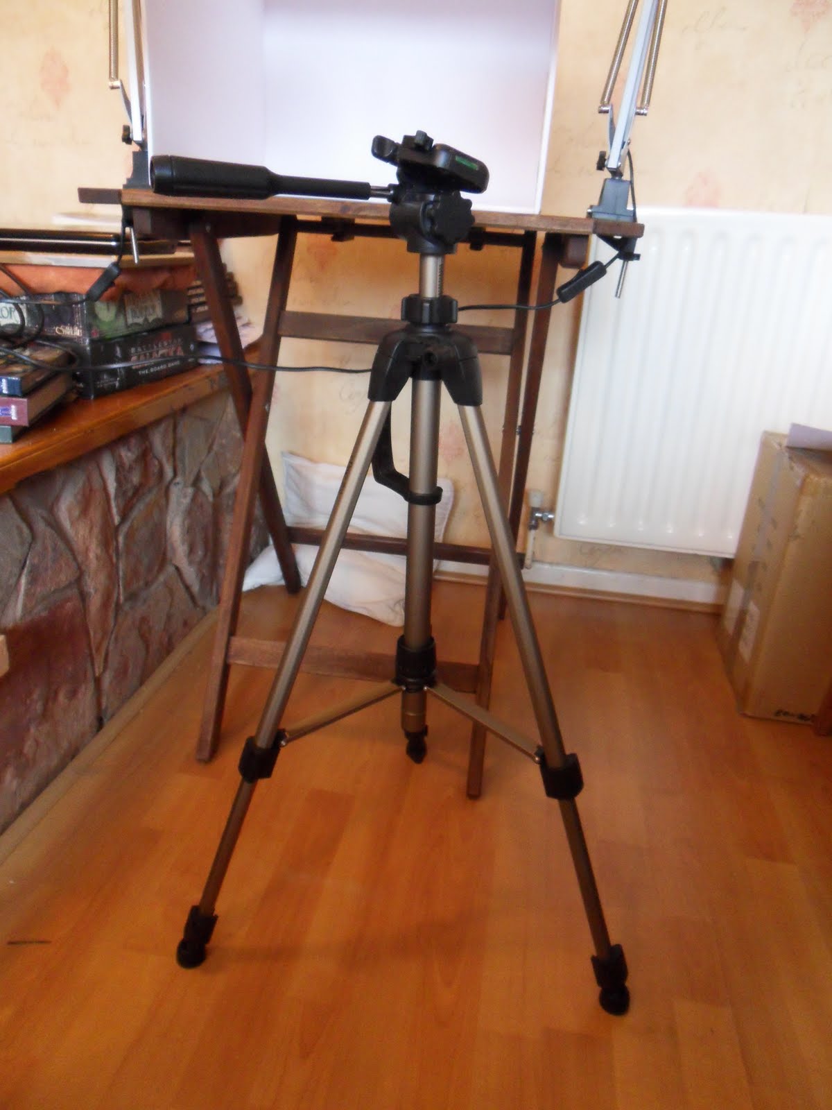
A good tripod is essential to miniature photography. Mine has a spanky feature of a telescoping central bar that you can wind up to adjust the height of the camera. The pillow is an optional extra and doesn't do a darn thing except look messy on photos, sheesh. The tripod eliminates hand shake - just be careful of things like washing machines on the same section of floor, seriously, I have had photos shaken by household appliances! Always use either a remote shutter control or use the self timer feature to eliminate that final human element of the shutter press. For gear-geeks like me: the camera I use is a Samsung WB500. This is an ace piece of kit. The most important feature it has is a 10x optical zoom. Now go look at how much it costs on amazon and then compare some other 10x optical zoom prices! For non photographers out there, the optical zoom is important because all that most cameras do is enlarge the centre of their field of vision to zoom. All this really does is crop the image and thus reduces the resolution every time you zoom in. An optical zoom uses all of the available pixels in the reader and just makes the camera focus all that resolution on a smaller area.

With the gear dealt with I thought I would take you through the process of preparing models for display on Pirate Viking Painting. I've just finished a devastator squad for my Blood Angels and so we'll use this as our example. First, a long shot to establish the group effect:


Make sure that you use the macro settings on the camera with the broadest possible depth of field. Unless you are very adept at using cameras it is best to let a good cameras settings take the strain. On my model the "food" setting is the best mix of depth of field and macro focussing. Next, I individually photograph any more interesting figures, just keep the others out of the field of shot and you can quickly go through the whole batch.


We now have the "raw" footage of the models. Most cameras these days allow you to play with the white balance within the settings. I prefer to use photo manipulating software to correct the colours. I'm lucky enough to have photoshop but there are lots of cheap alternatives that do the same job for this kind of work. Why do you need to do any of this you ask? Well, here is the raw shot:


Technically there is nothing wrong with this, the picture is in focus, the composition is a little off, too much white space but otherwise ok right? Now look at the results after the software has done it's work. I just use the auto levels feature:


Now you can see the reason for all that white space, it helps the software to recognise what is white and adjust the colours to fit. Now to loose all that horrible composition, just crop the region that you want; leave a little white space around the image.


There we are! Now we look at the individual models. Mostly they are processed in exactly the same way as the group shot but with additional cropping to draw attention to interesting features; like so:


The sergeant is a nice model and gives me a chance to talk about the general principles of how the unit was painted. However the wing on the shoulder looks nice and draws the eye so I took a second shot from a better angle and cropped to showcase the wing:


Simalarily the lascannon model has a section on it that I found interesting to paint so I took a pair of shots to showcase it. This is the opportunity to introduce interesting/useful painting techniques like so:

"The lascannon has that odd concertina section between the barrel and the rest of the gun. I've seen this painted in all sorts of different ways ranging from a recoil spring - mildly ridiculous on a laser weapon - to coils of wire like on the plasma guns. I figured that they would either be a train of focussing lenses or an insulator between high tension sections. I eventually went with insulator and decided to try and paint it like the glass insulators on electricity pylons. This was achieved with an Orkhide Shade basecoat, the shading defined with Badab Black. The highlights needed to be sharp to show that glassy effect so an Orkhide Shade and Skull White mix was used. To get the green/blue glassy feel back I washed the insulator in Thraka Green and Asurmen Blue. A gloss varnish finished off the effect:"


Its easy to overdo this kind of detail shots. Just pick ones that show things that you have done differently, been proud of or showcase a technique you want to share. Here are the other detail shots taken from the Devastators and why they were chosen:


Used to showcase the technique for heat blackening the nozzels of the Multi-Melta


I just like the radiation symbol! Plus it shows off all of the work I did individually painting all of the wires to add realism.


Showcasing the verdigris weathering of the copper containment coils. I figured copper as plasma is contained by magnetic fields. The easiest way to achieve that is with an electromagnet, hence copper coils. Given how old these weapons are I figure a build up of some oxidised copper was inevitable.

Finally, write up the background text explaining your pictures and get them online!


Well, I hope that this article has been of use! Feel free to contact me if you want any questions answered.

TTFN

Wednesday, 15 September 2010

Jewel in the Chaotic Crown

So, due to absent mindedness this is part 4 of our three part feature on the Warriors of Chaos!

Actually it has turned out pretty well as the model at the centre of this feature is the jewel in the crown of this army and is one of the models that I am most proud of. The Slaanesh-mutated Chaos Giant Thunderfoot the Defiled!:


Now for those unfamiliar with the base model here it is! The model is made from most of the parts of a giant kit, several spare faces and a chaos spawn kit. The most obvious feature of the model is the two heads so we'll start there:


The head/s were made by shaving off the "inner" eighth of both heads to just ahead of the ear. The heads were then married together across the neck join with plastic glue. The join was disguised with green stuff which was sculpted to look as though the skin was under tension. I didn't take a clear picture of it but I actually shaved down and split the backbone to have a line of vertebra running to each head.

The next feature to take a look at is the weaponry and arms:


The third arm is added by thinning the join to a point and glueing it into place under the left armpit. The join is smoothed out with green stuff. I made sure to continue the tricep up from the armband and into the back muscles. Getting fantasy anatomy at least plausible is essential to allowing a suspension of disbelief and a better model. The weapons are simply the kit parts, of note is the plaster clinging to the archway. It would be easier to paint this the same grey colour as the rest of the stone but it would lack that extra detail.

As if three arms and two heads were not enough Slaanesh has seen fit to grace poor Thunderfoot the Defiled even more mutations:


The spines, are from the chaos spawn cut down and blended into the vertebrae. Again, by attaching them to the vertebra you reinforce the biology behind the beasty. I deliberately left a gap between the skin and the spine, when filled with blood mix this means that the spines look like they have burst from the skin recently. The fanged maw and eyes are also from the spawn kit. I particularly like how the blue eye looks panicked as though an element of sentience remains. Finally we come to the belly. I figured that part of the mutations wracking the giant's body would be that any victims eaten by the giant would become part of his tainted flesh, swelling his bulk and leaving just a gibbering face driven mad by it's predicament. I like imagining a whispered cacophany of voices accompanying Thunderfoot as the lips of the victims mouth their confusion and distress. Right, having convinced you all that I am lightly insane here's how it is done. Just file down a spare face from the back until you can easily glue it into place, smooth in to place with green stuff and run blood from the various openings.

Thunderfoot is one of my best models - where modelling is concerned - and there are still bits that I reckon I could do better these days!

Before we leave the Warriors of Chaos theme I thought I'd share another model with you. This was made and painted for a Games Day table a few years back. I was given it afterward and intend to make it the centerpiece of Tzeentch contingent one day.


The base of the model is an High Elf wizard with an Empire wizard head attached. With this small change and the paint scheme he becomes a Chaos Sorcerer on Disc of Tzeentch. This was made from two large round bases with green stuff layered over the top and carved into stones to match the Elf wizard base. A few more gravity defying stones made of green stuff finish the blending. The lightning is made from paperclips bent and glued together and then painted Ice Blue highlighting up to white. A few glowing eldritch runes finish the effect and create a unique disc for the sorcerer to travel on.


The yellow and blue paint scheme denote the Tzeentchian loyalties of the wizard. The pink fires contrast nicely with the other shades and also represent the spell pink fire of Tzeentch.


The runes appear black, but that would be too stark against the yellow and blue. Instead, they are a very dark blue - Necron Abyss and Chaos Black. This is a subtle change but important to bind the paint scheme together. The gold is darker than my usual mix to contrast against the yellow better. This uses Devlan Mud rather than Gryphonne Sepia as a wash.

Well, that really is it this time! Hope you've enjoyed it. Back to normal service next time.

Back to start

TTFN